In this activity we were drawing from observation the areas and interiors we could see from the university building. We were to use a mix of mediums to create our drawings, and use different mixtures of material and image in order to experiment with drawing styles.
The ones used here are; fine liners, pencil, felt tip.
The first image I drew is directly below. Here I focused on the atrium windows with in the university building, and use observation skills to replicate similar dimensions of reality on to the paper. The area in which I drew can be seen behind the photography of the board in which I drew on. I found that visually I could see more detail within my study area than I could effectively replicate with pen and paper. Using pencil to create tones was difficult and meant that detail of Windows for example was lost, therefore this image is just a sketch of the main outlines of the area I was viewing. However it was difficult to draw the curved pillars on each side of the corridor , without shading it is unclear that these are supposed to be rounded. Also without using a ruler, my work has inconsistencies of dimensions, and looks inaccurate architecturally- for example on the dividing lines in the panoramic window as well as on the internal class room windows. Similarly difficult to represent was the curved walls the atrium balcony looks out upon. The left hand side wall is concave while the right is convex- this is more dramatically obvious in reality than I was able to illustrate.
The second drawing I completed was a second pencil and paper drawing, however having previously used a macro scale frame of observation- here I wanted to use a smaller, more micro one. The detail I was trying to draw was all evident on the ground I was sat drawing on- so I chose to simply draw the belongings I had scattered at the side of me. The photo below shows actual objects, while my drawing of these placed underneath.
My own image isn't too clear on here due to shadow and low quality alongside very light, gentle pencil use. Here I think the drawings of the 2 pencil cases and phone are the best. This is mainly due to the simplicity of the phone for example, and due to the layers of content spilling from each. The smaller items were easier to draw as they could be observed more closely. However this drawing is to vague and doesn't look precise enough. Similarly the brand of drink bottle here and the logo isn't a true reflection of how it appears in reality. The chewing gum wrapper was particular hard to sketch, as the folds and rips in the paper were hard to portray, alongside the fine print letter on both this and the ID card.
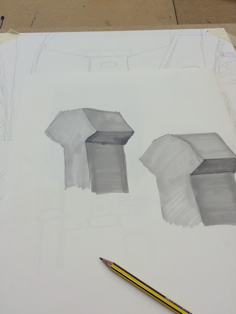
The third drawing completed was to focus more on the how different shakes and tones can be presented on paper. To do this I used the grey scale felt tips. The material I was replicating is shown below.
These large air vents were seen from the studio window; and they're industrial simplicity was perfect for focusing solely on the shades of one colour within a 3D object. Here greys are just used.

The lightest grey on the left hand side is where the object is paler due to the light, the top is then one tone up, filled by the vertical right hand area, followed by the underneath of the shape as the darkest not shaded area. While these allowed me to fully understand how essential tone is; they are very simplistic and looks unprofessional due to the lines created my the felt tip pens.
The final work in this activity I completed was using the black fine liner as a means of creating a cartoon-like illustration of the skyline from the window of the studio at university. The view i was trying to replicate is shown here. The heights and variety in buildings is emphasised in my own drawing to make it more distinctive in levels in comparison to reality.

My replication is shown in the larger image below. I think the use of fine liner gives a sort of innocent rustic style to the drawing- looks childish and cute as if would be included as a illustrative piece in a children's story book . it has a certain charm by being drawn freehand with inconsistencies and inaccuracies- the imperfect looks acceptable in this way. I much preferred drawing using this medium, while it may show less detail and less skill, it was enjoyable to complete and I am happy with the overall image as it retains a sense of purity. The lecturer also agreed that drawing with the fine liner was the best medium for me and it lead to be wanting to draw the contents of my handbag for the studio project in which I am undertaking.


