Friday, 30 October 2015

halloween


As a project at home, I assisted my sister in producing a poster to advertise a halloween event at the restaurant she works (The Windmill Cavery).  Above on the right shows it part-way done on the living room floor. The "halloween party" type was traced from an online source but then edited the type face to be more relevant to the theme. "31st October" was free hand drawn- which although not professional- it doesn't distract attention from the header. My sister added all the other elements and used facebook (as above) to distribute the information to a localised audience.

train series


Thursday, 29 October 2015

physical study 2, internal drawings

In this activity we were drawing from observation the areas and interiors we could see from the university building. We were to use a mix of mediums to create our drawings, and use different mixtures of material and image in order to experiment with drawing styles.
The ones used here are; fine liners, pencil, felt tip.

The first image I drew is directly below. Here I focused on the atrium windows with in the university building, and use observation skills to replicate similar dimensions of reality on to the paper. The area in which I drew can be seen behind the photography of the board in which I drew on. I found that visually I could see more detail within my study area than I could effectively replicate with pen and paper. Using pencil to create tones was difficult and meant that detail of Windows for example was lost, therefore this image is just a sketch of the main outlines of the area I was viewing. However it was difficult to draw the curved pillars on each side of the corridor , without shading it is unclear that these are supposed to be rounded. Also without using a ruler, my work has inconsistencies of dimensions, and looks inaccurate architecturally- for example on the dividing lines in the panoramic window as well as on the internal class room windows. Similarly difficult to represent was the curved walls the atrium balcony looks out upon. The left hand side wall is concave while the right is convex- this is more dramatically obvious in reality than I was able to illustrate. 


The second drawing I completed was a second pencil and paper drawing, however having previously used a macro scale frame of observation- here I wanted to use a smaller, more micro one. The detail I was trying to draw was all evident on the ground I was sat drawing on- so I chose to simply draw the belongings I had scattered at the side of me.  The photo below shows actual objects, while my drawing of these placed underneath. 


My own image isn't too clear on here due to shadow and low quality alongside very light, gentle pencil use. Here I think the drawings of the 2 pencil cases and phone are the best. This is mainly due to the simplicity of the phone for example, and due to the layers of content spilling from each. The smaller items were easier to draw as they could be observed more closely. However this drawing is to vague and doesn't look precise enough. Similarly the brand of drink bottle here and the logo isn't a true reflection of how it appears in reality. The chewing gum wrapper was particular hard to sketch, as the folds and rips in the paper were hard to portray, alongside the fine print letter on both this and the ID card. 


The third drawing completed was to focus more on the how different shakes and tones can be presented on paper. To do this I used the grey scale felt tips. The material I was replicating is shown below.
These large air vents were seen from the studio window; and they're industrial simplicity was perfect for focusing solely on the shades of one colour within a 3D object. Here greys are just used. 


The lightest grey on the left hand side is where the object is paler due to the light, the top is then one tone up, filled by the vertical right hand area, followed by the underneath of the shape as the darkest not shaded area. While these allowed me to fully understand how essential tone is; they are very simplistic and looks unprofessional due to the lines created my the felt tip pens. 


The final work in this activity I completed was using the black fine liner as a means of creating a cartoon-like illustration of the skyline from the window of the studio at university. The view i was trying to replicate is shown here. The heights and variety in buildings is emphasised in my own drawing to make it more distinctive in levels in comparison to reality.


My replication is shown in the larger image below. I think the use of fine liner gives a sort of innocent rustic style to the drawing- looks childish and cute as if would be included as a illustrative piece in a children's story book . it has a certain charm by being drawn freehand with inconsistencies and inaccuracies- the imperfect looks acceptable in this way.  I much preferred drawing using this medium, while it may show less detail and less skill, it was enjoyable to complete and I am happy with the overall image as it retains a sense of purity. The lecturer also agreed that drawing with the fine liner was the best medium for me and it lead to be wanting to draw the contents of my handbag for the studio project in which I am undertaking. 


Monday, 26 October 2015

typography


DEFINITION- 
(Walter Tracey)
process of making words visually attractive and effective, professional is trained to perform that task and the designer will earn a living from it
(Willie Kunz)
intellectual and emotional meaning. Communicate a message.


Bag typography will stand out and good typography <<will blend in (Craig Ward)

 How to piss of your designer friends and give them a  migraine. (Zag)>>


Font- is what you use
Typeface- is what you see


Tracking is the spacing between each of the individual letters within a word. Higher the number, the further apart the letters.
Metric tracking is universal irrespective of any other factors.
optical tracking spaces the letters so it appear visually even, it gets differentiated.


Leading is then the spacing of each line of text from each other. This naming term came from the print process in which lead strips were used to split and add partitions between the lines.


http://blog.iso50.com/wp-content/uploads/2008/07/windowslivewritercraigwardtypography-144c7533181210951137-3.jpg
https://unilearn.hud.ac.uk/bbcswebdav/pid-1662672-dt-content-rid-2501259_1/courses/TFD1413-1516/05%20Typography.pdf

typography post-it notes

After learning about the different styles and typefaces used in fonts and by typographers; we were challenged to create our own. 
These primary outcomes reflect the difference and versatility type can create- and how each has a different place within the field of design.
To coordinate the letters to form a broad range of letter choices, we were each assigned three letters, and were asked to design each just using 6 post it notes. Everyone had a different interpretation of this as people have a variety of skill sets or preferred means of showing creativity. 
Examples include, 3d models, origami, sketches, pen drawings, caligraphy, own typefaces, copied fonts, free hand, with guides, using all post-its, or using all 6 to produce the 3 letters still.
I chose to freehand draw, 6 different styles with pencil and a felt-tip pen. I wanted each to stand apart from the previous, and show the broad range at which lettering can be produced in. 

My letters were G H I

G- inspired by the block writing everyone used in high school level graphic design. A square is draw and then the out lining shape is blacked out, leaving the letter centred.
H-in a more regal, handwritten style. Using the difference of width for horizontal lines and vertical.
I- used like a 3d stick
G- inspired by the italic capitals on the 'lucozade' logo. It appears to be moving by being italic so could be linked to the word 'go" in onomatopoeic terms.
H- appears similar to the hotel.com logo. Using an over emphasised 'bubble' effect
I- Using the literal 'eye' to incorporate the letter 'I'.

Here is the full alphabet, comprising of the whole classes letters combined.


"The quick brown fox jumps over the lazy dog"

Thursday, 22 October 2015

indesign double page-spreads


Using Adobe InDesign we continued on developing knowledge of the software. The week we were using the skills in which would be exercised in replicating a double page spread.
In opening the new document we set the height and width, the margin size and the guttering size, then on the right hand side; selected and dragged the pages in order to produce two adjacent sheets. From there the grid we would be designing on was set. The grid was set at 3 by 3.
The first skill was to use the tool in which forced text on to a preexisting line. The pen tool was used whilst holding shift in order to form a greek key pattern diagonally across the page, as seen in the example. The shift key ensured that all the lines drawn were set at 90 degree angles to each other and ran perfectly straight. With this whole area selected, the text transform tool was used and placeholder text inputted. This naturally ran along the formed line then, but sight cited was needed, as the corners of the shapes had overlapping letters in some instances. This was done my just manually repositioning the words using the keyboard functions like spaces. 
Next, a rat silhouette image was selected from an online search engine and saved on to the desktop; from there this was opened on Adobe Illustrator. The white background was removed using the magic wand and delete key, and then the outline points were edited by making the image a vector one in which the outer points sat tight to the shape of the actual inner image. This was then copied and pasted in to the InDesign document. Having the 'content' set to a 'graphic' meant that the image could be edited. Using the select tool and delete i was able to remove the preexisting curled rat tail, and replaced this with a straight one by dropping the edge points of the image. This meant that the pattern the text was in, then looked like to continue seamlessly in to the shape of the rat. 
Next we inputted a large text box on the right hand side of the page, and used placeholder text to customise the size and leading of the font and type. Reselected the 'rat' image we then edited the wrap points so that the new text box expanded around the image outline.  The same was done when adding an alternative text box with the initial sentence in. (Green lettering on top left of the right page.)
Then the 'rat city' typography was added. This was the stage in which I gathered the most new skills from, as I have never before edited type on this kind of software. In order to achieve the 'mismatched' effect; each letter had an edited base line, either higher or lower the the original. Also the font was changed along the colour and the height, and width was adjusted accordingly. Finally the distance between each letter was edited, and the leading (gap in between each line) was changed too in order to fit perfectly around the pre-existing zigzag of type on the page.


Above is my finished copy.
And below the one I used to copy features from.


Next we used the second double page spread example. Show below here.

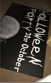
This advertisement wasn't as guided in how to reproduce, but allowed us to each experiment with font and effects in order to reach a similar outcome. (The actual font used was not available, so we had to customise existing fonts as much as possible in order to get a similar look.)
Because of this I used 'hobo' font which is an alright replication, but does not have the same serif use as seen in the example above.


My work is displayed below.


This process was time consuming as the amount of lettering had to be approached in a systematic way. If time hadn't of been such a stretch I would've liked to edit each letter individually in order to look more like the orignial- however this was not possible, so the L and the A are the only letters to be manipulated. The L elongated to stretch the length behind the work 'months' and then the A with a rectangle auto shape attached, and with outline points edited to create more of a point underneath. 

The images on the right hand side are then from an online search engine, and edited using photoshop. These colour options are exampled within another post in more detail.


film- Urbanized

Urbanised is a film by Gary Hustwit;

He is an independent filmmaker and photographer. His film work is generally in the style of documentaries. Three popular titles are; 2007- Helvetica, 2009- Objectified and 2011- Urbanized.
This trilogy focuses on aspects of graphic design, typography, industrial design, architecture and urban planning. With a quote in an interview for Dwell magazine stating that he likes to look at things we take for granted in close detail.
"I like the idea of taking a closer look at the things we take for granted and changing the way people think about them, whether it's type or objects or whatever."

(This mindset of design is something I have taken great inspiration from when initialising the idea of my 'sense of place' project. Focusing on the inside of someones handbag is a look at the close details that most overlook, especially of an object which is taken for granted so often.)

In 2008 Gary Hustwit was nominated at the Independent spirit Awards for the "truer than fiction award."

The film we watched was "Urbanized", which is a feature length documentary about the design of cities. It focused on who is allowed to design and control the layout of our city and how this has an impact of the population living there. It also focuses on both the strategies and issues each place encounters and  therefore displays which areas in turn have the best function for the people who actually live there and interact with that environment. This is one of the most important features in city design- as it must work well with the people who live there.

The Guardian "Urbanised is a brave and timely movie that manages to strike almost exactly the right tone. The more people who see this movie the better."


The Cover art for this film was composed by "Build",  as was the other art for the other films.


By 2050, 75% of the worlds population with live in cities.

After watching the film it clearly illustrated how a sense of an area (links to the brief of a sense of place) is essential in order to 'work' for all those who will use or pass through it. In city planning it is therefore essential to use past and future ideas to develop the best possible outcome for development while still maintaining happiness of the people living there.
In Germany however, this was not the case as a new fast train line was initialised to update the rail links (modernise) but this caused public unrest and riots as park land and historical nature had to be destroyed in the process. Fundamentally a vote was taken though, and this was followed, meaning the riots were unjust as the majority of the population must of agreed with the intended change.
A show of incompatibility is also the case in Brasilia, in which the birds eye view approach to designing has meant that the features and monuments of the city are spread far apart; this is not 'walking friendly' and means a lot of commuting is necessary.  
Commuting is a big part of city planning, as demonstrate in this documentary film as "its not the poorest- those without cars- who move the fastest". This is especially the scenario in Colombia, in which the money for town updating and maintenance is allocated to the sidewalks and bike lanes; while cars are left to move around on muddy tracks. This puts people first; and doesn't only reward the middle class.

Fundametally design should be formed around the functionality it will have for the user; whether this is architecturally, graphically, artistically or locationally influenced.  

From this film the segment which carried the strongest message for me was the one of the information used in a form of gorilla marketing on Tidy St of the British town Brighton.  This is best demonstrated in the image below; here graphics are used as a visual representation of how much Brighton residents use in energy.  Having this displayed publicly outside the homes here initiated competition amongst residents to continually try to reduce their own consumption rates.
And it worked!