- Rudy Vanderlands
- Zuuzanna Licko
- First digital type foundry
- Sold or gave away the fonts used in the magazine
- very popular stylistically
- digital and portable
exploited the possibilities of apple software to produce a new innovative design language.
Very digital (deliberate) typefaces, bitmap 'un-smoothed' out type.
(experimental jetset had article published in Magazine)
http://sandilandslucy.blogspot.co.uk/2016/10/low-budget-typographic-posters.html
(worked with DesignersRepublic, published their work)
http://sandilandslucy.blogspot.co.uk/2015/11/ian-anderson-lecture.html
Content
- "Dear Emigre"- Letters to Emigre.
- funny venting that is published in a magazine.
- Form of trolling?
- some essay length submissions
- back and forth discussion
- writer and reader discussions
- firey
- disguised political debate of post modernism and modernism
- fought out through type and composition, as metaphor for political debate.
Format changes- attempt to move away
- CD and dvd format editions in a period before you would've seen this
- open to changed
- Tabloid
- Smaller 'news' magazine
- Emigre music publishing
- "Catfish"
Monotony of International Style
- graphic interventions
- the grid strips away unconventional things on the page.
Barry Deck- Originally design template Gothic (postmodern graphic design style)
vernacular style- understood and used by ordinary people on an ordinary basis.
The future as imagined by those in the 1950's. Mass Produced.
Critics
Massimo Vignelli (neo-modernists)- 'A national calamity', 'An aberration of culture'
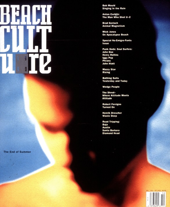
David Carson (postmodern)- Beach culture magazine published an issue with a cover one that boasted "no Emigre fonts", although the logo itself was set in Licko's Senator.
Ironically it was designers like Carson who popularised it.
Allies
Stephen McCarthy- "the voice of a new generation of graphic designers: post-modern, deconstructed, experimental".- Break lines of text
- use a mix of fonts
- deconstructive layout.
- broke affordances (broke rules) you could introduce awareness of what they are reading.
- crafting digital technologies
Vaughn Oliver- deep human qualities but highly surrealistic. Contemporary designer sensibility in animation (e.g. Tim Burton surrealism, poetic, Freudian references). Juxtaposition. Everyday objects with imposed human sensibility.
- typographic style was calligraphy.
- Starts with part of the body/ human cultural artefact.
Katherine McCoy- Cranbook. Communicate ethos of the Cranbrook course. Legibility and communication shouldn't be confused. Deconstruction can convey that message if thats what you want to portray. Collaboration of artists (Cal arts also).
- Jeffery Keedy (Modernism 8.0 Emigre)(old modernism vs new modernism)
- Ed Fella
- Lorraine Wild
- Andrew Blauvelt.
Walker Art Centre- Rebrand for exhibition design
- snap of serifs
- stripe motif patterns recurring.
Emigre 64 and 65, refused to be interviewed for Gary Hustwit's Helvetica film.
Octavo- associated with music labels. More minimalistic.
- small crafter work
- reduction
- use of white space
- all handcrafted
- depth of design despite not using multiple technologies.
- Swiss influence (e.g. Wolfgang Weingart)
- filled with associations
- e.g. Peter Saville. Minimalist modernist, worked for factory records.
- Win Crouwell
https://s-media-cache-ak0.pinimg.com/originals/21/3a/ab/213aab6b075f5a209025208ef13a205f.jpg
https://s-media-cache-ak0.pinimg.com/236x/83/5c/55/835c559cd1a476838c08f04dff73be2d.jpg
http://static.flickr.com/67/191189104_a71f037461_o.jpg
https://gamswennewsmag.files.wordpress.com/2012/04/pixies.jpg
https://s-media-cache-ak0.pinimg.com/736x/6f/e5/9d/6fe59d48bbacb3a4fa65ea6c8e4dd371.jpg
http://farm4.static.flickr.com/3580/5780946882_a9b30955b2_z.jpg


