In this process and production we were learning about an effect known as 'boiling' using adobe after effects. Overall this will produce a digitalised version of hand drawings/ illustrations in to an animated sequence. The use of physical line drawings on a screen has a charming quality, that restores traditional views of artwork and design. The juxtaposition of digital manipulation and organic, raw line work forms a visually interesting animation.
Some examples of work possessing a similar style are below.
I also particularly found inspiration from the "Todays programme" idents/ adverts for bbc. These dramatically use line work and illustrations to give a sort of emotional affect to the information it is presenting. It has a more personal connection knowing the details are hand crafted and has an innocent quality.
Firstly the hand drawn images were created. We used 3 of these, as even tracing the original sketch lead to some variations on the design outline, and this was intended. I wanted to create an illustration which was simplistic, and not complicated in detail as I wanted the drawing to 'look' hand drawn and to not be too difficult to mask during the editing process. I chose to use a coffee takeaway cup.


 The images above were then placed in photoshop and using the 'multiply' blend mode I could ensure that the lines on each illustration could layer as accurately as possible. This was essential and it will save the animation jumping too significantly once placed in After effects. These were saved as jpeg images under the names "image_001" "image 002" and "image_003" which would mean they could be imported as a jpeg sequence in the software.
As standard the document was then set up in after effects.
- dimensions- HD screen. 1080p 720p
- frame rate- 25 frames a second
- interpret footage- frame rate 25
- interpret footage- loop 50 times
- import jpeg sequence- select all three files then open
- add these to timeline
- edit to size on screen
 The the illustration lines were masked using the one tool. We were advised to do each masked section in the order it was drawn, as this would look most natural for the following animation. As each line was masked it was important to not close the masked layer fully, and to leave a small gap, as otherwise the mask wouldn't just be a line, it would connect and form a shape. This would then make the effect not work. The masks can be seen below with a different colour per line masked.
 To the left here is an instruction of how the stroke was added to these masked lines. This could be then edited on the left project tab, changing the colour and the stoke width. The effect then applied on the object can be evidenced below. In order to form an animation which looked like the object was being hand drawn, the project controls needed to be edited further. The "end" option was set at 0% to commence the animation in the timeline, and then set to 100% in the timeline when i wanted the animation to be at its most complete. At first this was set at 9seconds, so the image was whole for a second before looping again. The paint style was set to "reveal original image". This would mean that the hand drawing effect would now animate the graphic.
After this the editing continued on the main composition tab. A background texture was suggested as this would further indicate a hand drawn quality. For this reason the background I selected was that of damaged paper, with stains and rips. I thought the stained effect worked well with the theme of a coffee takeaway cup as certain areas looked like coffee cup ring stains from cups placed on top.

Colour was then added to the animation. The asks were redrawn, but this time closed in order to form a full shape. This meant that coloured could be used to fill. Theses masks were separate to the line masks and so the editing could be done with the lines and the block fill working separately from each other. This too adds to the natural, innocent aspect as the outline could be shown before the colour joining it, just as the process is for illustrating and adding colour in real life sketches.
The variety of difference outputs utilising what I have learnt can be seen below, with a link to an uploaded vimeo file.
The same techniques were applied to each of these different outcomes.
https://vimeo.com/user44881903
In creating the developments for this project I did face some unexpected issues. This came when trying to add text in to the project window and then the timeline.
The typeface was chosen on photoshop and then this was manipulated on different layers so that the alignment differed slightly between each replication. This was (like previously) saved as flattered image and saved as a jpeg to form a jpeg sequence of 3 files. However when saving under 'image_001/002/003' I didn't account for the original coffee cup drawing being then saved over by the text as it was saved as the same name and same file format. This caused lots of problems as when the original file was opened, the layers containing the effect were automatically changed from cup to text. After this, when the cup drawing was re-imported the masks didn't align and the frame rate changed which I was un aware of as it was a new imported sequence. It took a lot of trial and error before realising what had changed and be disrupted, and what therefore had to be edited to get the cup animation back to how it was previously. The text files had to be saved under new file names and then be added as a jpeg sequence and have the frame rate changed to 25 and be on a loop rate of 50 and then be added to the timeline before the animation started to form in the way I had hoped.
Having realised my mistakes, the last example shown above was created with a much quicker process. This was further sped up due to just one layer of text being used instead of a three image jpeg sequence used. This works better than previously, as this is a single line type and it doesn't jump and move around the screen so can be read more clearly.
In creating the developments for this project I did face some unexpected issues. This came when trying to add text in to the project window and then the timeline.
The typeface was chosen on photoshop and then this was manipulated on different layers so that the alignment differed slightly between each replication. This was (like previously) saved as flattered image and saved as a jpeg to form a jpeg sequence of 3 files. However when saving under 'image_001/002/003' I didn't account for the original coffee cup drawing being then saved over by the text as it was saved as the same name and same file format. This caused lots of problems as when the original file was opened, the layers containing the effect were automatically changed from cup to text. After this, when the cup drawing was re-imported the masks didn't align and the frame rate changed which I was un aware of as it was a new imported sequence. It took a lot of trial and error before realising what had changed and be disrupted, and what therefore had to be edited to get the cup animation back to how it was previously. The text files had to be saved under new file names and then be added as a jpeg sequence and have the frame rate changed to 25 and be on a loop rate of 50 and then be added to the timeline before the animation started to form in the way I had hoped.
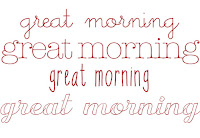 |
| choosing typeface |
little days regular
american typewriter lite
KBSoThinteresting
Transatlantic cruise demo regular
 |
| type used in animation |
 |
| Pen tool to mask outline of the text |
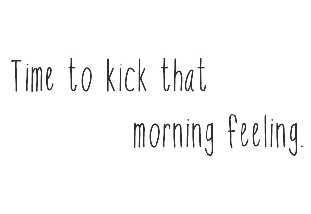 |
| type used in animation |
 |
| timeline of animation for the 3x coffee cup animation |
Having realised my mistakes, the last example shown above was created with a much quicker process. This was further sped up due to just one layer of text being used instead of a three image jpeg sequence used. This works better than previously, as this is a single line type and it doesn't jump and move around the screen so can be read more clearly.