In this lesson we were experimenting with creating a "rotoscope" animation on Adobe after effects. In creating this piece, a short piece of video is cut an masked frame by frame in order to create a fluid 1 second animation which can be used repeatedly to make up a short clip. e.g. 10 seconds (in this case.)
In order for this to be possible the document was set up to have a frame rate of 25 a second, and this was inside of a clipped 1second range. The dimensions were set to HD as this could be a piece made for the screen (TV, advert etc). Below shows the set up taking place.
The footage taken was then imported. It was a 6 second video of movement, which was filmed quickly and inexpensively just on a smart phone. We were made aware that the quality of the footage didnt have to be particularly high, as the original video would not be seen in the final render, but would just be used as a guide for each movement to mask from. The video acts as a template in order to outline each movement per frame within the second. (So in total 25 masks will be created per this one second). As this was a 6 second video, once imported I had to chose the bits of movement I wanted to include. There were a few guidelines to this to make it look most effective.
- The figure to be contained within the frame at all times.
- To be ending as close to the original starting movement as possible in order for a looping of the clip to not look too jumpy and not smooth.
- Be quite basic in movement
- Have a clear outline of figure against the background colour (for ease of outline tracing)
- Try not to include any fine details such as hair (as this proves very difficult to cut out)
Below shows the one second clip being placed in the timeline in the right location.
Below are the preference adjustments to enable different masks per frame to be held within the same mask on the timeline.
After this we started the rotoscoping effect creation. This was done by using a mask, and outlining the individual movements of the figure in the video (frame by frame).
Below you can see the figure cut out from the background as an example.
It was suggested when dong this to use as little mask points as possible. While we wanted a fairly accurate online of the movement, it was explained that each of these points must remain in every frame, so the less to move the easier to manipulate and the quicker this would be. For this reason when we started to place the mask, it was advised to do the first outline on the figure when it was at its most expanded in shape. This way no points would need to be added further on in the editing process.
This was still however a very laborious process and very time consuming. Especially as the motion of punching I had chosen meant that editing the points across the whole body was needed on each frame. Until the video is slowed down its hard to realise how the body twists and the legs turn even when it just appears to be a punching movement from the arm. Therefore it took quite a while to get each frame outlined suitably.
Another problem encounter here was the background choice. As this footage was taken simplistically and naturally in the home, this meant that there wasn't a plain background to work against. When the video runs at full speed it is easy to distinguish the figure from the background. However when slowed and analysed frame by frame it becomes more difficult to make out the online of the body compared to pattern behind, especially when zoomed in for accuracy trying to distinguish the difference becomes more difficult.
Above in the screenshot shows the completion of the masks on each frame within the 1second video clip. In the timeline you can see this as a small dot where the mask has been adjusted on the mask path tab. I learnt that during this overall editing process it is essential to save the composition after each mask path has been edited, as my software crashed several times and the editing felt even more tasking when having to be repeated.
But once this was done the style and interest could be put in to the animation through colour and effects. For this we were left to experiment and have free reign over what effects we wanted to trial. As I am not as comfortable with after effects as other adobe software I thought my work would look most effective if I utilised the skills I had learnt in other lessons. Because of this I made use of the effect of 'venetian blind' which we had experimented with in a previous lesson. This effect can be seen below in the screenshot; the figure on the left with a white venetian effect and the one on the left with a dark blue and vidid red stipe effect. To further contrast these figures from the solid background colour I copied the figure and used this misaligned as a backing colour for the venetian effect. I think the image towards the left of the screen looks most effective, as the white lines are really the main focus and give depth to the layers that are placed on top of one another.


This is displayed to the left here in an alternative frame position.
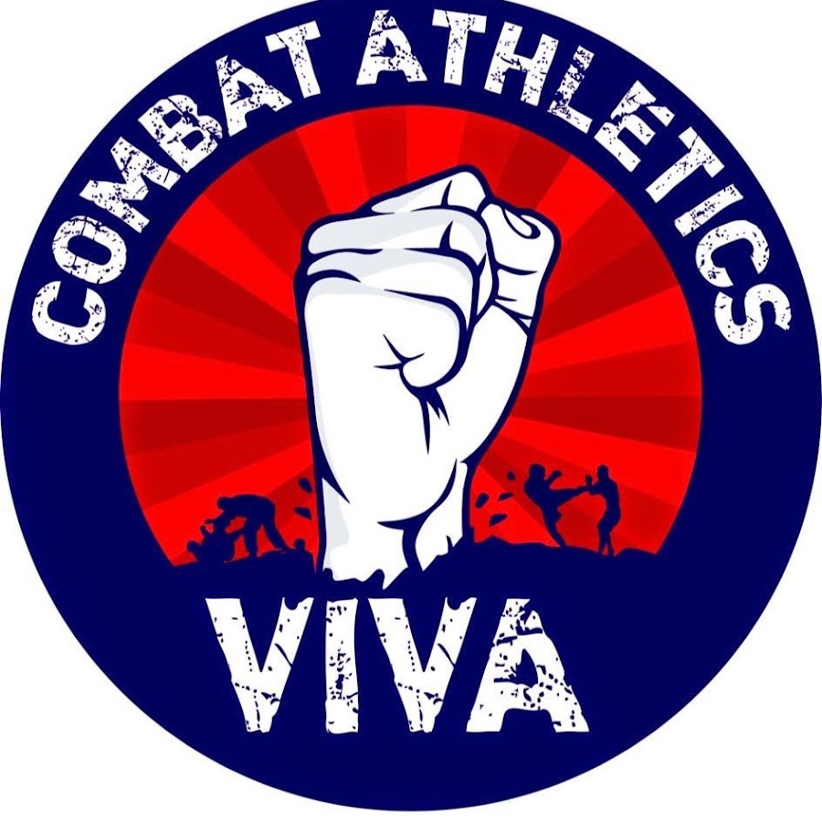
For the colour palette used here I took inspiration from a logo used from a combat athletics club. This can be seen in the bottom right of the screen shot above, as I used the eye dropper selection tool on this internet image to select the colours. They go together very effectively as the vivid red is quite 'punchy' and contrasted the deep blue of the background.
However because this is an existing club logo I need to seek permission to further use this within my work. But my intention would be that this rotoscoping could act as promotional material for this local club. The short length of this animation would make it suitable for an internet moving image such as a GIF, and would also be effective as a moving ID for the club's online presence. Such as a motion profile picture on Facebook where a video can now be used as a reflection of your profile.
Another idea here would be the capture individual sections of the film here and use these to form promotional posters. In the full outstretched punch motion the image would look striking alongside the logo and details of the club and the information needed to attend. In this example the white stripe would make effective use of white space, as the viewers eyes would automatically see this as a figure, despite just being made from stripes.
Below is my rough version of the animation. This has been uploaded to vimeo with the link at the foot of the post.
 (click to enlarge)


