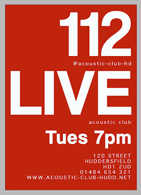
Brief- A3 Poster One — Acoustic Night
Session 2,
Bar 122 Live, 120 New St, Huddersfield, HD1 2UD
Acoustic Club
Every Tuesday evening from 7.00pm — late
01484 654 321 www.acoustic-club-hudd.net
strum@acoustic-club-hudd.net
@acoustic-club-hd
You can only use typography
You can only use THREE type sizes.
One large, one medium and one small.
Just use Red, Black and White.
You can also use tints too.

Brief-A3 Poster Two — Craft Beer Expo 2017
Session 2
6-19th June 2017
Tickets Now On Sale, book online.
The Huddersfield Craft Beer Expo 2016
Magic Rock Tap, Willow Lane,
Huddersfield, HD1 5EB
01484 649823
www.huddscraftbeerexp.com
beer@huddscraftbeerexp.com
@huddscraftbeerexp
You can only use typography
You can only use THREE type sizes.
One large, one medium and one small.
Just use Red, Black and White.
You can also use tints too.

Brief-A3 Poster Three — Interpret
Session 2
Your poster must include the following:
Designers name.
Full uppercase alphabet.
Full lowercase alphabet.
Numerals and glyphs.
Years active.
A short paragraph about why you have chosen your particular designer, what is it about them you find
compelling or explain why you wanted to try and
understand more about their approach.
Quickly research your designer.
Find out key information you need.
Call out the characteristics that make up the visual
language of your chosen designer. Do they use a
particular colour pallet? Any specific typefaces used? Do they structure their work in a particular way? Is it hand-drawn, physically made?
Example shown below.
Brief- A3 Poster Four — Wilson's Republic 6
Session 2
The overall theme for the evening and talks is:
"Resilience".
13th April 2017
6.00pm — late
Bates Mill, Milford Street, Huddersfield
HD1 3DX
A Design Network for Huddersfield
www.wilsonsrepublic.com
@wilsonsrepublic
#WR6
Christopher Nunn
Lord Whitney
James Sommerville
You need to include the WR logotype and pipe marque.
You need to use the WR colours, only use Red,
Black and White. You could also use tints and half-
tone patterns of those colours.
Developments are shown below. With my final design showing at the foot of the page. The work previous slowly inspired how I wanted the final poster outcome to look. With the theme being 'resilience' I wanted the '6' to stand out against the background, but decided I didn't with the background and main focus to be too contrasting. This was also the case due to the limited use of colour requested in the brief. The final outcome too has the impression of being pushed out of the background colour, I think this reflects a resilience as the character is further ahead than the rest and is stronger and bolder by being int he foreground, it is much more prominent.


 The images above were then placed in photoshop and using the 'multiply' blend mode I could ensure that the lines on each illustration could layer as accurately as possible. This was essential and it will save the animation jumping too significantly once placed in After effects. These were saved as jpeg images under the names "image_001" "image 002" and "image_003" which would mean they could be imported as a jpeg sequence in the software.
 The the illustration lines were masked using the one tool. We were advised to do each masked section in the order it was drawn, as this would look most natural for the following animation. As each line was masked it was important to not close the masked layer fully, and to leave a small gap, as otherwise the mask wouldn't just be a line, it would connect and form a shape. This would then make the effect not work. The masks can be seen below with a different colour per line masked.
 To the left here is an instruction of how the stroke was added to these masked lines. This could be then edited on the left project tab, changing the colour and the stoke width. The effect then applied on the object can be evidenced below. In order to form an animation which looked like the object was being hand drawn, the project controls needed to be edited further. The "end" option was set at 0% to commence the animation in the timeline, and then set to 100% in the timeline when i wanted the animation to be at its most complete. At first this was set at 9seconds, so the image was whole for a second before looping again. The paint style was set to "reveal original image". This would mean that the hand drawing effect would now animate the graphic.


