In this seminar session we aimed to convey a message in a graphically, innovative way. To do this we were guided by how meanings can be hidden within.
With an example of this being Michael Barry's unsuspected bridge. Here he used hot air balloons as the means of transportation across the river- this fulfils the function but is presented from a less 'expected' perspective.
Similarly we looked at ambigram tattoos, which have more than one meaning- and were guided to create our own graphic piece. Which possessed either an alternative perspective to demonstrate the meaning, or presented the meaning through multiple elements within the composition.
An example of an ambigram tattoo is below.
You can clearly see how the same graphic can be read in two different rotations, to significantly present something different. e.g. here the top word reads 'regret' clearly, whereas the one underneath is read as 'nothing'.
The next activity was to create our own graphic which could represent two contrasting ideas.
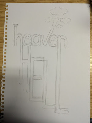
In my graphic sketch I wanted to combine messages that are the exact opposite of each other; so chose heaven and hell. Here is the initial drawing.
I wanted to combine a light, angelic typeface and style with that of a heavy sharp capitalised typeface in to one. This was to portray each of these two poor opposite extremes. I also added small drawings to emphasis the connotations surrounding 'heaven' e.g. with the halo and the clouds.
However this does not blend as seamlessly as the example above, as there is still a strong divide between ideas. I hope to improve this through adding a colour gradient across the whole piece by using photoshop to edit to a higher professional standard.
This is my finished heaven/hell innovation graphic piece. This was based on my original sketch, however this has changed significantly due to being digitally manipulated. I used two different typefaces for each work and blended them by adding auto shapes of the same width to attach them together. e.g. on the H extension and the last L elongation. This was created by changing the spacing of the letters on the character panels, so the H and N could correspond with the H and L on the following line. I then added a new layer and changed the blend mode to lighten so that when I added colour on to this layer it only remained on the black dark shade of the type. To add the gradient I did this manually using the brush tool and altering the opacity and brush size to blend my own choice of colour seamlessly. This was more effective than using a gradient feature, as the manipulation was easier on where I wanted each shade to appear and fade out in to the next.
The colours are to reflect the connotations already surrounding each of these words- with hell being the vivid 'hot' colours like red and orange (as in fire), work in stark contrast to the cool greys and blues which would be associated with the sky and clouds associated with heaven.
https://s-media-cache-ak0.pinimg.com/736x/62/4f/2f/624f2f97a1689d6334208a26a09c8109.jpg
https://unilearn.hud.ac.uk/bbcswebdav/pid-1667983-dt-content-rid-2514870_1/courses/TFD1413-1516/ReFRAMING%20%26%20Innovation%20HANDOUT.pdf


