Monday, 30 November 2015

design and emotion


This lecture session was to get us thinking about graphics as a means of emotional engagement and meaningful communication.
In a way this was involving psychological and sociological explanations and reasoning behind certain works. I took particular interest in this as I enjoyed studying sociology as part of my A-levels. 

As designers its important that we think outside the box, so therefore we cannot take for granted what we can see, we need to investigate things that aren't so obvious to us. We have to explore the 'blank space', for example.
In order to do this we have to ignore perception and illusion and uncover things for what they actually are. To exemplify this an image of what appeared to be streetlight was given; however this is only presumed as the page was black except for a small white shape and shading of a vertical object. It is our knowledge of the world which presumes for us- often subconsciously.  The brain de-codes according to past experienced using visually stimulation clues in order to do this.
This could be linked to the sociological perspective of interpretivism and more specifically interactionalism. In which a strong emphasis on societies cohesion is formed by people using their own 'world knowledge' and 'a shared common sense' to make sense of the world. 

Visually seeing fully what is around us is provided by the two types of cell we have in our eyes;

  • cone cells (give complex, detailed and colour to what is sighted)
  • rod cells (peripheral view often subconsciously, in black and white, part of the eye which triggers fight or flight reactions due to giving an exaggerated vision of movement.)
Sight is a main sense, and sometimes we over rely on it. Our eyes and brain can recognise certain phenomenon within new in which we categorise the new information by. For example our brain subconsciously jumps to assuming a face to be 3d with the protruding to be that of the nose. So even when faced with a new face in a new format we still try to apply this rule. This is the case for the T-rex illusion. 


We only see what we expect to see.

This is all due to humans having deep set habits, maybe from priming (in which people are set up to behave a certain way.)  Its very hard to step outside of the way in which humans work. 
Illusions like this t-rex one are prevalent in still image form too, in which our colours are tested as we stare at one set of colour combinations and then when the picture is adjusted our eyes retain the opposite colour version within our sight. There are many examples of these including the blue and yellow squares or the union jack pattern or those which involve starring at a dot on a black and white image.
While our minds cannot make sense of why this happens, some illusions can be foiled. Clever Hans was a horse in which people believed had psychic abilities and could relay information; however this was found not the case later as the handler was found to have primed the animal in order to respond a certain way to specific micro movements they perform.

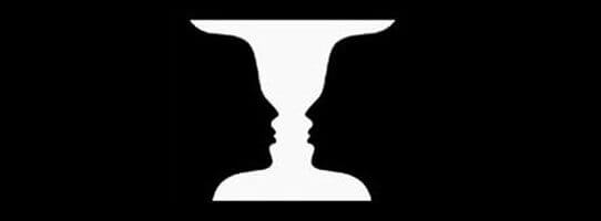
As well as illusion, there is also a high use of perception variation. This being so clearly demonstrated in the the two way head images, where two faces are included within one, or with Ruban's Vase images (below). Depending on each individuals perception, they either see the vase first or the two facial profiles first.


Next we looked at how if we are born with our senses, we must also be born with some sort of innate perception. Proving this was an experiment which involved toddlers and mothers. The children had to play within a certain area, and then be called by their mum to crawl over to them- only to find that when they do so, the glass section of the area floor has a significant drop below. The test was the find if the children would crawl to mum regardless of the danger they could put themselves under if the drop was real. In most cases the babies stopped but this is argued that this could be to do with the age of the children in that they already had some knowledge of depth perception from at home. 

While different age perceptions are questioned there, so too can be the perceptions held by certain cultures. For example the study of tribal occupants who had to gauge the length of two arrowed line (parallel bit arrowed in opposite directions.)(below) They were able to decipher that they were the same due to the lower cultural knowledge of certain rules or experiences; however we would maybe see these two lines as different due to the taken for granted rules we each possess regarding space labelling. e.g. arrows facing outwards are seen to look smaller in relation to the one on the left. 
Another example is trying to find the letter "F" in a text extract. As we skim read we pick up on the obvious f letters. However on closer inspection we can see they we have subconsciously not counted the three "F"'s in the word "of" being repeated. This is due to this sentence connector often being over-looked. 

In summary its essential for graphic designers to never assume. They need to explore every avenue fully and make sure to investigate the "blank space" as this may hold some clue or answers towards the rest.  Finally proving how it is hard to avoid assuming we were set of a challenge to connect a 9 dot grid formation (all) in just four straight light. We all struggled to complete this as it seemed impossible, but the trick was shared as to extend the lines to do it in the outside border the shape. 


innovation

In this seminar session we aimed to convey a message in a graphically, innovative way. To do this we were guided by how meanings can be hidden within.
With an example of this being Michael Barry's unsuspected bridge. Here he used hot air balloons as the means of transportation across the river- this fulfils the function but is presented from a less 'expected' perspective.


Similarly we looked at ambigram tattoos, which have more than one meaning- and were guided to create our own graphic piece. Which possessed either an alternative perspective to demonstrate the meaning, or presented the meaning through multiple elements within the composition.
An example of an ambigram tattoo is below.

You can clearly see how the same graphic can be read in two different rotations, to significantly present something different. e.g. here the top word reads 'regret' clearly, whereas the one underneath is read as 'nothing'.


The next activity was to create our own graphic which could represent two contrasting ideas.
In my graphic sketch I wanted to combine messages that are the exact opposite of each other; so chose heaven and hell. Here is the initial drawing.


I wanted to combine a light, angelic typeface and style with that of a heavy sharp capitalised typeface in to one. This was to portray each of these two poor opposite extremes. I also added small drawings to emphasis the connotations surrounding 'heaven' e.g. with the halo and the clouds.
However this does not blend as seamlessly as the example above, as there is still a strong divide between ideas. I hope to improve this through adding a colour gradient across the whole piece by using photoshop to edit to a higher professional standard.

This is my finished heaven/hell innovation graphic piece. This was based on my original sketch, however this has changed significantly due to being digitally manipulated. I used two different typefaces for each work and blended them by adding auto shapes of the same width to attach them together. e.g. on the H extension and the last L elongation. This was created by changing the spacing of the letters on the character panels, so the H and N could correspond with the H and L on the following line. I then added a new layer and changed the blend mode to lighten so that when I added colour on to this layer it only remained on the black dark shade of the type. To add the gradient I did this manually using the brush tool and altering the opacity and brush size to blend my own choice of colour seamlessly. This was more effective than using a gradient feature, as the manipulation was easier on where I wanted each shade to appear and fade out in to the next.
The colours are to reflect the connotations already surrounding each of these words- with hell being the vivid 'hot' colours like red and orange (as in fire), work in stark contrast to the cool greys and blues which would be associated with the sky and clouds associated with heaven.


https://s-media-cache-ak0.pinimg.com/736x/62/4f/2f/624f2f97a1689d6334208a26a09c8109.jpg
https://unilearn.hud.ac.uk/bbcswebdav/pid-1667983-dt-content-rid-2514870_1/courses/TFD1413-1516/ReFRAMING%20%26%20Innovation%20HANDOUT.pdf

Thursday, 26 November 2015

indesign interactive pdf

In this processes and production lesson we were focused on how InDesign (adobe) can be used to produce an interactive pdf document.
To start of the piece a new document was created and the size (pixels) was set due to this being a web based output. The margins were then set (20px), along with a new created guide of a 12 rows column grid with no gutters but with a grid line every 60px, fitting to page. The baseline grid was incrementing in points of 8 too. 
In the recreating of the "pervasive percussion" album art, I pasted the original as the background layer so I could 'trace' its style. 
Firstly I sampled the colours to form swatch styles. This was done by double clicking the colour fill option on the top tool bar in the centre and then using the colour picker tool to select each colour manually. These were set to be saved under the RGB colour code (RGB is suitable for web use, unlike with printing.) These swatches can be seen as added to the colour tool bar on the right hand side. Using these colours and the circle tool (holding shift and alt) I could replicate the circle shape and then duplicate this multiple times until I had the right mount needed. The smaller circles were then added and grouped to the one behind- in doing this I was able to select a row of the circle at a time and align them so they look visually spaced evenly. The pink circle and adjoining thin rectangle where added in the same way. 


Here it can be seen below in 'presentation' mode; without interference from tools or guides. 

 
Next we focused on adding the content to the rest of the document pages, these were two text pages and two pages containing media (video or still image).  The 4th and 6th pages were left white background and left aligned text added and filled with placeholder text. 
On the fifth page an image of "count-basie" was placed to fill the whole frame of the document on the right hand side. The frame section was altered as a means of cropping the image. 
Secondly the settings of indesign were changed from 'essential' to 'interactive for pdf', in order to add a mp4 video file.  The file was sourced and placed on the right hand page on top of a black background, at the foot of the right hand tool bar I used the film/ media icon to choose the file through. A preview was then seen of the file towards the right.
The clip can be seen here within the fullscreen play back of the interactive pdf. This short movie also contains sound. 


I also learnt that it was possible to improve interaction by adding control bars including the play/pause and volume options for the film within. It was also possible to have the video commencing on click or when the page first loads. This wasn't something I was aware was possible beforehand.  

Carrying on with exploring the interactive features- I was able to add buttons within the document. I chose to add the button to the small blue circle selected in the image below. For this to be easily notifiable as to be about to be selected, I changed the second layer "rollover" layer to an effect with a shadow. 

The final interactive feature i added was a contents page on the 2nd page. With an introduction on the 3rd page. To have this automated with hyperlinks within the document- I created paragraph styles for the subheadings on each different page. By doing this i was able to create contents and add each different paragraph style as an option within the table of contents. These are then numbered accordingly.

The document was then saved and exported suitably to be opened at an interactive pdf.  This can be set to open automatically to full screen.The first page displayed is the one shown above (pervasive percussion), and then goes on to the contents page when the blue button is clicked. From the introduction and contents page the user can then navigate across the whole document from this list of included items. The page containing the video is set to play automatically on the loading of the page. 


fears of the dark

Peur(s) de Noir (2007)


This animation is a French film in which we watched one of the sections (e.g. a short story within). Although this film was originally made in french, the translated version is still easily understandable due to not having any narrative except for sound effects and music. These sound manipulations add the 'horror' and tension to viewing the clips as the graphic content itself isn't particularly scary. The noises add a psychological terror as your mind over emphasises the dangers portrayed. 
In the clip we viewed, the man in the centre of the above poster was the character who's fears were exposed. He was exploring a darkened house in a typical 'haunted house' manner; the lights were not working, there was a 'spooky' basement, doors that locked behind him, and what appeared to be no exit. 
The way in which this snippet portrayed the darkness of his environment was very clever. The whole animation was in black and white; but using these tones the animator was able to still convey a scene effectively as light and shade added depth and a realness to the 2 dimensional illustrations. Again this could be argued to be even more improved due to the brains capacity to 'fill in the blanks', e.g. in one instance a black bottle rolls across a black floor, but this is only evident due to the very small white label rotating and rolling across a pitch black screen otherwise. 
Adding to the fear in this snippet is the size and build of the character they have created; the large stocky man is not what is initially thought of when picturing a fearful individual. Therefore when this character seems 'jumpy' or anxious it seems heightened to the audience in a stereotypical view that men wouldn't want to appear scared.

https://skullbangerdotnet.files.wordpress.com/2014/05/fear1.jpg

Wednesday, 25 November 2015

introductions and abstraction


An abstraction is the overview of a phenomenon, as could be described as a brief summary of content. In essay writing this can be linked to setting the mindset/ idea of what your reader is going to consume subsequently, and works as an 'introduction' for the rest of the following information.
Within this abstraction the overview should remain direct and relate clearly and concisely to the main points that will continue. It is promoted that an abstraction should be a few sentences long and should remain summarised.

To illustrate how this can be done with larger bodies of information, the class undertook an activity in which each of 6 groups summarised a 20 second film snippet in to one sentence. These were then all pulled together to sum-up a 2 minute clip in to 6 short sentences. The film used was 'Withnail and I' (1987) and it was easy to recognise how detail could still be included even when just giving a general abstraction.

To further demonstrate this we watched a scene from the 1942 film 'Casablanca'. In this short section of film the audience is fully informed of characters, possible storylines and of past histories giving context to the future character developments. The conversations between just two characters (Rick and the Policeman) ask and answer all the right questions the audience may have; with intrigue being consequently created by including just enough relevant detail to the upcoming story. This narrative is an example of a strong opening.


In contrast to this is the weak commencing of the 2003 film 'The Room'. The information given in this short clipping has no relevance to the rest of the film and seems random and disjointed. This inconsequential scene has drawn out scenes with no evident meaning in the present let alone as a reflection of the future film progression. Cliches too further disvalue this abstraction.


My first thought of another film which used the opening establishing shot to foreshadow furure information is the the opening scenes of the 2009 film 'Zombieland'.  In which the 'rules' which will be tested and justified throughout the film are first mentioned. In doing this clips of the upcoming film are also showed in which creates an interest in to carry on watching.


The main character is also distinguished as the narrator, an intense graphic content sets the tone for the gore and violence to be expected, and the rules put in place give a history to how the main character has come to these conclusions.  All that are needed in an effective abstraction.


Similarly the character introduction and history given here intrigues the views to watch more; especially with the cryptic phrase concluding the sequence. "This is not a love story' sets a contrasting tone to what is presumed.

Similarly in Easy A, a starting abstraction is used. The brief round up of events that will follow leave the audience to continue watching in order to answer the questions the opening has caused. 


genealogy recap

Keywords and definitions;

Method- The way of going about or doing something

Methodology- The knowledge of how you are doing something

Objectivity- Is a view of something which is detached from personal opinions

subjectivity- when a phenomenon is dependable on your viewpoint/ opinions

eternal truth- is an absolute fact

fabrication- expanding on or creating a manufactured idea

establishing shot- the opening frame especially seen in animation opening titles.

perspective- your viewpoint or how you look upon certain phenomenon 

pre-conceived- is when something is already pre-determined, you know what will occur before it does so. 


my abstraction

This document aims to propose my final outcome to a studio based sketchbook project completed previously. The way in which I hope to do this is by creating my own magazine type document, as a professional touchpoint and physical item which demonstrates all my primary findings. 
My original project was focused around an individual's handbag- and while this seems a narrowed search, it was in fact very informative as to how we each have taken for granted belongings that we carry routinely despite the mundaneness of each separate item. It's the collective belongings that I seeked to pay attention to- as I felt that the contents of someone's handbag was a good show of character or style or even what requirements they give priority to.
This project was something I'd not seen exposed in this was- as publications containing "bags" or consumer goods tend to take a literal approach of simply advertising. I wanted to produce an 'exposure' of why we carry what we carry; how it's useful to us, any stories behind objects and what makes them apart of our 'daily need'. In doing this I hypothesise to find that a bag is essential, especially stereotypically to the female sex. But also that so much detail is hidden in the seams and pockets of our fashionable or functional purposed bags. 
My choosing to compose a small magazine (time permitting) I'm linking this "fashionable" glossy mag format to a typical materialistic want of a handbag- except I want the content of the text and photography to be much less formatted and structured in this way. Interviews and personal stories and survey/ questionnaire results will be written and this acts as an "insight" in to another's value of objects. (Subject views). With natural even laughing photography of each item (reveal every detail) and how much of a "need" a bag is. In doing these type of relaxed shots I aim to reflect the relaxed attitude we also have regarding paying attention to the mundane in life. Hopefully this publication will serve to open eyes to the unintentional impact each of our bags creates.

Monday, 23 November 2015

information graphics

 In this seminar session we were focusing on how graphics can be used to portray information in a fun visual way. 
Information graphics have become popular in more recent years as companies seek aesthetically pleasing ways to demonstrate facts or ideas in a simplistic way. 
These can be achieved through both graphic design and more animative pieces too. 
In this activity we were asked to formulate an "info graphic" piece which was personal to us, and convey this to an outsider. 
The example given was particularly effective as it was centralised on a drastic  life event... Death. In this piece the graphic artist had chosen to use separate curved lines across a horizontal axis to illustrate the "shortening" of life. To do this- the years lived were colour orange- while those that have been lost by a gun crime related death were colour grey. It was remarkable to see not only how many deaths were caused by this form of weaponry but also how this sort of death significantly ends a life way before expectancy would presume otherwise. 

The simple sketch I completed in class was very basic but was according to distsnces from "home" certain people, places or things were.
This is shown below with a key to explain the graph in the top left corner.


As this was only a rough drawing, I thought it would be worthwhile using the computer and Adobe Indesign software to produce an Information graphic piece which had a much more professional finish. Being new to this software I chose an alternative idea which was much easier to produce. This was that the colour of a circle would intensify according to how much I liked that thing. E.g the darker the colour, the more I liked it. I used the colour blue for this as their are many shades so was easy to distinguish between each tone of this one colour. The result in shown below. 50 items are listed and the pages have this information graphic style due to the rigidity of layout and standardisation of text and auto shapes used. In this WA the colour changes are the most recognisable feature if the 2 page document. 


message and meaning

In this lecture we were focusing on how in this communication field, to is essential to have a strong connection between the sender and the receiver of information. The message must have clarity to be interpreted as intended when delivered to the desired audience. 

Key terms
message- short communication, words and signals from one to another
meaning- what the source or sender expresses. What the receiver infers from the current context. 


Here shows a diagram of how the information can be passed on from the sender to the receiver. 

  • The sender encodes; this is done through semiotics usually- in which symbol and forms are used to represent ideas or concepts. Their aim is to visually communicate in a way in which will be understood from the receivers point of view.  The sender also picks which channel it will be sent through; and this is dependent on appropriateness e.g. quick (urgent), private, or is feedback needed.
  • Channel or medium of transmission- this is effective in different formats depending on the situation. Each has strengths and weaknesses. An example of a channel is advertising- this can be in the form of broadcast like tv, radio, cinema and music, digital through mobile or web and through print.  It is essential that the channel of transmission does not interfere with the signal. In other words designers want a direct signal, they don't want noise interruption as this will detract from the message. Designers take control of this transmission in what is referred to as design authorship. Anthony Burril has don't this with "don't say nothing" and google beach". while Richard Linklater has done so by producing a comparatively diverse of film of boyhood called "waking life". Kurzgesagt also had a similar 'no interference' approach as they composed there science in a 'nutshell' animated video.  This is an example of video that would be used on a 'touchpoint' in which users could interact with, without significant understanding being pre-needed. (this is ideal)
  • The receiver decodes; this is done through interpretations. As the receiver is influenced by there own attitudes, experiences, knowledge, skills, perceptions and culture. Marshall McLuhan concluded that he believed the media to be the message as he had studied the effect that technology had had on the people. His book "medium is the massage" expressed his findings. David carson also found a link with technology in his piece "the book of probes" where he writes 'the only human thing about us, is our technology'.
fundamentally the only way to ensure that a message has been correctly composed, transmitted and received is through the feedback of how it has been interpreted by the end user, and that this is correct.


Friday, 20 November 2015

proposal ideas


In preparation for the start of part 2 of our brief ("a sense of place") we were asked to give three proposals towards a final outcome we could present to end our project. 

My suggestions are shown below here.  With a creative initial mind map at the foot of the page.


This is a "place-making" project, in which the task is to develop the proposal as a visually inspiring pitch- this can be done through printed material, digital moving or static material alongside a written a4 document with written rationale of what you are doing and why.  The three proposed ideas are shown above and are to be discussed with tutors in order to consider areas of further study or refine ideas further.
These ideas need to be formulated in such a way which shows creativity as well as a technical ability, with a lateral (not literal) fashion. We are seeking "creative vitality not neutrality".

Some areas to consider that were given were; 
-is something missing or absent
-is there something wrong here
-can you promote a 'special-ness' that already exists

With this in mind i think the last option is particularly relevant to my project as I am seeking to uncover and expose all the taken-for-granted procedures and standards individuals use daily in relation to the objects they take around in their handbag.

REQUIREMENTS

  • portfolio
  • market justification
  • background material (sketchbook of primary and secondary research)
  • proposals explained.

Thursday, 19 November 2015

10 second video


 For my 10 second video clip I wanted to use recognisable characters in order for this fast pasted, short video to be instantly linked to the film in which it is intended.  Above shows my own drawings of main characters from the film 'finding memo', these were done using a fine liner pen on sketchbook paper.  In order to replicate the images, I used images found on a search engine, but drew these free-hand without tracing or printing. These were then scanned in and added to psd, Photoshop files. Each on a separate file I was able to add colour or modify the drawings where needed. On the illustration of Nemo and of Dory, the eyes in particular needed slight adjustment, to align and look positioned correctly on the face. The colour was added using the magic wand selection tool and the paint brush. The background was also removed using the erase tool.

Below are the coloured illustrations added to a 'sea' background also created by myself on Photoshop. The text was also added on this software and positioned similarly across them all.


The timeline of frames is shown below. They were created on HD dimensions of 1080 and 720. Each has a constant background of the sea, and a consistent typeface across all. The aim is to have a message presented across each frame, with the pictures incorporated in to the summed up story. The files here are jpg ones.


In aftereffects we started a new composition and set the dimensions and background to transparent. The first thing we did was add an audio file, this can be seen once drag din to the bottom timeline box. It was dragged and adjusted in order to have the sound commencing at the same time as the motion. It can be seen in this screen image. 


Next we used the keyboard shortcut of an (*) when listening to the audio in order to mark points in the music in which are distinguishable like a beat or a significant change. 
From this we then added solid new layers of varying colours to start at each sound marker.  These were positioned by dragging the solid bars along the timeline section. 
This is shown here.


Then these colour blocks were replaced by my own jpg images. These were added to the left column and separated dragged- while holding the alt key- in to the bottom timeline on to each frame. These were then adjusted so that each had a suitable time in-between and the message was clearly readable.


Here is my finished composition, with the audio and jpeg images animated. I think the mix of text and images makes it easy to interpret and breaks up the stream of text. 

To get these mov. files the after effects projects were rendered to the desktop, and then from there these were opened using QuickTime and then exported as 720p file externally.


Wednesday, 18 November 2015

expanded genealogies


In this seminar we were exploring how the concept of a genealogy can be applied as a method; for example within essay writing. 


METHOD- is the way of going about something/ or a way of doing something.
METHODOLOGY- is the knowledge of the method. With the 'ology' representing the knowledge of  X- in this case, X is the method. Other examples include zoology, cosmology, and sociology etc.

Using this we can decipher that the 'methodology of genealogy' is the knowledge of the way in which you compose a genealogy. 
A way of 'working back' to find meanings involves looking at the history of the thing in question. This could be explained to be done by "examining the pre-conceived and questioning the phenomenon that we tend to feel (without it having an obvious history").

In laymen's terms we should aim to uncover 'why we have and do things the way they are?'.

Even when things appear to have no history- e.g. a colour, a mindset or a physical mundane object, they will still have a history behind them which makes the what they are today. This history is the expanded genealogy of it, nothing is absolute. 

To illustrate that nothing can be absolute is the idea of Good and Bad. If we link this to the two oppositional tones of black and white its easier to identify that nothing is simply one or the other- there is always grey tones within the middle. 
For designers this grey area allows for creativity as there is a scope to deviate from the strict opposing ideas. Exploring the grey areas leads to the fabrication of concepts in particular. 

Because of this, expanded genealogies are very subjective; the researcher is close to the enquiry and therefore each person thinks uniquely about the past of the phenomenon.
Summing this up is Michel Foucalt stating his believe that "historians actually don't have the right to seek an absolute of what happened in the past", instead we should explain its dissipation (the fragmented pieces leading separately to the meaning something has now.) 

An example used here is an advert by the Guardian, in which they claim to have the 'full picture', having this entire 100% claims an objective, absolute truth- however this is never possible, there is always room for interpretation or to expand even further on a deeper meaning. 
In short no one or nothing can truly have an eternal truth.

Here is the video


one singular perspective shows the banker being attacker, looking again you can see him pushing him to save him injury, however this still might not be all it appears to be- the mod may have an accomplice who disables the bricks to fall? 

Historians seek roots while dissipation of history gives a better picture.

Equally important in presenting a picture in writing (essays for example) is the introduction. As a graphic designer this can be linked to how an establishing shot works in animation opening titles. Example of family guy, american dad, the simpsons, south park, bobs burgers etc. In these the main characters and the main locations are presented to the audience early. Similarly this should be done in the first couple of sentences in writing. 

To summarise, this can be condensed in to 4 main points to incorporate in to writing. 
  1. establish parameters of research (like an establishing shot); where are you? whats similar? what is the tone?
  2. What are the conditions and contingencies (history) of the enquiry? (like a background context e.g. the Star Wars crawler of opening film introduction) are these relevant to enquiry? (American Beauty film, opening minutes show narration, characters, scene and foreshadow the upcoming story)
  3. What has occurred? (unrevealing of what has come before it and what concept started the fabrication) e.g. Disney conspiracy that they are all linked, interconnectedness? 
  4. Analyse the fabrication; e.g. in the case of Disney films,could be argued to be linked to 'Burroughs' description of paranoia, that individuals then intentionally seek links as an explanation, e.g. future disney films must also henceforth fit within this- people seek even the smallest links no matter how vague.

An example incorporating all this in a verbalised essay form is an individuals analysis of Gotham city from Batman. There is history, character identification, subjective interpretation, research in to initial concepts, then future films and tv series still fitting to the themes of the fabrication as well as being modified to each producers image of this fiction city. 


The example in which I thought of in relation to unpicking a history is the concept of the TV program 'how i met your mother'. In this the past is explored fragmented piece by fragmented piece in order to build up a full picture of a 'how i met...' story. 
However in discussing this idea with the lecturer, we decided that this did not thoroughly reflect an expanded genealogy as one would expect for a history to live behind a person, as opposed to the un-thought-about history of an object for example. 


Monday, 16 November 2015

influence and behaviour

Influence- is the capacity to have an effect on the character or have an effect on others emotions, actions or development.

Behaviour- is the way in which a person behaves in response to a particular stimulus.

factors which influence YOU are;

  • personal
  • political
  • cultural
  • social
  • informational
  • psychological

Political/ Psychological examples;

  1. Edward Bernays- this was Sigmund Freud's nephew who is considered now the 'father of public relations'. He was the first to use propaganda in a way in which harnessed the media as a way to control the masses, this was done by giving specific messages. His work was a big part of the World War 1 effort.
  2. Charles Dana Gibson- also did work towards the World War 1 effort, and was responsible for the 'Gibson girl'. He had a lot of influence in particular as he was the editor of 'life' magazine which was a very popular publishing. 
  3. Torches of Freedom- "lucky strike" was a popular British American tobacco company, who used the idea of 'smoking making you slim' to sell their product, and as a protest for females to take thier own freedom. However this was clearly propaganda as Bertha Hunt who stated she uses "torches of freedom, no particular brand favoured" was hired by Edward Bernays to say this. Smoking as a sliming device was also incorporated by the brand Virginia Slims. More recently Jenny McCathy promotes a Blu e-cig in a similar way; that its classy for the female gender and is attractive. 

Personal/ Cultural examples;

  1. Wolff Olins- was the head designer behind the London 2012 olympics logo. It was created with energy lines in what they describe as 'pre-scribed anarchy'. The reason for design of this logo was to be fluid- in this, it was possible for other brands to incorporate their own manipulations or graphics on to it. 
  2. Wieden + Kennedy- As the olympics was sponsored by adidas as the main sportswear brand, NIKE were unable to use the logo; because of this a new 'find your greatness' campaign and advert were created illustrating how their is greatness everywhere, not just between professional athletes in London. In their advert they filmed talented individuals in different "london" related locations around the world. 
  3. Fob Inferno- similarly this agency was responsible for allowing sport to continue thriving after the finishing of the official olympics. To do this they used "this girl can" idea. This was apart of sport England but can clearly demonstrate a clear association with a particular group in society.

Social/ Informational examples;


  1. RedBull- found themselves under a law suit claiming they had created deception. RedBull is a very large Austrian company who are responsible for other attributes alongside drinks production e.g. cartoon archive, sports sponsorships etc. Their slogan of "gives you wings" came under prosecution as an American citizen complained that it "doesn't actually give your wings"; the settlement here came to $15 million. In response the company launched an advert which could be argued to take a 'jib' at the complaint.  "NO REDBULL, NO WINGS". I actually remember listening intently when i first viewed this advert as it was easy to recognise that the slogan had changed- without prior knowledge of this lawsuit I was still able to note that a recognisable brand had deviated from what the public would usually presume. This illustrates how widespread slogans reach; and how 'drummed' in to our heads they are, in that one small change creates intent listening on a mass scale. 


Changing the Relationship
  1. Wolff Olins- readdressed a customer and client relationship as one that is more reflective of a GIVE GIVE analogy. This is that the customer is a key asset in further promotion. This approach can be seen broadly across many brands now; as they encourage customers to 'share' their experience on social media for example. Each share of re-tweet broadens the viewership of this brand, hence more potential customers.
  2. Touchpoints- This is business jargon for the encounter where customers and business engage to exchange information, provide services or handle transactions. e.g. tv advertisements, billboards, internet banner ads, radio, newspaper listings etc. 


Sunday, 15 November 2015

colour printing


 Above displays the different colour adjustment model in use on photoshop (Adobe). The first left is in RGB colour, second in CMYK, bottom left is in greyscale and the bottom right is a bitmap. 

Here they are presented in a grid made on Indesign. A frame was made and then duplicated to form the four square patter. Then in each I imported a different psd file. 

The RGB file was the one originally sourced from online.

When converted to CMYK the deepness and vividness of the colour range lessons, as most visible on the grass sections. This is the colour range in which most printers print however. 

The grey scale image uses black, white and grey variations to achieve the right balance.

However in the bitmap, just black and white are used, and the size and density of circles dictates the colour it produces. This is normally used in graphics that are used in print (Newspapers).


Friday, 13 November 2015

digital photography workshop


In this workshop we were experimenting with two ideas of photo editing to produce a video. The software used was 'Processing' and Photoshop.
First of all we used a digital camera and tripod to capture portraits of each group member. The lighting was set accordingly (with he right light box slightly higher and on a brighter setting than the left). A reflective board was also used to lighten under the face for the most flattering lighting and shadows. Each of us had several shots taken, with slight movement in between.
(Below shows this process).


Two of the images of myself are shown here. Both edited on photoshop so they were cropped to HD dimensions with the eyes in the same place on each image. This was done so that when they are layered, the eyes will consistently remain in the same place as each image fades in and out in to the next.


The black and white image on the right was created by desaturating the colour and using level adjustments; this will be used in the next project to experiment with glitching capabilities. However the other two images (and more) of each group member were added to a "DATA" folder in order to be incorporated in to the randomly automated video.
We then formatted a previous projects code in order to create a faded photograph video with text randomly generated in the foreground. 
The text was made as a txt. file and was decided to be around personal memories and lies; with the idea that peoples truths and lies are truly anonymous when randomly generated alongside another randomly selected image. In this no one will be able to decipher someones one truth as its so easily lost in a stream of constant lies.

This video below shows the code at the start before the compilation starts to play. It could forever run on a continuous loop as an image is randomly selected, a random line of text is too- it would be a while before this started to form replications. Also it requires no user interaction as it can just play and play and play.


As mentioned, the next project we worked on was 'glitching'. This had a similar idea of requiring no user input, as the computer breaks and fixes an jpg image on purpose in order to create strange and unique glitching combinations each time. 
This was achieved similarly through processing code.  Trying with both a colour image and black and white one allowed for clear variations in how setting of an individual have an effect of how it 'breaks' too. This was too added to a new folder with a 'DATA' folder, with the image of choice being names 'source'.
When playing back this, the processing preferences had to be edited to have a high memory.
Here is a single screen capture of one of the outcomes.


These two videos show a black and white glitch in comparison to a colour glitch. These were just recorded on a  smart phone as its hard to record this screen footage using quicktime, as its a random process and one a moment has gone it won't be seen again- some moments work well while others don't, but this cannot be controlled.
I really like the beauty in the destruction of the image, and that each moment you see is special to that moment, it won't be generated again. For this reason its quite captivating to watch as you watch eager for the next effective glitch.


Wednesday, 11 November 2015

christmas animation

As part of this workshop we were asked to produce a 10second GIF relating to Christmas, incorporating a 'snow' element.
This was to build on Adobe AfterEffects software skills, and produce something in which could be used within the university as part of seasonal marketing. 

First of all we researched quickly other GIFs popular on the internet, and tried to think of something which hadn't already been created.
Secondly we drew out rough storyboard-like sketches in order to work out what image or animation was to go on each of the frames. 

Having not used many of the features on Illustrator or Photoshop, I decided to opt for a character in which i could create very quickly and easily using pre-set auto shapes.  Doing this also meant that the areas in which I chose to change and animate were much clearer against a block colour, simple character background. 

This was my plan.


With time only being short, whilst creating 8 different frames, i only use 6 in the actual final outcome. This adds to its childish simplicity and also means quality can be high due to not being rushed for quantity instead. 

My creation is names "WetherBot" with the story being that this robot is in charge of the weather, and when selecting 'snow' from the weather option dashboard, he's suddenly smiling brighter. 

After creating these 8 frames, I then used Photoshop to create a snowflake. This was with auto shapes and the rubber tool too, as not much intricate detail was needed. The background was removed and this was saved as a psd file.
In aftereffects this was opened as the top layer only, and replicated in the 10 second timeline 20 times. Each snowflake was reshaped and resized to look slightly different, and then the motion stop function was used to record the 'falling' of each individually across the background.

Then I edited how long of the ten second each of these was on for, so that the snowflakes fell randomly but consistently for the last frame of the animation only.
To fill the first couple of seconds, I imported each frame as a separate psd file and customised the length to a second on each. However the last frame with the snow had to overlap with the times the snowflakes were falling on in order to have my desired effect. 

I think the finished animation is graphically simple whilst still having a touching story with the facial expressions changing on the robot when he gets the weather he wants. Its easy to recognise a stark contrast between the initial emotional-less robotic actions in comparison to the small cute smile concluding the video.

The finished result is displayed here


The clip was rendered using the appropriate settings on to the desktop, and then opened in QuickTime to view. From here I then exported the file in to 720p and as a mov.  


Monday, 9 November 2015

pixel parlance

This workshop class was to highlight how typography can be blended digitally through pixels. We replicated this by using post-it notes to represent each individual pixel. In total our grid was 40x 20. 800 pixels.
The first element was a plain pink post it note screen of 800 pieces. This was light and photographed. Then the first group coloured in several post its in black marker, and used these to spell out "WORK" on the pink screen, by replacing one post it for another. This was done by following a grid reference of how this word should look when completed on the wall.


Here it is shown on the left. The middle orange section here is the start of the 'transition' from one type face to the other. 


Below is the other groups final outcome being produced. The last here was to follow the grid references on an alternative 800 post it notes, and colour out sections to form the word "play".


 The section I coloured is above.

Here the transitioning continues. As you can see the orange square continues to grow in a spiralling sequence, with the colours of green and blue starting in each corner with the same circling effect.


Once all the pink and black squares were replaced with; orange, green, blue or yellow post-its, we then started to transfer the other word across on to this board. The way this was animated was through the top left corner, and bottom right corner gradually fading in to the centre. This was quite difficult to coordinate quickly, but each diagonal row inserted was photographed individually, so it gave time to perfect and readjust before capturing the change.


 Left is the type we replicated. Then right is it displayed on the wall after it's full transition.


We then discussed how best to end the animation. Collectively it was decided to destroy all the post-its off the wall. I think this was to vent frustration at moving 800 post it notes 4 times.

This was shot in the same way as the rest of the images; by taking continual still shots. We all ran in to the focus and destroyed the display one at a time. I chose to experiment with the filming features on my smart phone; so took a long slow motion film to capture this moment, and also a time lapse quickening the process, displayed below.

Then a slow motion film of myself kicking all the used post it notes abandoned on the floor afterwards.


To end the overall production it was decided to use the pink and black post its from the first "WORK" screen. The end goal was to have "GAME OVER" displayed. (This is shown right).


The transition here was to have the lettering slowly creeping along the pink background until all the letters were in the frame. E.G (E and R first. ME and ER next, AME and VER next, and GAME and OVER finally.)

Here are the finished results.