Typographic poster examples
Anthony Burrill

Experimental jetset


Hort

In this process and production lesson we were shown the above examples of how typography can be used to create visually captivating posters in a simplistic nature. Despite these just using typefaces they convey a lot of meaning, they fill the space on the poster thoughtfully by being structured to their best effect. These graphic designers have series' of typographic posters demonstrating their talents but the ones above are the few that stood out to me, particularly due to the restricted number of typefaces used within.
This was something we also incorporated in to this self publishing poster work. We were provided with pages of text in 3 different typefaces to cut and paste from and form various a3 posters from. These fonts were;
- helvetica
- Clarendon
- chicago
 We worked in a small team to roughly cut out all the alphabet (upper and lower case) of each font and organise them in alphabetical order for easy sorting and use in poster designing.
This made selecting which type for each letter would be most suitable. It was important however for these to have a 'low budget' hand crafted quality, as this adds to physical way type posters used to be created. When a new typeface is created it is firstly hand drawn before being reminded digitally, so this process mimics this tactile, hands on experience to manipulate a design.
To add to this we were advised to cut the basic letter shapes from the surrounding white paper background. This was done with scissors or craft knives in order to still retain the clarity and detail which gives each letter its strict shape and style. I personally found this very therapeutic, it was very calm and an individual personal process of sitting and working through cutting and sticking for your own outcome. Although the ripping of thin areas to cut made this not such a calm process haha.
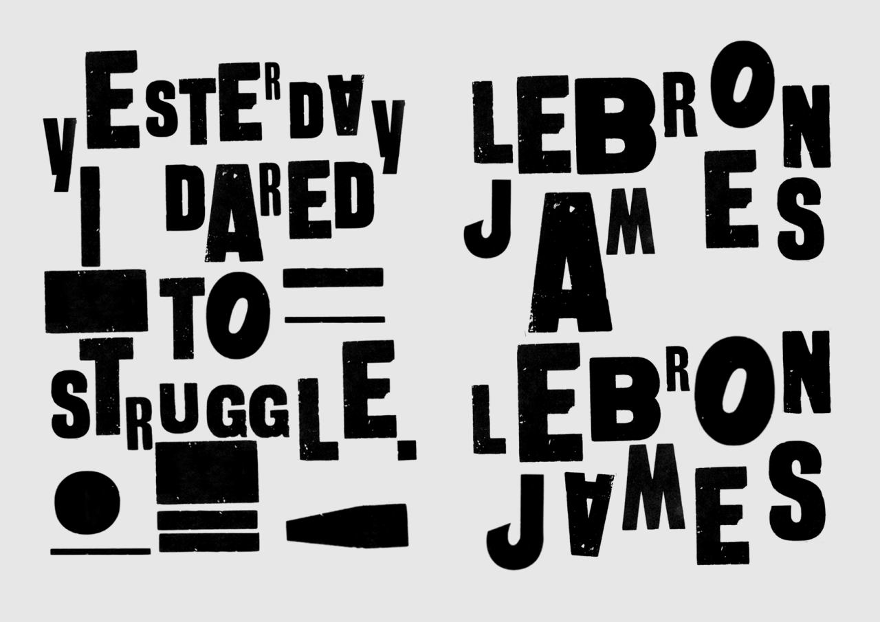
We were given possible phrases to use that would link to our studio projects of 'cybernetic self'. These were;

Although some of the class chose to use their own statements within this project.
Below show some of my work being produced in the studio.

On the right here is the first statement i visually represented.
Chicago was used for the word 'global', helvetica for 'village' and then helvetica uppercase mixed with Clarendon lowercase to produce the disjointed work 'idiot'.
As an idiot wouldn't make sense in the nature of the word, i wanted its graphic portrayal to also not really make sense and to be a bit scatty.

The cutting of the curved edges on the letters was difficult, as the knife obviously cuts straight lines more neatly than curved.

The next piece I worked on was just one typeface, this was helvetica as I wanted the positioning of the text to be the key feature- not what style the text was displayed in.
The idea here was that the internet was that dead that it had slumped down the page and was piled in the corner lifeless. This could be portrayed most effectively with the word dead, as the last 'd' could be positioned horizontally and looks like it is lay stationary, depressingly similar to how a dead being would be positioned. It was also crucial here thought that the text was still legible despite its positioning.
When scanning this piece, as the information is in the corner of the page it was difficult for the scanner to pick up the edges left plan on the page, so kept re-printing it with the text bleeding off the edge of the page. Again, while I didn't like this at first, the DIY aesthetic is not more proved than in this factor alone, plus the random ink splodges on the page give a screen printing affect which is a very hands on design process.