Friday, 28 October 2016

research material


Design Feature Research

Layout
Make use of all space
Contain a scattering of logos/ slogans to keep the image of the eatery
Dimensions of the menu card should be in proportion to the table they will be used on.
Should make use of gaze motion.  (Ozdemir 2012) direct attention to what they want to sell more of. 
Columns-
making use by highlighting certain areas, e.g. with use of boxes to highlight or white space
Used on promotional pieces
One column menus appear boring
Family dining make use of all space available to promote wide variety
More expensive eateries use two or three columns to pick out specialist options at each stage of dining. 
Should contain similar amount of text within each on both front and back.
Boxes- used as sectioning tool, but to also define specialties. 
Makes that one or two items stand out and be the ones that the restaurant considers the best.
Could be used to promote “new” recipes.
(Reynolds et all 2005) argues that boxes don’t always mean an increase in sales. 
Colours- Often link to the surrounds of the restaurant. 
Colour schemes should be followed and maintained throughout all menu relating material. 
Most effective menus use a darker text colour, to promote easy reading.
Be readable in any lighting and be in keeping with atmosphere of restaurant (Sheridan 2001)
Typefaces-
This can be open to restaurant interpretation as to fit in in to what the pre existing graphic material contains
Make use of uppercase type
Bold or italic type 
Exotic fonts help sell exotic foods. ( Kotschevar, 1987)
Emphasised texts-
Links to typeface.
prices are de-emphasised by centred justification. Don’t want people to choose from the price and not from what they would really like to eat. 
A new trend to emphasise healthy food.
Images
General perception that food with images will sell.
(Gueguen 2012) images of sea significantly increase sales of seafood. But pictures of farms didn't increase sales of meat products. 
Text and Language
Should keep to tone and style of dining, e.g. formal or casual.
Food should contain a small description which reflects accurately.  (Hartwell and Edwards 2009)
Should list offerings but also communicate these understandably.  (Jones and Mill 2001)
Format/ folds
How is it received by the customers, 
is it in a booklet
a flat card 
double sided
Have room for attachments within.  
Finish
Essential spellchecks and magnified views to account for the detail some may see within. 
Has to be covered and protected to account for the damage caused by customers. E.g. in children’s restaurants with crayons or spilt drinks.
Card or luxury paper menus have to be replaces if and when damage occurs. 
These can be finished accordingly by the restaurant who may choose hoe to finalise the product before showing to customer. E.g. presented on a clipboard or in a folder. 


Psychology Research

Pre evaluation
Is the prejudgment of the food we will receive.
Taken from whole surrounding experience but also menu portrayal. 
Links to food label and description.
Post evaluation
After you have eaten what was ordered
This can be affected by your preconceptions- if these were high then even if the food wasn’t to standard you might still deem it as good. 
Sweet spots on page
These are the locations in which the eyes are transfixed on moving too regardless of colours or type. 
This is accurate for the starter or entrée selections. People pay most attention to the top or bottom of the list. (Dayan and Barhillel 2011)
Visual gaze
This is linked to the visual gaze, as eyes wonder and then return to certain options. 
Remembering 
As a rule we tend to remember what we want to order from its specific wording
Or its location on the page
As with the starters, we tend to remember only the first and the last options on the list. 
Price perception
People search for value for money.
Not necessarily what is the cheapest.
Extreme aversion, people don’t go for the most expensive or the least expensive.
People judge general price, and go off first thing they read. This should be expensive for the rest to then seem cheap. 
“for two” deals work due to people assuming that is the best offer for them
This is a clear target market and can limit choices to maybe new customers overwhelmed with what is the best choice.
In “per person” cases people generally don’t multiple by how many people will be eating.
Prices should be centred and not right justified, as people tend to look down a list of prices and search for cheapest first before.
If two prices are there for a “small” or “large” portion, people feel they have got a choice and can compare. E.g. bracketing.
The pound sign also indicates expensive price. No pound sign or just a single number makes consumers not recognise it’s a price so will pay more. E.g. 11 looks better and £11.00
The more the exotic the label or vivid the description the more people are willing to pay (Wansink 2001)
(Shoemaker et all 2005) detailed menu descriptions negate impact of price
Descriptions act as an anchor for price bracket. 
Quality Perception
People have expectations and it is necessary to satisfy these (Teng and Chang 2013)
Food quality relates to how well it is labeled and. 
Adjectives add to this. 
Description 
People read the quality of the ingredients
(McCall and Lynn 2008)  the more complex, the higher the quality
New trend to fresh, nutritious ingredients are better so have higher quality.
Label
Evocative labels appeal to the senses can help customers have a positive image. (Lockyer 2006)
Increase of one forth when using good label (Wansink 2005)
Cultural Perception
People can determine what they want from what cuisine has native foods. Want to experience their best foods
People are draw to the words such as “tradition”, “family favourite”. 
Familiarity Vs Exotic
Are people risk adverse
Or open to trying new things
Special boards are an example of trying to sway peoples normal ordering habits by suggesting something unseen on the menu and often promotes an immediate decision.


Bahattin Ozdemir & Osman Caliskan (2015) Menu Design: A
Review of Literature, Journal of Foodservice Business Research, 18:3, 189-206, DOI:
10.1080/15378020.2015.1051428

Friday, 21 October 2016

expanded practice 2

Cinema as a subset of animation
  • Johnny Hardstarr- academic and theorist in tv advertising and experimentation film making. Self described as 'in the mouth advertising" e.g. because of the demand, the peaks of ability are shown and showcased. 
    • produces hyperreality. 
    • works are for sony orange and in the Honda cog advert.
      • inspired by artwork by Fischil&Weiss- the way things go.  As shown in the video above. 
      • unearthed a change in people being open to gentle and simple campaigns thats focus on the small and simple details, even more specifically the 'synthetically natural'.  For example the playstation designers tok a more 'gentle' and 'tender' approach to there advertisement production.
      • slide from chaotic advertisements (in your face) to a pastoral, simplistic, beautifully simple design. Quite zen like in its output.
      • natural cgi was becoming more desirable, as in the bouncing ball advert.
      • it is trying to be produced without actually looking like there is trickery or compositing. 
      • sony advert also is gentle in its soundtrack and colouring. 
    • see emotion in design.  And  emotional forms of communication with playful and imaginative ways. 
    • orange advert
      • paint shots were asked to be removed by the client, as told were too beautiful as it appeared too real and not the street corner aesthetic they were looking forward. What level off artificial realism is an allowable level. 

  • Norman Klein- from the Vatican to Vegas- A history of special effects.
    • spectacular constructed spaces, socially important places have taken for granted aesthetic with a script of how to behave in that place. Clear expectations and norms. Scripted spaces become an art canvas. 
    • hog heaven- slaughterhouse "walk around and pretend you are a pig, and then buy a sausage". Have the same thing in this country with the pig holding an axe with apron, its comical in its output. 

  • Lev Manovich- live action film is a subset of animation 
    • fundamentally film is animation as it is kinetic. 
    • database cinema- is films that have non-linear narrative. e.g. using live camera scenes.
    • hard to determine what is real and what isn't. 
    • all outputs are mediated through the amount of screens we view it on
    • Hybrid media- links to the apollo launch. Real filmed materials combined with post production software to 'finalise' the version seen by the public e..g in news broadcasts.
    • media becomes portable and can be fused between software. We can move things one to another, no longer just linked to what would be done in the physical world in that field. 
    • at the end processes are all just algorithms. 
  • Media design, software in action.
    • "we shape our tools and therefore our tools shape us". Marshall McLuhan 1964.
    • technological determinism. 

Wednesday, 19 October 2016

bloom guest lecture

personal information of how he got to where he is;

art=

  • for example a pencil and models and he speaks about how this was all he needed to be creative and let him imagination flow at his dining room table. 
  • His first graphic design interest was colours and styles and type seen on the stickers and transfers to decorate toy models with. 
  • Another interest was on all the logos and symbols on scout and cubs badges which he could stitch down his arm. There was no interest in the skills which got him the badge- but the look of the emblem. 
school=
  • saw his way out of trouble to win attention through being great at art
  • his one gcse obviously reflected his lack of care for the schooling system.
  • His A gcse was in art though which reflects where his true talent lies. 
College=
  • work hard and play hard
  • and led to a path of working his way up to where he is now. 
  • filing collection of things in 9 shoe boxes. They are little interesting, inspiriting things he finds in his every day life. Quite novel and playful in characteristic but always include a graphic or style type style he finds particularly interesting
  • offered a job off the back of his final show. 

Now he explains his style has been formulated from these experiences. In studying illustration at art college, his work is a mix of illustration and graphic design really. This is often reflected through branding of both big and small companies with big or small funding available. Overseas and locally his work is seen with a playful illustrative twist or more corporately.
A most recognised design was the branding behind the identity of ghd, logo included. 
Quite a lot of partnering with makeup or fashion brands is seen as his illustrative skills are harnessed to create drawings with an editorial style which are often popular with these fields. 

  • drawing
  • illustrating
  • screen printing
  • package design
  • designs for print
  • painting
stress the freedom his job allows. There is no daily timelines or requirements, if it a creative process, so requires a creative approach to how the work must be formed. 

Examples of Branding 

  • hepworth gallery wakefield (top lit gallery with hard lines and shapes, that should be utilised) needs colour within there to lighten the mood and to create an atmosphere that promotes creativity.  e..g canvas or transfers on the walls to promote art within, as the building totally allows those modifications. Branding could be done by four key shapes, e.g. the outlines of the unique building designs. Simple colour palettes and use of the artwork there can be used within the graphic framework to brand it in every way. Add some humour and some smiles to the industrious look. 
  • victoria gate casino leeds. Money orientated clients are difficult to work with. They need good rationale and reasons behind spending money.  Start with V diamond, with 50 different adaptations of this logo beforehand before this version. This branding is so versatile to be used on uniforms, statues, signage, playing cards, member card, chips, adverts, carpet etc. Colours of blue, purple, gold, red are all cliche colours, but they are stereotypical and just work. Especially as gold can reflect the money and luxury they would want to promote. 

low budget typographic posters

Typographic poster examples

Anthony Burrill

Experimental jetset


Hort

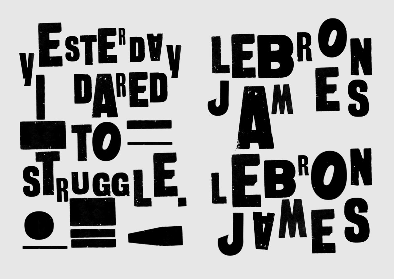
In this process and production lesson we were shown the above examples of how typography can be used to create visually captivating posters in a simplistic nature. Despite these just using typefaces they convey a lot of meaning, they fill the space on the poster thoughtfully by being structured to their best effect. These graphic designers have series' of typographic posters demonstrating their talents but the ones above are the few that stood out to me, particularly due to the restricted number of typefaces used within. 

This was something we also incorporated in to this self publishing poster work. We were provided with pages of text in 3 different typefaces to cut and paste from and form various a3 posters from. These fonts were; 
  1. helvetica
  2. Clarendon
  3. chicago
Each of these had a different visual characteristic. Helvetica being the classic designers typeface of choice, with a sans serif. Clarendon appeared more formal with a serif on each letter, while chicago was more of a display type with more of a decorative visual aesthetic.

We worked in a small team to roughly cut out all the alphabet (upper and lower case) of each font and organise them in alphabetical order for easy sorting and use in poster designing. 
This made selecting which type for each letter would be most suitable. It was important however for these to have a 'low budget' hand crafted quality, as this adds to physical way type posters used to be created. When a new typeface is created it is firstly hand drawn before being reminded digitally, so this process mimics this tactile, hands on experience to manipulate a design. 
To add to this we were advised to cut the basic letter shapes from the surrounding white paper background. This was done with scissors or craft knives in order to still retain the clarity and detail which gives each letter its strict shape and style. I personally found this very therapeutic, it was very calm and an individual personal process of sitting and working through cutting and sticking for your own outcome. Although the ripping of thin areas to cut made this not such a calm process haha. 

We were given possible phrases to use that would link to our studio projects of 'cybernetic self'. These were;


Although some of the class chose to use their own statements within this project.

Below show some of my work being produced in the studio.

On the right here is the first statement i visually represented.

Chicago was used for the word 'global', helvetica for 'village' and then helvetica uppercase mixed with Clarendon lowercase to produce the disjointed work 'idiot'.

As an idiot wouldn't make sense in the nature of the word, i wanted its graphic portrayal to also not really make sense and to be a bit scatty.
I wanted the work 'idiot' to be without the plural s, as i found it quite a comical idea that in the expansive internet network around the world that there could be still one idiot. Like the only idiot in the village, the only idiot in the full global village. It is as though that the connections make us feel that connected and as small as a village, that still having one idiot is a reasonable ratio.

The cutting of the curved edges on the letters was difficult, as the knife obviously cuts straight lines more neatly than curved.

I chose to cut down the scanned version of this piece as I didn't like the blank space down the right hand side of the landscape piece, although on further reflection I quite like it.  It looks like the blank space is fictional and purposefully added.

The next piece I worked on was just one typeface, this was helvetica as I wanted the positioning of the text to be the key feature- not what style the text was displayed in.

The idea here was that the internet was that dead that it had slumped down the page and was piled in the corner lifeless. This could be portrayed most effectively with the word dead, as the last 'd' could be positioned horizontally and looks like it is lay stationary, depressingly similar to how a dead being would be positioned.  It was also crucial here thought that the text was still legible despite its positioning.

When scanning this piece, as the information is in the corner of the page it was difficult for the scanner to pick up the edges left plan on the page, so kept re-printing it with the text bleeding off the edge of the page. Again, while I didn't like this at first, the DIY aesthetic is not more proved than in this factor alone, plus the random ink splodges on the page give a screen printing affect which is a very hands on design process.


Monday, 17 October 2016

buyer behaviour

(click to enlarge)
What has an affect on the buyer behaviour process

  • memory
  • environment
  • culture
  • family
  • class
  • work
  • ethics
  • marketing (exposure, attention, comprehension, acceptance and retention.) This is done by you.

Maslow's Hierarcha; of needs.
  1. PHYSIOLOGICAL= food, water 
  2. SAFETY= shelter, defence (secure and at ease in this place)
  3. BELONGINGNESS= relationships, family, home, sex 
  4. ESTEEM and STATUS= power, respect, worth (you are accepted for your skills and talents)
  5. SELF ACTUALISATION= personal values (can inflict personal values e.g. presidential influence) 
    • Parento in Milan.
    • only 20% of population want hassle and power of decision making. These 20 percent own 80% of worlds wealth. 
    • other 80% want leisurely life with out the hassle, but they own 20% of world wealth.
  • natural disaster for example disrupt this process, animalistic needs come through as there is a need of water and food. Things crash when this happens as people morals and status and belongingness are shattered, they is little respect left. 

(click to enlarge)

Business

Design and business run on a two way means. 
But business also have marketing issues. 
Must understand the real market issues (market segmentation, real market issues, end user aspects)
This leads on to effective research
Research affects the design and gives justification. 
You must consider macro environment issues and ethical /social issues. 

PR- damage limitation- minimise the damage before it occurs. These are the ethical and social issues that must be considered. 
e.g. ICI playing fields leeds was a goodwill investment, so when a problem occurred with a gas leak the people living nearby were less likely to complain as the issues were quickly rectified and they felt loyal to this company as they had had previous investment in the area. 

All these process form a Targeted design through the target marketing 

Shannon and Weaver model of Communication

Sender= must have a reason for the message. They have a reason for communication and an ethos to coordinate with.

message= simple, complex, long, short.  This links to advertising- as this could be the output.

Encode= throughout design, with style, type, colour, text etc. Vehicle of channel is the brand of which the output is e.g. a magazine output could be 'menshealth', or cinema could just be exclusively odeon or showcase. This must be targeted correctly to the people you want to see it, this is an external environment consideration. 

transmit= One thing to consider here is the noise interference which occurs during the transmit section.  e.g. billboard posters can be interfered with by graffiti, or being unlit on dark mornings/ evenings or folding in the rain. Its important to understand that all designs can be effected by interference. e.g. cinemas sound may be out of sync- this effects the user experience considerably. 

Decode= mood immediate- is the uncontrollable fate of who will be receiving it. they will decode a situation in relation to how they are feeling that day. This can be attitude specific or culturally affected- but does overall have a decode that is formulated by the clients external environment.

Receive= sometimes this may be misunderstood. or maybe be understood but is it something good or bad, is it rejected or accepted, is it stored or dismissed. This all works as feedback to help the reason for message be much stronger for next time. Sometimes it is better to 'lose it' and stay afloat than be dragged down by badly timed designs. E.g. 9/11 affected any media that was using anything to do with terror attacks- it was too detrimental to produce this material at a similar time. 


This all depends on a mental situation:
e.g. 
  • babies
  • children
  • youth/ kids
  • rung adults
  • adults
  • OAP's
  • Very old. 
Are the market at a stage of high mental and physical change or are they at mental and physical decay? This has to be considered significantly. 

Photopic/ Scotopic vision

Is what you see in daylight vs what you see in the evening. For example this can mean there is colour differentiation. Communication is therefore affected by how bright the light will be when it is received. High levels of light= vivid colours. Low levels of light= dim colours. 

How are they thinking to how you are thinking? does the different brain types affect how they will receive your information or understand your design.  
e.g.  convergent or divergent thinking. 


Friday, 14 October 2016

lecture week 3

Both animators and graphic designers now want to have ownership on everything while still having an expanded practice
This means work is hard to classify and Hybrid design/ products now exist.


very changing interactive music video( e.g. hacktivist) Is an example of a difficult piece to classify.

  • Moniker's- "do not touch"

Stay in the green zone. perimeter is designed and structured, internet protocols orchestrated and set up beforehand. Mouse pointers prove the animation, so is a semi controlled animation, with prompts and participation.


  • Moniker's- "hey lines"

https://studiomoniker.com/projects/out-of-line
recorded drawings,  people use any opportunity to have their interactive input, even if this shows rebellious attitude. Technological centricity. Stretches boundaries of what animation and graphic designers can do.


  • "3d draw structure"

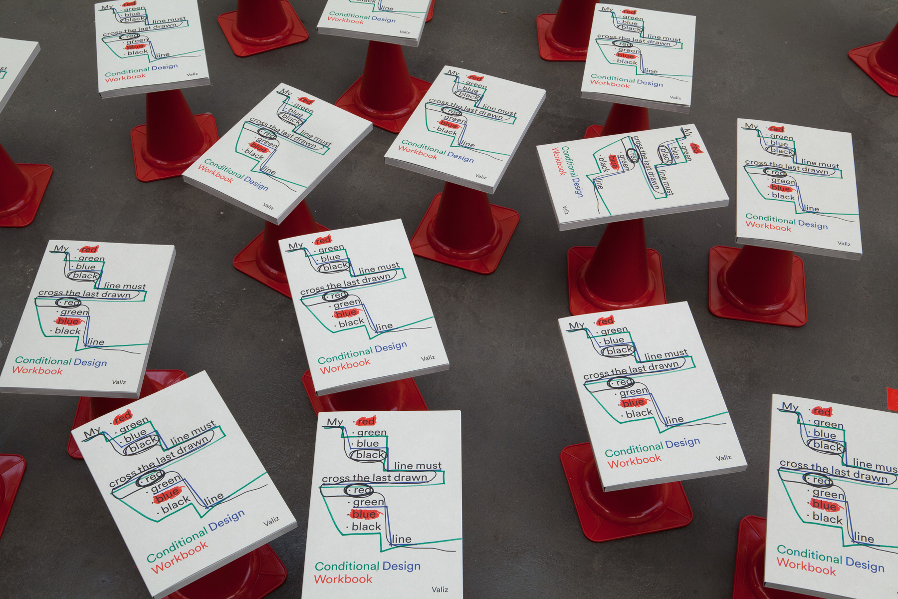
structured rules with conditions, but the freedom to be playful with these exercises. Emphasis on the collaborative, and expanded design they can produce.  Part of the "conditional design workbook". Seemingly uncontrolled outputs, but each person involved is coordinated to achieve the right aesthetic. 


  • Universal Everything- simplistic, paired back design. Almost anti-deign/ default design perspective. Reductionist response to postmodernist, as went for default font and weren't modern or postmodern perspective followers. Minimal but not flush pieces of design with hybrid work (including performance). More corporate, higher budget, more prestigious clients but similar ethos to moniker. 
    • surface production- portraiture- uses lines to vaguely outline a persons face. 
    • boundary challenging work (but not necessary shocking). Innovative.


  • "what is graphic design for" Alice Twemlow. 2000's
    • functional design thinking, graphic design is a language communication with several purposes and not simplistic. 
    • can be clear or complex, it has that broadness of meaning. 
    • audience= people, passerby, viewer, reader, users, receivers, participants, players, communities, inhabitants, consumers, customers, subscribers, clients, interactors.
    • can be in small local communities, or larger more global consumers.
      • e.g. site specific designs such as new York- designs can focus on the grid like new York city mapping has. (Shakespeare in the park- Scher)
      • e.g. larger consumers connected with global offices and the introduction of a laptop.
    • the designer is 'multiple' they have multiple roles. and an expectation for collaboration, as cross disciplinary design requires more than person.
      • e.g. core team is then expanded by freelance or buying outsourced expertise.
      • or two agencies can collaborate and roles tend to merge.
      • transdisciplinary  (open, try a new role)
      • clothing, music labels, production lines, publish magazine, blogs, web design, furniture, open galleries etc. (this should be embraced, as valuable to keeping creativity alive.)
      • Bruce Mau- Institute without boundaries
      • interdisciplinary (work as a team for all roles filled)

  • Andrew Blaurvelt "hippy modernism" 60/70's
    • e.g. metaphor of American Werewolf in London.
      • contorting of the figure- inner turmoil and difference
    • were the hippy and the modern opposed or compatible. 
      • really comes down to technology
      • counter cultural groups use technology in weird ways
      • mobile, gypsy like structures built, with natural materials
      • e.g. radio built out of natural materials. The communication and connection brings people together.  Bauhaus like the communication- but it has a trash aesthetic that doesn't fit to their sleek standards. 
    • transformation of modernist through an encounter with it hippie other. 

    • Fuller- deodistic dome, formal, geometric, but temporary structures,
    • Cranbrook design trip- you wouldn't think hippie style would any way link to modernise. 


research question generation

It is important to generate a research question for many reason

  1. it keeps you on track for what you are looking for.
  2. it is an initial suggestion of your research subject. 
  3. reveals how you will investigate your research subject. 
  4. narrows down your investigation- the search criteria can be refined. 
  • research subject.
  • research title.
  • background and literature review. 
  • research question/s. 
    • e.g. why is Scandinavian graphic design receiving international recognition and dominating the industry?

Below we were told to compose possible research questions which can link to our area of research. 
(please click to enlarge image for clearer text)

Wednesday, 12 October 2016

in design typography

In this process and production lesson we were focusing typography. This acted as a refresher of the text tools we all use, but gave some direction in what and how to use and to what effect. 

Key terms:

  • Kerning- the spaces inbetween each individual letter 
    • (spacing should be consistent throughout a word, visibly, even if not numerically) 
    • (Below illustrates this, there needs to be a suitable distance between letters as with the "w" and "i" of "Windows".)
    • (Each example here is demonstrating a different level of kerning)


  • Tracking- is the uniformed spacing  of letters within a word.
    • (quicker editing process)
    • (provides a less visual alignment as all letters are spaced equally regardless of how that appears on the screen)
    • (as seen below with "claws" and "Jupiter")


  • Leading- refers to the distance between the baselines of successive lines of type.
    • this can be manipulated to increase or decrease the gap.
    • Playing around with this function we were challenged to create a "jaw" like image of the words jaw. Below is my attempt, I wanted the sharp points of the 'w" to reflect the teeth, however the outer edge doesn't look defined enough yet.


  • Rag- is the irregular or uneven vertical margin of blocks of type.
    • this is normally what appears on the right, as a left margin is usually aligned.
    • This can be changed manually by pressing shift and enter to move the out of place text on to the next line. (This was a new shortcut learnt.)
    • (This can be seen in the second image below)
    • Rag can also be controlled by the computer, by changing the line alignment options on the top tool bar, although this may not generate the right look.
    • To further manually control the right rag, the tracking of specific line of text could be subtly adjusted to make the text fill the same space. 
    • This should only be done subtly, the text shouldn't appear to be changed.


After this we looked further at the choice of typefaces people have, and why what we chose is crucial in the design process. Types can have different meaning according to their appearance and its important to marry the ethos and connotations of a word to a suitable typeface. Going through examples with multiple choices, it was clear that the class were quite decisive in which one seemed best suited for the information it was to be used on. However the few variations that did occur were still justifiable due to how that word presented itself to that designer. Each of us has a different perception of certain words, so will therefore also have a different opinion in which font best reflects it. By realising this, its also important to understand that it all depends on which context that word will be used with. For example "school"- "Old-school", "`primary school", "`nursery school", "grammar schools" and "official school documents" would all require a different typeface due to their striking difference in formality and audience. 

Finally we looked at how words can be edited using a "crop" function. This was obvious when explained but was something i had honestly never considered as a way to customise typefaces. We trialled this out on a number of different examples, and then used my name to form my own design from letter cropping.


(Bebas Typeface)


However this would prove more difficult with a patterned background, as a white box to act as a blanket over the unwanted text wouldn't be suitable. The items I believe would have to be grouped and then saved as a PNG image so that the white could remain as a transparent background. So to use this in any works may need some preparation beforehand to ensure it was in a suitable file format for continued use. 


Tuesday, 11 October 2016

studio week 3


(please click to enlarge image for clear, readable text)

In this weeks studio time, I rethought the direction in which I wanted to approach this brief. I had previously wanted to explore the layers of my own personality, but during the group seminar discussions we agreed that in some persona projects it is hard to detach from the content. Because of this the work can become quite, unintentionally sentimental, it is hard to receive criticism on and is hard to produce from a detached perspective.

Following on from this i was heading towards how I presented by self in the cyber world instead. This could still be linked to an element of my personality and each person has several personalities which they portray at different times in front of different people. A social media presence is just one of these self portrayals. Taking a snapshot of my Instagram profile for example- there was a key theme of how I chose to post pictures of food. Thinking about this further I thought about how common this was amongst other people- we all have a compulsive need to show either '# clean eating' or '#dirty food'. Maybe to show off or maybe to reflect something similar to the profiles of food bloggers.  People discussing food online is so prevalent that food blogger's opinions have high prestige, and value to the companies/ brands they mention. This further ties in to people online need to be liked- one way this can be done is by location tagging and by company official profiles following or re-sharing your personal experience. This innocently taken photo can therefore make you feel apart of the company/ brand and that your custom is valued.

Another reason in which i wanted to focus on food was in regard to the cyber technology we can use in relation to food. In particularly dieting and lifestyle apps. On a recent health visit at the doctors, she suggested i track my diet and exercise through an app and suggesting "just monitoring it online". The blasé attitude she approached food monitoring made me think of the level of technology we have now in order to improve our health- with just a scan of a barcode we can uncover nutritional information and tailor this to our own personal diets. Us and technology have now become one for something as common and mundane as food consumption.

The exemplify the success food has with a cyber audience there are key celebrity figures;

  • the diet chef with lean in 15
  • jamie oliver e.g. food revolution (sign it, share it)
These celebrities have such a huge following and high recognition for they're work- and this was basically accelerated by utilising social media. 


Monday, 10 October 2016

business- marketing


Firstly in this business lecture we were focussing on the market in which our work will be placed in to. Peter Norris aimed to emphasise how essential market research was in regards to work placement and design being thought out in relation to the right target market.
In research I learnt that there are two main collection methods of quantitative and qualitative;
  • quantitative 
  • qualitative 
How I am able to define both of these is due to my previous study of sociology- because of this i determine what form of research is being collected as to whether is collects a large Quantity to where if focuses on a smaller number of studies but has a higher quality of detail. 

There are different advantages and disadvantages to each of these

Qualitative

+detail
+clarity
+cheap
+more holistic view
+personal opinions

-there is no statistical validation
-it is subjective
-successful information gathering depends thoroughly on communication skills
-some can’t verbally express effectively.

Quantitative

+detail
+statistical proof can be gathered
+remains objective

-costly to use
complex and difficult to achieve on a large scale
-needs careful control as handling large number of people/ figures. 


Both of the above are primary research methods as this is the data you collect yourself. In contrast to this is secondary data which is research or statistics which already exist and are available to be accessed. This data has already been published but normally there is such a large quantity of information available that careful research is needed in order to refine search to the market segmentation required.


Market Segmentation is how the market is split and divided in to other smaller, niche groupings. Examples of these are; sex, hobbies, class, age and location etc. In marketing and even designing the product it is essential that it is targeted correctly to the right segmentation of people. Being measurable, accessible, substantial and meaningful ensure that the market targeting is successful. An example of successful was market targeting is the Sainsbury’s adverts featuring Jamie Oliver. Sainsbury’s needed to appeal to the ‘family’ market and to do this household name “Jamie Oliver” was added to their tv advertisements. Because of his ‘well known’ factor, people were more likely to go or to spend more in Sainsbury’s in accordance to the recipes and good quality produce this ‘celebrity’ was advertising. For ever £1 that was spent, this increased to £5 with the backing of Jamie Oliver.


Another way in which secondary data can be collected is through data sources. These can be specific statistics and reports made publicly available by businesses and companies. This gives key indications in to trends and figures which could also be linked to an area or field you are conducting research in to. Examples of these are; mintel, gmdb, keynote, fame and newspaper proquest. It is important to remember that classifications of people have gone through significant expansions as to incorporate the social changes and experiences people now go through. It is thought that there are now 120 classifications which each have secondary data that can be found about that social group. It is important in studying secondary data that the evidence might be relevant to just a few of these groupings (or studies only conducted on certain groups) and that it may not be true for any other groups than the ones it is directed on. 


Sometimes, this is why both primary and secondary data collection is needed, as this can be thoroughly tailored to what market area you wish to investigate and want your product or service to be suitable for. 


Wednesday, 5 October 2016

after effects geometry test


In this process and production session we were developing after effects skills by making a short ten second animation which contained 10 one second compositions of fast paced motion. The overall finish is to resemble that of an ident or of a visual introduction to a video.


Firstly we needed shapes that would form the main animations in the piece. These were advised to work best when they were more simplistic.  These on the left were quickly formed in adobe illustrator, just using the pre-set shapes and creating a simple triangle.

However on further reflection of the source material, I thought the striking factor of the designs was due to the restricted colour pallet.

Therefore I chose to remove the orange coloured shape and just have a pallet of four colours; teal, pink, purple and white. These are seen above.


In this planning stage we were also encouraged to design how we would want stripes to look if these were incorporated in to the project. And we also had to set the canvas sizes to ones which would be suitable for the after effects screen dimensions of HD TV. 1080p by 920p.


Here is the full composition set up. While the whole project would be 10 seconds, each part would just be one second. The frame rate was set at 25, and the dimensions also adjusted accordingly. 

After this I started the visual elements of this design. To do this the file containing geometric shapes was imported on to the window and as each shape was on a new layer, on this software to they were all manipulatable due to being isolated form one another.


 Above is the creation of the venitican blind effect, which would create something similar to the effect planned. I had never used this effect before so this was something I needed to understand as there was a few one second compositions that I would like to have this effect. 2 layers of coloured solids were added, and then using the tools bar of options on the right hand side this could be edited and manipulated to vary the stripe effect. 


Above are the other examples of where this feature was used. To stimulate high visual interest I wanted each of the stripe effects to be different. For example in rotation or in width or in speed and direction of transitional movement. These could be edited on the timeline at the foot of the page, by using the timer icon to set the edit, move it and then re set when the effect was to end. 


Next I was experimenting with an effect than can be seen on the right.
Here the circle from the geometry illustrator file was added to a new composition.
To create the spread out starring effect seen below, a wiggle was added to the shape.
This was then magnified and emphasised by smoothing out and extending the points.

However this look doesn't fit with the shapes I had intended to use, so while this was a skill to learn, it isn't seen in the final render.
A smaller wiggle effect was used later on in the edit with a fast paced composition solid colour changing in the background.


Here is the wiggle effect being used still on a circle, but on a composition which is incorporated in the final output.

Firstly I significantly stretched the circle in the teal colour, to cover majority of the screen area. In doing this it means that when the shape wiggle is activated it's effect is suitable just towards the corners.

I thought this would appear better as it was less distracting than the other outcome to using this feature.

The 'wiggler' was set on the right tool bar to 'smooth' and to a frequency of 12 per second. The higher the frequency, the quicker the movement appears.

This circle is placed on a pink solid behind, and I think the unusual contrast works well and still in keeping with the colour scheme.

Following on from this I chose to use the same pink colour on the triangle shape. 

I really liked the effect that could be generated here, as the selected shape could be edited to flick through the different colour ranges. As seen on the screenshot above, this is done by going to effect, colour correction and the hue and saturation can be edited.  I think the end effect looks great, but It would be good if there was a way to specifically pick the colours that would be displayed. As in this video it would look most effective for the colours to be the ones also contained within the colour scheme. 

To end the stream of compositions I wanted to do something similar to how the piece opened. So i returned to a similar stripe animation and colours seen firstly, and used the triangle to anchor this composition to the previous.


In the timeline below, I moved and rearranged each of the second clips to an order which meant each transitioned in to the next quite seamlessly. This could be done by colours being consistent, shapes being the same or background colours.


The type was added lastly to add some context to what the animation was about. The typeface had to be consistent to the theme without the animation alongside being able to work on each composition in the corner. 

In the opening of the piece this is large and the main focus, before gradually reducing the scale and position in order to lock in to a footer position suitable throughout. 

The overall composition can be seen below, and also on my vimeosite.


If i was to develop this further however, I could add a sound clip to accompany the graphics, or practice further by changing the colours and animation styles to demonstrate the possibilities available.