Thursday, 17 March 2016

cinema 4d

In this process and production session we were working on cinema 4d software. This was the first time I had ever used this- so the many screenshots here were to thoroughly document step by step all the new controls or procedures I would want to reflect on later. 


Left is an example of how graphic designers could use this software. Here the design of packaging is wrapped on to the 3d model it is intended. This gives a good outcome to show to a client of how a finished product would look once produced physically.


Left is an example of the axis on the programme. These are the blue, red and green lines with arrows in the centre.

Basic key controls were also learnt such as
z= zoom in or out of scene
x= across
y= up and down


t=translate
r=rotate
e=scale

And the bottom left of the window shows you an orientation guide.  With setting of object positions on the bottom right. Any new objects placed in the scene will be put at origin 0,0,0. And this appears to have the base line intersecting half way through. 
Any new objects are added from the top 'blue cube' icon.


The attribute panel is dependent on what is clicked on screen, while the object panel contains the relationship these objects have with each other.
The colour of these can be modified too, as seen in the screenshot below.  Effects can also be seen on left hand side of the pop up options window. However the more effects added, the longer the render and the higher amount of space it will consume.


 Next we added 'quick shading lines' on to the shades. Both on the cube and the pyramid.

Then we added rounded corners to the cube shape.  (Fillet edge) In the smaller left image this looks most obvious- however it was guided that a tight curve on an object makes it appear more realistic. So this is on the screenshot right below.


 Below shows the selecting of a curve from the drop down options. The size remains the same here in the right hand menus, and the two screenshots below show the segments set at z, 3 y,3 x,3.


Therefore the curve here isn't smooth as the segments are large. Increasing the amount of segments in the curve therefore also increases the smoothness of the arch, as can be compared below.


Here shows the scenes aspect in multiple angles. Using the wire outlines of the shapes. 
This is the authorgraphic view. 

From here I learnt how to adjust the environment the object was placed in. From the light blue icon next to the camera filming icon on the top bar means this can be adjusted. A dark floor was added here. 


Lights can also be added to the scene as though in a studio environment. Placements of lights is essential as the brightness should be cast on areas of importance, and the shadows can either be significant or backlit in order to avoid occurring. 


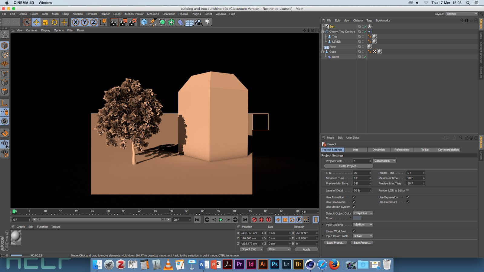
The example right was given in order to demonstrate how natural light can be reflected digitally. Here you can see how direct sunlight would hit the tree and the building and cast shadow from the leaves of the trees. 

 I also learnt that the preset shape could be distorted by editing the corner points of the shape. As seen below. Here Coordinate P is changed 100.


 Below is another pre-set example of graphics being placed on a 3d object. Parametric objects retain simplicity- wheels adding images on to this software like this converts to a polygonal object , and this can't be undone. 


 To replicate that shown in the example- you can import and paste illustrator images, by using the file as a texture on to the object. The PNG image file is collected and added to the folder path. The texture is then mapped on to the object; whether this is flat or curved. The TAGS on the imported file contain the meta data on the photo and tells this software the parameters of its use for when the piece needs to be rendered. 

To experiment with this I created a shape on illustrator to then import to cinema 4d. This is shown below. It was created from two circles joined using the shape finder tool, and then a curved blend was added. This had to be saved to be compatible with illustrator 8.  This was then added as a merged file and the scale was selected. The separate paths were then editable. 


However this got very confusing to work with due to the high level of paths. The shape wasn't simple enough to clearly see the 3d effect.


The collection of screenshots above shows the steps of creating an animation of my name using cinema 4d. This was experimental to see how type could be edited similarly. Just like the cube and pyramid example, the text was added to the scene at 0,0,0 and there I could type my own content and customise the font to one which is also used on my blog.  The colour and texture could also be change, and more effected such as an inner and outer glow could be added. A light was also set up to illuminate the the front of the word. 
When rendering this out it consumed quite a large space due to the effects I had added, but this could be saved as a quicktime mov movie to be play backed. 
However to add this to my blog here the compression could only contain half in order to be upload able. So this version is shown below.


We were then taught about the timeline that can be used on cinema 4d at he foot of the page. I found using this similar to the one that is in adobe after effects software as the user can manipulate sizes, movements by stopping and adjusting the stoppers on the timeline.
To illustrate this a figure was used from the objects selection. (above)


Above they were cloned and set to radically spin as a movement. The count of figures is changeable here and the radius in which they will spin. (right menu selection).

Below shows how the spin was created. The R was set to 360 degrees. 


Here is a screen capture taken mid play back. My figures were set to rotate, and increase in number from 5 to 20 as the time went on. 


Wednesday, 16 March 2016

how to conclude


In this seminar we were looking at hows our essays could be effectively concluded in a professional academically credited way.
In a 'focus-group-like' discussion, the small team of people deciphered the followed as the most essential and of what should be included in the 'rounding up' of the main bodies of essay text.

What is your essay about?
in my instance the keywords which could best describe my essay content were;
  • punk
  • subculture
  • reggae
  • design
  • fashion

These were subjective to each individual persons essay as each of us had used a different essay question and interpreted it in different ways. 

In a conclusion;
  1. condense paper in to 1-2 sentences
  2. is it fitting to answer a previous claim/ question
  3. is a round up with an overall suggestion needed
  4. should include memorable sentences
  5. short, snappy, concise detail
  6. maybe content own opinion is relevant
  7. conclude the debate if an argument has been expressed
  8. maybe suggest how this isn't a complete view
  9. there may be holes in your work/ search so express this
  10. show your own critical nature
  11. include the words "further research" to show interest in field and academia
  12. talk about what hasn't been explored e.g. gender, age etc.
  13. do not exceed one paragraph 

Monday, 14 March 2016

advertising: a sign of the times

40p out of ever £1 is spent on digital advertising.
530% growth on the amount of adverts on social media.
A predicted growth by £1 billion every year, from 2015 onwards.

TIMELINE 
1960's

birth of teen culture
social change
optimism
US market became an influence
Burn back's VW advert
freedom
liberation
TV adverts directed by the film makers of today.


1970's

creative
self-confident advertising
trend setting 
try 'new' shocking elements
attach stories to adverts that last generations
political instability 


1980's

yuppies
north/ south divide
rich vs poor
social inequality was high
new media/ technology was developing
consumerism
more money spending
channel idents first used
high street brands across all high streets. 


1990's 

Globalisation
new media worldwide
Brand Management taken seriously
kinder face of advertising
fun experimental designs
new labour
cool Britannia
e-commerce commencing

http://38.media.tumblr.com/
tumblr_lloyx0yyK01qhd6bw.jpg


2000's


millennium
millennium bug
less is more mindset developing
fun adverts
advertisement to fuel to 'talk' factor
interesting, 'new' concepts and ideas


BRANDING

"single idea/ concept you own in the mind of the consumer"

e.g. Coca Cola, in which have maintained a solid brand for 130 years. 


What is a brand?;
  • branded animals
  • concept of singularity
  • unique
  • people, places, ideas
  • rely on habit
  • something we want to be associated with
  • accelerated through advertising
  • marketing is what targets brand to the right audience
  • should be place din the right market place
  • brand and consumer must express same values. 


How ikea changed their brand image?;
  • known now for sleek, swedish design
  • cool coloured design
  • large superstores
  • had to find a way to target a british audience
  • used women as the main audience
  • women are house proud and have own income now to spend
  • tv advertisements that focus on females completing home improvement.
  • "Chuck out your chintz"
  • public were ready and needed this change 


Thursday, 10 March 2016

3d space with 2d type


In this process and production lesson we were focusing on how 2d objects and lettering can be transformed and manipulated in order to appear to be contained within a 3d space.
This was done by using 3d selecting features on the timeline in after effects, alongside the ability to use camera to adjust depths and angles. 
This process was inspired by the bbd four promotional advert for the "morning" program, accompanied by Stephan Hawking with a voice over.

To start this production, adobe illustrator was used to add each required layer. This is shown in the screen shot below and it was essential that each word or item was included on a new layer for easy manipulation once used in after effects.

I used a mix of geometric shapes (circle with broad stoke outline), clip art like image (book), and two different typefaces of text (sans serif and a hand written calligraphy like type). The fonts here were downloaded from da font. 

In after effects these files were imported and then the composition was double clicked to open the individual layers separately in the timeline at the bottom of the page.


At this point I chose to remove the larger circular moon as this looked to large and overpowering when layered with this delicate type. 


The composition settings are then adjusted to 25 frames per second, and the hight and width were adjusted in order to fit with HD screen dimensions. 

Then experimentation with the timer/ stopclock icon on the z,y,x rotation tools were used. These are available in the transform controls once the 3d cube icon is selected and added to each layer. 
It was suggested that subtle moments would be best, as it may appear too busy, messy and confusing if objects were flipping or spinning in the final outcome.

Next the camera tool was selected from the 'new' tab at the top of the window.
The pop up window on the screenshot above shows how this camera working in a similar way to a slr camera in reality, with optimum presets either being 35mm or 50mm.

In order to have more control over the manipulation of the camera, the view on screen was changed from single to double. And as seen in the screen shot below this means that an above angel of the layers stacked can be seen on the left hand side. This adds to the ease of editing the order in which each different layer will move in sequence on the screen right. 


The angle and camera rotation too could be adjusted on this left hand screen. The path of its navigation is seen in the waved light pink line in the centre,  and the focal point is evidenced buy the central pink large dot. Both of these can be manipulated to achieve the desired effect. As this was the first time id used these tools, i used trial and error to see what would work best and how these could be manipulated to achieve different outcomes. The position of the camera was also changed using the transform dropdown options. This is all evidenced below. 


Above shows the layers and how they are stacked to move across the 3d space.
However it also shows how a background image or texture can be added to the stacked layers, and can be moved to the base of all the layers so can provide depth to the piece. This too has to be set to 3d settings for the movement to appear like it is travelling with depth.
I used a copyright free downloaded texture for this. And as the words had a delicate hand written emphasis i thought that a paper background would be the most effective. 

This is the rendered version.