In order to feel fully informed around how books/ magazines are composed (for the proposal studio project) I chose to research binding techniques, and stitch styles used to adhere documents.
In this process and production lesson we were learning how animation can be added to basic characters using adobe aftereffects software.
I had never worked with aftereffects in using this typeof editing, so I chose a very very basic character to apply my animation on to.
inspired by these child drawn cartoons research on google images, I created my own in a similar style using Adobe Illustrator software.
The pen tool was used to outline the basic shapes, and then the stroke and fill features to add colour to distinguish each separate component of the character. It was essential to have each part of the character on a different level, so that when they ere imported to aftereffects, each section of the body could be manipulated separately in order to form a smooth animation. I hadn't realised the extent to which each part needed to be separated as I originally incorporated the hand and arm in to the same layer, before realising in after effect I could then not formulate the waving hand movement I wanted due to this.
Correcting this issue then made the animation a lot more realistic as the arm and hand could each be transformed separately to form a more life like movement. However this still cold b imposed, as the "stick-man" like arm meant that no movement could be formed to move as an elbow would on a real human. I still feel the wave has a full effect tho- especially when accompanied with smaller less subtle movement of both the right hand in to a neutral position and the slight movement of the right leg.
Above is a screen shot of the animation being applied at key anchor points. This is a time consuming process- however when continually manipulated gradual improvements refine the movements and make them look much more effective. This process still needs a lot more practice with however. As the timeline editing with the 'stopwatch' icons to set certain locations/ sizes at certain time sin the animation was a little difficult to keep up with.
Im looking forward to improving these skills, as its clear how professional an outcome can look from this form of editing.
Below is the rendered version of my short 10 second animation.
As the first set of photographs taken for this project were unsuccessful, it was essential that these be re-done.
However we were unable to rent the same appropriate, professional studio suite as previously; and were also unable to have access to the same camera facilities.
Because of this, the photos this time were set and staged within the graphic mac suite on a smaller set-up with less space and fewer specialist facilities. Alongside this, the photos had to be taken on a slightly older camera and were therefore a lower resolution consequently.
However, due to close deadlines, this was the only time we could capture the shots we desperately needed, so the less professional hardware had to be the compromise.
By doing this, it meant that from the outset more computer editing and manipulation was needed, which is not ideal as it is much easier and produces a much higher quality finish if the initial photographs are too at a very professional standard.
The same set up for each shot was tried to be used- however it was no longer possible to shot the portrait in which the figure is holding the bag content, as the light set up area was too small to do this.
Here demonstrates the limitations of the workspace (top image) and the poorer quality produced by this camera.
Below are the edited versions of some of the best images- and are to be used in the magazine I am planning to produce for my studio proposal.
The editing was completed using adobe photoshop software, with manipulation of brightness and levels, alongside being emphasised by the darkening and lightening of some areas by using her dodge and burn tools.
In this seminar we studied how every process requires a narrative- and that there is a "hollywood formula' in which has an ideal structure.
This could be linked to our studio and proposal work as this too has to have a continual story in which there is flow as well as being able to spark interest
As you can see from this diagram, a story just have a beginning a middle and an end.
BEGINNING- set the scene, opens up a "hook" in which will captivate the audience. This sets a story which is ready to be unfolded. Character, story and setting are all described in "The Lighthouse" in the first act, this set up responsible for 25% of the story, and also contains one plot point in this example.
MIDDLE- the middle sections contains majority of the story points and adds the detail and story to the intended theme. E.g. action, confrontation, crisp happen within this section. 50% of the story is within this span of time, with several plot points excelling the story from one scene to the next.
END- The ending is essential a story as this has to satisfy the audiences needs and be a concluding outcome in which they are content with the cut off point- whether this be positive or negative or even be unresolved with a cliff hanger end in which questions are left unanswered. The end should link back to how the story commenced as the content has come round full circle to now close. This 'act 3' is also 25% of the story and should never be a 'let down' to a viewer who has remained intrigued throughout.
The "best advert of 2010" mouse and cheese uses a contrasting plot point and audio soundtrack to build interest and to end in an unsuspecting way- leading the audience on a roller coaster of events.
In this lecture we were taught of how narratives are essential in a creative's design process.
As Aristotle quotes "A whole is that which has a beginning, a middle, and an end." Of which we can now refer to as a 3 act structure, which can be linear in its sequence of approach, or can be non-linear in that the narrative can not seem to run in order. This is seen when some popular films start with the conclusion of the story before the previous information is revealed.
The linear approach to narrative, is what which is illustrated in the diagram above. The setup of the story then leads to a peak of confrontation before actions working to end with a final resolution.
This is known as Freytag's Pyramid
Rather Quiller Couch noted that he thought there was 8 essential stories in which are narrative seeks to explore. These were believed to be man against; man, fate, society, supernatural, machine, god, self or nature. And in the case of the recent Ben Stiller movie "Walter Mitty", each of these is individually explored to make up the narrative of the full film.
Exposition- e.g. crawler text in the star wars franchise films (setting scene and context). This leads on to the narrative- this is an account of connected events, "that which can be narrated" (Feldman) in order to usually visually narrate an explanation of a solution. Examples of companies which work on the premise of connecting events- are feed music.com, basilico. Finally denouement- ends with the story you were really trying to convey throughout, what is the; issue, event, characters and context.
Story Based Meanings
Duarte- " The audience does not have to tune themselves to you- you need to tune your message to them".
This is meaning that in the narrative of these companies, the meaning was predetermined and this lead to the evolvement of the story around what they want. An example of this is from the shoes brand TOMS. This company was established in order to fundamentally resolve the effect of poverty on material possessions in poorer countries- yet they were unsure how to go about this. This is the ESTABLISHMENT stage. Then it was noticed that "an absence of a shoe" was significantly prevalent, and the EPIPHANY OF PHILOSOPHY to change this came about. In order to supply suitable shoes to those who needed them, they initialised a "one for you, one for me" kind of approach in which when someone purchased a pair of TOMS, a pair was paid for for someone who needed them too. REALISED AMBITION came when this style of shoe became a trend, in which more and more purchases, resulted in even more shoe donations to those elsewhere.
Structure
IMAGERY- redbull "aussie fishy story" illustration and cartoons are used to portray the narrative.
TONE OF VOICE- Massimo Vignelli sets a style in which can be seen in his book designs.
SYMBOLS, ICONS, AND COLOURS- should have a 'glance ability'. Miles and Civaschi's "life in 5 seconds" symbols for stories. Logo design such as sony vaio- portrays sound waves and binary code within to merge analogue and digital. A.k.a semiotics.
HIERARCHY OF INFORMATION- how to present- e.g. rules like in pixar's 22 rules of story telling. e.g. short and sweet, "i have a dream", memories or 6 word story rules (Ernest Hemingway) in which a limit of 6 words is best e.g. "for sale, baby shoes, never worn".
NAVIGATION- is the narrative linear or non linear. Does the moment gradually increase of is there peaks of interest and engagement like in Christopher Nolans' visualisation of interest pieces. Colour can navigate scenes, as script colour (incredibles colour storyboard), Plutchik's 'colour wheel of emotion' as a guide for movement between colours.
In this processes and production session we focused on observational drawings. In groups of three we worked on a rotating cycle of items to view and then represent on paper. Some chose to use plain 42 white paper for this drawing task; however I selected a paper board which had random material pre-attached so each of my studies was different and on a unique medium. As shown in the photographs- there is plain paper, blue lines paper, orange printed card and tracing paper on here.
The first objects drawn are shown here. On the table in front was a collection of 3d letter form arranged randomly. In order to draw these as realistically as possible measurements using a pencil were used from how the objects appeared in our direct eye lines. Here is the letter "S" I drew, alongside the angle in which I viewed it from.
The second collection of objects were boxed and shoe boxes stacked and arranged on the table. This time a focus was on the tone seen within. To do this grey tone pens were used in a range of shades to add light and shade to specific areas of a show box. This was drawn first as a pencil sketch, and then I used a tracing paper layer to add the grey shades. This is effective as this can be lifted to reveal the original outline, however the pens I used didn't work as well on this type of paper.
My next observational drawing was of the set-up featured in the photograph. This was done as a pencil sketch and I tried particularly to portray the objects as 3d on the paper. I think her the screen of the small monitor an the wire and plug are the closest to reality.
The next couple of drawings were doodles of text and typefaces I could see on other parts of the assembled objects.
Territory studios is a London based company established by three founders, including David Sheldon Hicks. They're current main works include digital art and screen graphics for film interfaces, with a strong repertoire of blockbuster films.
Hick gave three classic examples of screen graphic development and how they need to convey a story/ narrative as concisely and as quickly as possible.
star wars (the target screens)
minority report (actor and graphic interacting together as a new concept)
iron man (intelligent graphics)
Summing up that graphics are essential in creating a dialogue.
Other film works include;
prometheus
guardians of the galaxy
avengers: age of ultron
jupiter ascending
ex machina
the martian
In prometheus the graphics were used physically on set for perfect user interaction. However he explained how this led to stressful experiences as the unpredictable happens and spontaneous reactions are needed quickly as solutions are required as if live.
Guardians of the galaxy was Hicks' favourite film brief as he linked one of the three key requirements to his own personal past experiences. These three were 80's culture, sci fi and the essential marvel elements. These were all linked seamlessly in tot he graphic interfaces use din the film by using 80's colour and glows alongside a science format which had human-like imperfections and used combined to form the marvel character profiles. One piece that showed this was the tape graphic which was turned around in just a day despite being animated alongside of being designed.
The avengers film, was something territory studios worked on straight after the guardians of the galaxy work. It was a very large project nd included 7 designers, 200 screens and 9 month completion. The work they started created had many characteristics therefore of their previous work, which in reflection was decided did not fit the brief as required. A more 'real world' inclusion was needed- in particular this is done in a 3d cell animation which Hicks agreed improved the following of a language and colour scheme, and realness to each character. e.g. this cell was in green tones to represent hulk.
Another film containing territory studio work is jupiter ascending staring channing tatum and mila kunis. The design for this interface was inspired by weather maps and this influenced the 'worm hole' time and space travelling used in the film. These were fluid line movements which animated in to patterns.
Interface graphics were also completed for the film ex machine. Here they used coders to assist in their work for believability and to stay factually accurate. They designed a Scandinavian interface with a minimalist style, simplistic typefaces and colour palettes. As part of this project the company was also given the opportunity to design the internal make up for the robot sculpture.
Recent work was also included in the martian. Here they could work closely with nasa to ensure then the graphics would be functional if used in reality and to include all correct information. Information like this empowers designs as it broadens the graphic designers knowledge and strengths the believability of what is being portrayed. Colour palettes were less crucial heroes Hicks' describes the actual interfaces used my nasa don't have this type of consideration to visual appearance.
Other interfaces have also been included in the Forza motorsport 6 game alongside the work of turn ten car graphics and animation.
Most recently they were able to design the credits for the OFFF graphic festival. Their work was to be used for the Cincinnati host. They sought collective inspiration and combined elements to produce a graphic animation. I particularly liked the created typeface here as it had an aztec style and the thin line use looked impressive when animated to float in and out of word formations.
In this seminar session we were working on how everything carries a certain 'style'. To demonstrate this idea, a video interview of Dr Cornel West was used. In relation to fashion he highlighted how individuals present themselves in their attire doesn't necessarily reflect style. While clothing choice is inspired by many life factors and experiences (his own as influenced by his vocation/calling, old school, black preachers, jazz musicians, blues artists and reverends) he distinguishes a sense of style comes from within the attire.
In this way it could be stated that each individual doesn't have a single style but an 'own style'.
Henry miller describes his "I invent, distort, deform, confound and confuse as the mood seizes me. I obey only my own instincts and intuitions" (1960's).
while Trumen Capote says that style is a "mirror of artists sensibility- more so then the content of his work".
To test this style vs content, we can use Breuer's chairs as an example. His 1920's work was supposed to be solely about content by having a stylishness finish. The form of the chair was the main focus as to oppose previous fashions of ornate, decorative, victorian arm chairs. His aim was to create "purposeful construction of logical designed objects", however by simply focussing on the content- he intact created a new style of modernism and simplicity, in which form is paramount. Designs like this can be seen today, so must have some sort of style despite being designed to be "styleless".
Feminist writer and photographer writes "antipathy to style is always an antipathy to a given style. There are no styleless works of art, only works of art belonging to different, more or less complex simplistic traditions and conventions." This can be reflected as to mean that dislike of 'style' is just a dislike to one specific element, and art like Breuer's which claims to be styleless cannot be possible, as this itself then creates a new branch of style.
In the example of fashion this can be more easily gauged. A persons outfit choice can take inspiration from many different aspects and styles; but combined overall completes "your style" which people may agree with (in elements) or disagree with (in elements.)
Stylising can also be linking to fashion as in recent months ripped jeans have been seen as 'stylish'- people replicate this "style" but do so however in their own way by being able to use jeans they already own.
For this studio project I was required to take some digital photographs to contain within the proposal magazine document. These were to act as a visual portrayal of every item within the person's handbag, to an extreme amount of detail in order to explore every tiny component.
The photos were initially shot in the university's satellite photography studio using a DSLR camera that was available for hire here. The studio was set up with two halogen lights positioned at two different heights, and rotated to best light the object in the centre. The table, floor and walls all have a white background and this illuminated the objects even more so.
In order to capture all the images I wanted in one go, I planned and drew basic sketches of how I wanted each shot to be art directed.
carrying all belongings outside of the bag
exploded bag content
gridded bag content
bag as it is
birds eye view of the bag open
contents of a purse
contents positioned artistically to form a pattern
Seen as this is a personal investigation of belongings- I chose to ask a friend to partake in the photographs. In return for this I was also used within her project to help set up her shoots and to model for certain angles and compositions she required.
Teamwork here was needed as creating the freeform typography here was very time consuming; and had to be done simultaneously for a time lapse video to be captured at the same time.
However this photography session was unsuccessful due to not realising one of the setting on the camera was set to "manual" instead of "automatic" as we had hoped. Therefore no photos from this studio time were able to be used unfortunately
This lecture session was to get us thinking about graphics as a means of emotional engagement and meaningful communication.
In a way this was involving psychological and sociological explanations and reasoning behind certain works. I took particular interest in this as I enjoyed studying sociology as part of my A-levels.
As designers its important that we think outside the box, so therefore we cannot take for granted what we can see, we need to investigate things that aren't so obvious to us. We have to explore the 'blank space', for example.
In order to do this we have to ignore perception and illusion and uncover things for what they actually are. To exemplify this an image of what appeared to be streetlight was given; however this is only presumed as the page was black except for a small white shape and shading of a vertical object. It is our knowledge of the world which presumes for us- often subconsciously. The brain de-codes according to past experienced using visually stimulation clues in order to do this.
This could be linked to the sociological perspective of interpretivism and more specifically interactionalism. In which a strong emphasis on societies cohesion is formed by people using their own 'world knowledge' and 'a shared common sense' to make sense of the world.
Visually seeing fully what is around us is provided by the two types of cell we have in our eyes;
cone cells (give complex, detailed and colour to what is sighted)
rod cells (peripheral view often subconsciously, in black and white, part of the eye which triggers fight or flight reactions due to giving an exaggerated vision of movement.)
Sight is a main sense, and sometimes we over rely on it. Our eyes and brain can recognise certain phenomenon within new in which we categorise the new information by. For example our brain subconsciously jumps to assuming a face to be 3d with the protruding to be that of the nose. So even when faced with a new face in a new format we still try to apply this rule. This is the case for the T-rex illusion.
We only see what we expect to see.
This is all due to humans having deep set habits, maybe from priming (in which people are set up to behave a certain way.) Its very hard to step outside of the way in which humans work.
Illusions like this t-rex one are prevalent in still image form too, in which our colours are tested as we stare at one set of colour combinations and then when the picture is adjusted our eyes retain the opposite colour version within our sight. There are many examples of these including the blue and yellow squares or the union jack pattern or those which involve starring at a dot on a black and white image.
While our minds cannot make sense of why this happens, some illusions can be foiled. Clever Hans was a horse in which people believed had psychic abilities and could relay information; however this was found not the case later as the handler was found to have primed the animal in order to respond a certain way to specific micro movements they perform.
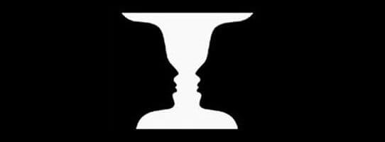
As well as illusion, there is also a high use of perception variation. This being so clearly demonstrated in the the two way head images, where two faces are included within one, or with Ruban's Vase images (below). Depending on each individuals perception, they either see the vase first or the two facial profiles first.
Next we looked at how if we are born with our senses, we must also be born with some sort of innate perception. Proving this was an experiment which involved toddlers and mothers. The children had to play within a certain area, and then be called by their mum to crawl over to them- only to find that when they do so, the glass section of the area floor has a significant drop below. The test was the find if the children would crawl to mum regardless of the danger they could put themselves under if the drop was real. In most cases the babies stopped but this is argued that this could be to do with the age of the children in that they already had some knowledge of depth perception from at home.
While different age perceptions are questioned there, so too can be the perceptions held by certain cultures. For example the study of tribal occupants who had to gauge the length of two arrowed line (parallel bit arrowed in opposite directions.)(below) They were able to decipher that they were the same due to the lower cultural knowledge of certain rules or experiences; however we would maybe see these two lines as different due to the taken for granted rules we each possess regarding space labelling. e.g. arrows facing outwards are seen to look smaller in relation to the one on the left.
Another example is trying to find the letter "F" in a text extract. As we skim read we pick up on the obvious f letters. However on closer inspection we can see they we have subconsciously not counted the three "F"'s in the word "of" being repeated. This is due to this sentence connector often being over-looked.
In summary its essential for graphic designers to never assume. They need to explore every avenue fully and make sure to investigate the "blank space" as this may hold some clue or answers towards the rest. Finally proving how it is hard to avoid assuming we were set of a challenge to connect a 9 dot grid formation (all) in just four straight light. We all struggled to complete this as it seemed impossible, but the trick was shared as to extend the lines to do it in the outside border the shape.
In this seminar session we aimed to convey a message in a graphically, innovative way. To do this we were guided by how meanings can be hidden within.
With an example of this being Michael Barry's unsuspected bridge. Here he used hot air balloons as the means of transportation across the river- this fulfils the function but is presented from a less 'expected' perspective.
Similarly we looked at ambigram tattoos, which have more than one meaning- and were guided to create our own graphic piece. Which possessed either an alternative perspective to demonstrate the meaning, or presented the meaning through multiple elements within the composition.
An example of an ambigram tattoo is below.
You can clearly see how the same graphic can be read in two different rotations, to significantly present something different. e.g. here the top word reads 'regret' clearly, whereas the one underneath is read as 'nothing'.
The next activity was to create our own graphic which could represent two contrasting ideas.
In my graphic sketch I wanted to combine messages that are the exact opposite of each other; so chose heaven and hell. Here is the initial drawing.
I wanted to combine a light, angelic typeface and style with that of a heavy sharp capitalised typeface in to one. This was to portray each of these two poor opposite extremes. I also added small drawings to emphasis the connotations surrounding 'heaven' e.g. with the halo and the clouds.
However this does not blend as seamlessly as the example above, as there is still a strong divide between ideas. I hope to improve this through adding a colour gradient across the whole piece by using photoshop to edit to a higher professional standard.
This is my finished heaven/hell innovation graphic piece. This was based on my original sketch, however this has changed significantly due to being digitally manipulated. I used two different typefaces for each work and blended them by adding auto shapes of the same width to attach them together. e.g. on the H extension and the last L elongation. This was created by changing the spacing of the letters on the character panels, so the H and N could correspond with the H and L on the following line. I then added a new layer and changed the blend mode to lighten so that when I added colour on to this layer it only remained on the black dark shade of the type. To add the gradient I did this manually using the brush tool and altering the opacity and brush size to blend my own choice of colour seamlessly. This was more effective than using a gradient feature, as the manipulation was easier on where I wanted each shade to appear and fade out in to the next.
The colours are to reflect the connotations already surrounding each of these words- with hell being the vivid 'hot' colours like red and orange (as in fire), work in stark contrast to the cool greys and blues which would be associated with the sky and clouds associated with heaven.
In this processes and production lesson we were focused on how InDesign (adobe) can be used to produce an interactive pdf document.
To start of the piece a new document was created and the size (pixels) was set due to this being a web based output. The margins were then set (20px), along with a new created guide of a 12 rows column grid with no gutters but with a grid line every 60px, fitting to page. The baseline grid was incrementing in points of 8 too.
In the recreating of the "pervasive percussion" album art, I pasted the original as the background layer so I could 'trace' its style.
Firstly I sampled the colours to form swatch styles. This was done by double clicking the colour fill option on the top tool bar in the centre and then using the colour picker tool to select each colour manually. These were set to be saved under the RGB colour code (RGB is suitable for web use, unlike with printing.) These swatches can be seen as added to the colour tool bar on the right hand side. Using these colours and the circle tool (holding shift and alt) I could replicate the circle shape and then duplicate this multiple times until I had the right mount needed. The smaller circles were then added and grouped to the one behind- in doing this I was able to select a row of the circle at a time and align them so they look visually spaced evenly. The pink circle and adjoining thin rectangle where added in the same way.
Here it can be seen below in 'presentation' mode; without interference from tools or guides.
Next we focused on adding the content to the rest of the document pages, these were two text pages and two pages containing media (video or still image). The 4th and 6th pages were left white background and left aligned text added and filled with placeholder text.
On the fifth page an image of "count-basie" was placed to fill the whole frame of the document on the right hand side. The frame section was altered as a means of cropping the image.
Secondly the settings of indesign were changed from 'essential' to 'interactive for pdf', in order to add a mp4 video file. The file was sourced and placed on the right hand page on top of a black background, at the foot of the right hand tool bar I used the film/ media icon to choose the file through. A preview was then seen of the file towards the right.
The clip can be seen here within the fullscreen play back of the interactive pdf. This short movie also contains sound.
I also learnt that it was possible to improve interaction by adding control bars including the play/pause and volume options for the film within. It was also possible to have the video commencing on click or when the page first loads. This wasn't something I was aware was possible beforehand.
Carrying on with exploring the interactive features- I was able to add buttons within the document. I chose to add the button to the small blue circle selected in the image below. For this to be easily notifiable as to be about to be selected, I changed the second layer "rollover" layer to an effect with a shadow.
The final interactive feature i added was a contents page on the 2nd page. With an introduction on the 3rd page. To have this automated with hyperlinks within the document- I created paragraph styles for the subheadings on each different page. By doing this i was able to create contents and add each different paragraph style as an option within the table of contents. These are then numbered accordingly.
The document was then saved and exported suitably to be opened at an interactive pdf. This can be set to open automatically to full screen.The first page displayed is the one shown above (pervasive percussion), and then goes on to the contents page when the blue button is clicked. From the introduction and contents page the user can then navigate across the whole document from this list of included items. The page containing the video is set to play automatically on the loading of the page.
This animation is a French film in which we watched one of the sections (e.g. a short story within). Although this film was originally made in french, the translated version is still easily understandable due to not having any narrative except for sound effects and music. These sound manipulations add the 'horror' and tension to viewing the clips as the graphic content itself isn't particularly scary. The noises add a psychological terror as your mind over emphasises the dangers portrayed.
In the clip we viewed, the man in the centre of the above poster was the character who's fears were exposed. He was exploring a darkened house in a typical 'haunted house' manner; the lights were not working, there was a 'spooky' basement, doors that locked behind him, and what appeared to be no exit.
The way in which this snippet portrayed the darkness of his environment was very clever. The whole animation was in black and white; but using these tones the animator was able to still convey a scene effectively as light and shade added depth and a realness to the 2 dimensional illustrations. Again this could be argued to be even more improved due to the brains capacity to 'fill in the blanks', e.g. in one instance a black bottle rolls across a black floor, but this is only evident due to the very small white label rotating and rolling across a pitch black screen otherwise.
Adding to the fear in this snippet is the size and build of the character they have created; the large stocky man is not what is initially thought of when picturing a fearful individual. Therefore when this character seems 'jumpy' or anxious it seems heightened to the audience in a stereotypical view that men wouldn't want to appear scared.
An abstraction is the overview of a phenomenon, as could be described as a brief summary of content. In essay writing this can be linked to setting the mindset/ idea of what your reader is going to consume subsequently, and works as an 'introduction' for the rest of the following information.
Within this abstraction the overview should remain direct and relate clearly and concisely to the main points that will continue. It is promoted that an abstraction should be a few sentences long and should remain summarised.
To illustrate how this can be done with larger bodies of information, the class undertook an activity in which each of 6 groups summarised a 20 second film snippet in to one sentence. These were then all pulled together to sum-up a 2 minute clip in to 6 short sentences. The film used was 'Withnail and I' (1987) and it was easy to recognise how detail could still be included even when just giving a general abstraction.
To further demonstrate this we watched a scene from the 1942 film 'Casablanca'. In this short section of film the audience is fully informed of characters, possible storylines and of past histories giving context to the future character developments. The conversations between just two characters (Rick and the Policeman) ask and answer all the right questions the audience may have; with intrigue being consequently created by including just enough relevant detail to the upcoming story. This narrative is an example of a strong opening.
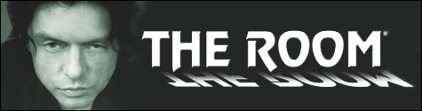
In contrast to this is the weak commencing of the 2003 film 'The Room'. The information given in this short clipping has no relevance to the rest of the film and seems random and disjointed. This inconsequential scene has drawn out scenes with no evident meaning in the present let alone as a reflection of the future film progression. Cliches too further disvalue this abstraction.
My first thought of another film which used the opening establishing shot to foreshadow furure information is the the opening scenes of the 2009 film 'Zombieland'. In which the 'rules' which will be tested and justified throughout the film are first mentioned. In doing this clips of the upcoming film are also showed in which creates an interest in to carry on watching.
The main character is also distinguished as the narrator, an intense graphic content sets the tone for the gore and violence to be expected, and the rules put in place give a history to how the main character has come to these conclusions. All that are needed in an effective abstraction.
Similarly the character introduction and history given here intrigues the views to watch more; especially with the cryptic phrase concluding the sequence. "This is not a love story' sets a contrasting tone to what is presumed.
Similarly in Easy A, a starting abstraction is used. The brief round up of events that will follow leave the audience to continue watching in order to answer the questions the opening has caused.


.jpg)


