Tuesday, 31 January 2017

tote bag


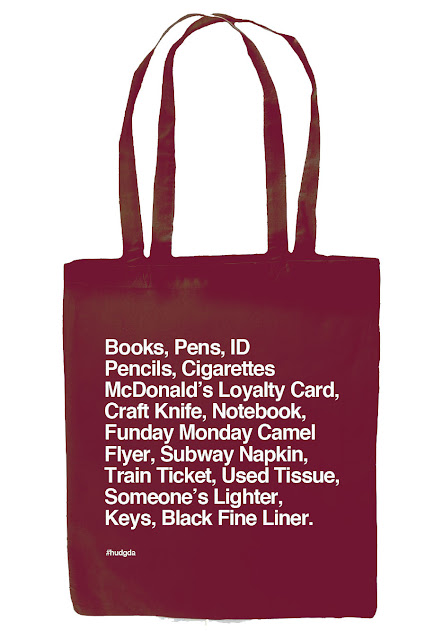
This mini brief was to design a screen printed graphic to place on to a tote bag. The theme was amateurs, as this is the year topic in which the year 2's (who receive this product) will conclude the rest of the year following in the style of.   We were given a project pack in which the brief was explained a bit more thoroughly, as well as mock ups and files to aid the presenting of our outcome.  Right shows the tote bag mock up which was supplied, it was suggested that the fabric colour of the bag could be edited and could be changed to whatever colour was desirable. 


Below shows the development of my ideas. The first created was "reused unlike my lecture notes".
Secondly was inspired by my initial sketch incorporating coffee in to the humour of the tote. However I decided against the illustration of the icons, as I couldn't achieve the look of the different coffee's by using spots as only one colour print was available.  Therefore type was used to make a joke at a type of coffee available "#000000" also known as black to graphic designers. Finally I produced one which was reflected as a sketch on the bottom left of the drawings above. It was to use a Helvetica type sheet to provide a detailed description as to what was contained in the bag. 


This Helvetic one was then further developed. Using the tote bag colours available at the site the university would be printing from, I explored the colour combinations of tote and print to discover what would work best and be more of an interesting colour than black on a plain hessian tote.  The specific names given to these colours are listed below the example. It was also advised to enlarge the type to as big as the printing area would allow, this too would make it easier to be identified and read once being used. The type sheet data and format was also changed, the date was removed not to make this exclusive to just one year of use, as well as "the University of Huddersfield" information not being required at the foot of the design. Instead the brief required "#" was then enlarged to add to the digital presence this bag was increasing. 


In asking friends and families which colours they would be most likely to use, the ones above were selected.  Black with white seemed to be the most popular, however I am quite intrigued by the more subtle colouring of the pale grey on the French Navy bag background colour. It doesn't contrast as strongly, but I think this adds to the hidden humour within the ordinary items, that the text too is also kind of hidden along with the background. 


Monday, 30 January 2017

Russia

population 143.5 million
GDP $2.07 trillion


Russia has been expanding
This does not include the Soviet (Communist) era.
Russia contains stresses so therefore causes break ups.
The breakups on the bridging countries are tackled very heavy handedly by Russia.
This heavy handed nature makes the government very wary, that it doesn't always work most effectively
Russia has huge wealth, that has been untapped
They need the western technology that has been developed in order to gain access to the possible wealth they have.
However they once viewed the west as the enemy, and this downgrades how 'independent' and self reliant Russia could be.
Equally the west hasn't helped
The east have a 'hard hitting' reaction to any sort of political leadership criticism, it is not accepted
Russia is an important player on the world stage due to its 'super power'
Its standing on the world has become vanished however, and Russia do not like to acknowledge this.
This has lead to tensions between the west and Russia
The state is virtually controlled.
Oligarchs- Many state organisations were split and distributed between key people (often politicians) for management purposes. This management then often used their wealth to buy it.
This has engendered a more mafia style upper class of Russia, as these people are difficult to be held to account. Politics and Oligarchs become intertwined
The russia economy is now in decline.
The result is the decay in the lands further away from moscow.
It is seen as particularly bad at making good decisions, especially when pressured for a decision
Arguably Russia takes a forceful approach


the Middle East

Oil Issues
-entire world runs on oil
-In 1950's, the middle east (via oil) was important.
-once refined, oil is a convenient way to store and carry energy
-49% of oil reserves are held in the middle east
-comparably Europe only has 1%
-oil quality depends completely on the area. High quality oil doesn't need as much refinement.
-oil reserve issues- as its not clear how much is actually left
-hubbert curve scenario
-are oil reserves going to turn out?


Why is this important for designers 

Links to the substrates we use;

  • plastics
  • printing
  • inks
  • packaging
  • process lubricants
  • pens
  • paper

This drives what we use and how it possibly might need to change.

Potential solutions to energy use

  • Stationary power
    • renewable
      • wind
      • wave
      • hydro
      • solar
      • geothermal/ hot rock
      • fuel cells 
    • nuclear
      • thorium
      • plasma field 
    • fossil fuel
      • oil
      • gas
      • coal
  • Transportation Power 
    • fuel cell
    • battery
    • capacitor


Friday, 27 January 2017

Wednesday, 25 January 2017

depth in a scene using after effect cameras

Reference- All I Ever Wanted was Everything

https://vimeo.com/32590845 
  • narration
  • story telling
  • cameras allow for the scene to pan out
  • panning out slowly reveals more and more detail
  • scenes can be heavily layered to reflect all that is going on at once, in daily life in this case
  • a solid colour is used to change the busy scene on to the progression of the next. 
Firstly, the art was needed for the animation. It was recommended to keep this quiet simplistic, and in doing this just use one colour per layer. As this was going t be collaborated in to a group project at a later date, each class of students was given a different are to focus their digital illustration on. The first groups was the UK, secondly the north and lastly just huddersfield town. The sessions theme I was in keeping with was that of the North. As I am from Manchester I chose to use a photograph I had of the city, in a well known area of St.Anne's square. The musicians in the foreground alongside the monument and the christmas market in the background does reflect thoroughly what can be seen in many cities in the North. 


While this first representation of this scene looks the most effective, as this was going to be edited in after effects, the background needed reducing in blue pigmentation, to incorporate with he other grey tones. As well as the sky and floor in the scene needed to be bigger, this was to make an allowance for the areas the camera in aftereffects will pan around. To support this the features were also reduce in size, and situated closer to the middle so the camera could explore each of these while the animation was running. 


music- http://www.purple-planet.com

Monday, 23 January 2017

the world in terms of business

The world has different markets and therefore some can be considered emerging markets, and there will also be some problem areas within this.


  • countries and markets that are now developing and have a change to come to prominence
  • markets are growing and becoming important to developments in markets
  • areas becoming volatile. 
e.g. growth potential (investing in the UK) (some of your clients will be from these investors) (new economic powerhouses)
  1. China
  2. India
  3. Russia
  4. Brazil 
e.g. problem regions (problem areas are world affecting)
  1. Middle east
  2. China/ Taiwan
  3. Russia 
e.g. interconnectivity of technology (technology will impact on you)
  1. younger generation
China
1.4 billion population

$9.25 Trillion GDP-  (The gross domestic product (GDP) is one of the primary indicators used to gauge the health of a country's economy. It represents the total dollar value of all goods and services produced over a specific time period; you can think of it as the size of the economy.)


The GDP of the country here shows an increase in growth from the year 2000 onwards,  but the GDP per capita remains quite stably low in comparison- with no growth really being evident. 

the Energy relations CO2 emissions of China in recent years have more then doubles. 2000 the rates were at 2 billion tons, while 2012 had a staggering increase to 9 billion tons. This is considerably lower than the USA and the western world statistics, as they are not governed by the same rules and regulations on emission rates.  However if these were controlled, the risk to the cheap labour and growing economy in china would be compromised. 

India
1.25 billion population 

$11 million GDP 
cheaper shipping rates then china as there is less of a delivery distance
open and approachable to businesses, through they're western business mindsets. 

India CO2 emissions are constantly quite low and static. They stand around 1 billion tons. 

  • victorian type imbalance of wealth
  • poverty not uncommon, variable across the country
  • living standards are weak and variable 
All of these negatives from both China and India caused social stress and can be problematic. 
There are also serious issues on copyright breaching, this would stop with regulation
There are big cultural differences.
Many in the east don't have what they need so there is a potential for something in very high demand. 

Population issues

7 billion worldwide in 2015
1.5 billion worldwide in 1880
growth of 466% in 135 years

Population can be dense. In terms of population density, UK and China as well as India are quite high in population given the size of the land. 

World Demographics 


Thomas Malthus- "Crisis Point"- when a serious issue occurs, e.g. war, famine, pestilence.  The resources can't keep up with the demand of the population. 


http://www.investopedia.com/ask/answers/199.asp
http://www.indexmundi.com/united_kingdom/age_structure.html
http://www.indexmundi.com/world/age_structure.html


Thursday, 19 January 2017

fight club 1999


In order to get a further understanding of the concept of hyper reality, I chose to watch Fight Club as this was recommended to further gauge that a reality can be simulated.  It perfectly reflected this as the film progressed, but it was even more engaging due to the suggestion and foreshadowing that came before the hyper reality was revealed.

The year this film was released (1999) could be linked to millennium and the disturbance the year change was thought to cause. This was a common misconception, as the media heightened the fear that the millennium bug would cause complete disruption to peoples lifestyles and the function of the world.

Similarly the booming of technology and telecommunications, the idea of a hyper reality is much more plausible. In a postmodern society the imagery and information widely avaliable  facilities the creation and stimulation of something no necessarily real. In the instance of this film, the hyper reality is wholly caused by mental creation, the image of a "new" person is completely internal but still so vividly real.

While this is a fictional simulation, Jean Baudrilllard also used this analogy to make sense of the Gulf War. Here it is claimed that it did not take place, and was simply played out on tv. In a similar way it could be argued that the reality we see on TV recently, is also a simulacra. Made in Chelsea and Towie still portray a real life simulation, without actually being reality.

Further research in to other sociological theorists is needed here to understand a more rounded perceptive of this kind of phenomenology.


https://telemachusunedited.wordpress.com/tag/fight-club/

Wednesday, 18 January 2017

stencil skills

In this process and production lesson we started off experimenting with stencilling as a design tool. 
At random we were allocated an object/ thing to stencil, as well as a phrase which too was random and to be stencilled over the top. 

The word I was stencilling was a sheep. So below shows some of the quick sketches at how this could be represented. Each shows a different illustrative style to how this could be created.

As this was going to be stencilled with one colour however, this narrowed down which designs would look best once outputted. The two which I thought would look most effective in just one primary colour were the upper and lower sketches on the left hand side. It was challenging trying to work out which areas had to be cut, or had to be left in order for the design to remain clear and as desired.


Here shows the sheep face on sketched on to a larger sheet of A3. Along with the templates cut out below this. In doing this I learnt that the tabs which would connect all the templates of the ares which would remain white, had to be larger than just a thin connection. This was due to them easily tearing in transition, and when the paint roller moved over them. 


After this the text was added. The phrase I was given was "choke me smoke the air. Below shows a few experimentations at what typeface and sizing to use. I wasnt sure here if the text should work with the sheep stencil, and work around the main bodies of colour, or if to purposefully graffiti over it in a rough style. 


The text sketched on the above right photograph was the one I chose. The kerning, positioning and leading makes use of the stencil-able area, but also both covers and exposes different parts of the red stencil behind it. I think the blue acrylic works well over the red as it is a deeper shade so remains solid and vivid when layered on top. To add a unique style to this type, I chose to blend the E with the previous letter it was next too. It makes the type different but still legible, and has an aesthetic which looks more like a typical stencil. 


On a trip to the Whitworth Gallery in Manchester there was an exhibition of Andy Warhol's work. A collection of these made use of stencilling too. A range of different camouflage prints in various colour combinations all had a similar texture to the stencils we were creating in class. The slightly rough edges give character and a hand made appearance to the piece. While still looking refined when seen from a difference.

Below shows both of the poster examples I have created.
With another sketched idea outputted as a stencil with random lyric type on top off. Inspired by the colours I'd previously used as well as those seen left in Andy Warhol's work, I stuck to using rich red and blue for the stencilling.


Below the photographs show the progression of this piece.


Overall I think I prefer this minimalistic aesthetic. Making use of the white space between the sheets head and legs works well, as the sheep wool would be a paler white tone in reality. Also this was much easier to stencil as there wasn't intricate details to try to keep. 
This was the same for the type, as inspired by the last stencilled text I wanted to block out the letters which contain gaps, as a typical stencil font would too. 


Below shows both of these outputs as mock up posters. 


As another development for this technique I hope to create canvas' which have a similar look. A family member has requested for art to be created for their bathroom which would be a minimalistic animal design too.


Below shows this creative process. The template was printed and then cut with a craft knife.
Acrylic coloured paint was used, and was stencilled on with a sponge as the design was quite small to use a paint roller. Orange and grey were used.


Below shows the main hedgehog body cut out as the stencil and then placed on black card. The geometric shapes provide a hard contrast between the black background and the white foreground.


I then edited these canvases. As is the nature with stencilling, a few of the edges of the design weren't crisp, and as seen in the photograph above the grey hedgehog had a small smudge of paint near it's nose. However using photoshop these could be rectified, and these look effective displayed with a backdrop as like with a mock up. 


Tuesday, 17 January 2017

poster zine

In this process and production workshop we worked on creating a poster zine. This had the familiar zine format we had produced in a previous workshop, but on a larger scale in order for the booklet to transform in to a poster.
An A2 sheet was used and was folded and manipulated in to the booklet that forms a zine. The idea was inspired by research documents that presented artist research in a graphic style while also being able to contain a lot of information within. During the creation it reminded me of the inserts that used to be placed inside CD cases, where the track list of song lyrics would be folded up alongside posters. Once unfolded then the choice of two A4 or one A2 poster was available.

http://www.coroflot.com/korystokes/Print-and-Packaging?state=14&specialty=1&

Here is an example of the song listing in a folded format. Although this example is smaller and arranged differently as the full spread is a square with 9 areas rather than a rectangle with 8.

Firstly we were given a scanned copy of a photograph of ourselves that was on the university system. This was the thumbnail of ID on the university swipe card. The task was to edit this and be deconstructive with it, in order to form an interesting version of the same image on one of the pages of the zine booklet. 


The deconstructive cutting and pasting I chose to use was to removed the facial features such as the lips and eyebrows, as well as detaching the head and neck from the rest of the image. The effect afterward therefore has a grungy aesthetic as enhanced by the black and white toning. alongside this it has the perception that each part of our image is separate, the hair we chose, the face we have, the eyebrow shape/ style, the lip size and colour we have is all chosen to make up our unique appearance. 

Secondly we were allocated a few minutes to draw a representation of ourselves.  Each of us took a different approach which shows the difference in styles we each have artistically. As I wouldn't consider myself a great drawer, I drew in a cartoon style, with simple line drawings. Some took a realistic portraiture approach while others a characature style. This style illustrates how someone sees themselves, as the features drawn over-the-top indicate what parts of their appearance the individual focuses on. 


The scan above shows both of these as part of the zine.


Next as part of this "self publishing" task, we explored another way to present ourselves. Instead of a conventional photograph, we used a printer scanner to capture our face. In particular the details that this has captured is very interesting, the true to life detail in the hair and skin blemishes reflects the physical features of a face much more accurately than a photograph. As seen on the left image, this print had to be cut and split across a fold of the card, therefore to refine this poster zine digitally I had to edit the image to remove the gap. This was done on Photoshop using the clone stamp and spot healing tools to fill the white areas. The result is then seen on the right. 


Focusing on the digital element of this years theme, emojis were used to form an image. As I have always liked collage, I chose to focus on a particular part of the face, rather than representing the whole face through these icons. I thought the pupil of the eye would be best for this, as the micro details could be captured by focusing on the colour (tones) these emojis have. For the centre of the eye, its actually the "poo" emoji cut to size, then the "thinking" emoji for the iris colour. The slight shade difference of the hand on the face gives some details as a persons iris is naturally a slightly difference shade from inner to outer edge. 


Finally on the largest side of the poster zine (A2 size) another collage approach is taken. Here different papers with different spot sizes were available, and these were to be ripped and layered to create another form of self representation. As the different spot sizes and frequency give the appearance of a different grey tone, these paper varieties allow for depth to be created with them. This challenge was particularly difficult as it was hard to think what areas would need to be light or dark.  Again when this was scanned in to be replicated digital, the seams that were caused when having to scan each corner in separately. This proved very difficult as it was hard to replicate the spot detail incorporating the same pattern.