Wednesday, 18 January 2017

stencil skills

In this process and production lesson we started off experimenting with stencilling as a design tool. 
At random we were allocated an object/ thing to stencil, as well as a phrase which too was random and to be stencilled over the top. 

The word I was stencilling was a sheep. So below shows some of the quick sketches at how this could be represented. Each shows a different illustrative style to how this could be created.

As this was going to be stencilled with one colour however, this narrowed down which designs would look best once outputted. The two which I thought would look most effective in just one primary colour were the upper and lower sketches on the left hand side. It was challenging trying to work out which areas had to be cut, or had to be left in order for the design to remain clear and as desired.


Here shows the sheep face on sketched on to a larger sheet of A3. Along with the templates cut out below this. In doing this I learnt that the tabs which would connect all the templates of the ares which would remain white, had to be larger than just a thin connection. This was due to them easily tearing in transition, and when the paint roller moved over them. 


After this the text was added. The phrase I was given was "choke me smoke the air. Below shows a few experimentations at what typeface and sizing to use. I wasnt sure here if the text should work with the sheep stencil, and work around the main bodies of colour, or if to purposefully graffiti over it in a rough style. 


The text sketched on the above right photograph was the one I chose. The kerning, positioning and leading makes use of the stencil-able area, but also both covers and exposes different parts of the red stencil behind it. I think the blue acrylic works well over the red as it is a deeper shade so remains solid and vivid when layered on top. To add a unique style to this type, I chose to blend the E with the previous letter it was next too. It makes the type different but still legible, and has an aesthetic which looks more like a typical stencil. 


On a trip to the Whitworth Gallery in Manchester there was an exhibition of Andy Warhol's work. A collection of these made use of stencilling too. A range of different camouflage prints in various colour combinations all had a similar texture to the stencils we were creating in class. The slightly rough edges give character and a hand made appearance to the piece. While still looking refined when seen from a difference.

Below shows both of the poster examples I have created.
With another sketched idea outputted as a stencil with random lyric type on top off. Inspired by the colours I'd previously used as well as those seen left in Andy Warhol's work, I stuck to using rich red and blue for the stencilling.


Below the photographs show the progression of this piece.


Overall I think I prefer this minimalistic aesthetic. Making use of the white space between the sheets head and legs works well, as the sheep wool would be a paler white tone in reality. Also this was much easier to stencil as there wasn't intricate details to try to keep. 
This was the same for the type, as inspired by the last stencilled text I wanted to block out the letters which contain gaps, as a typical stencil font would too. 


Below shows both of these outputs as mock up posters. 


As another development for this technique I hope to create canvas' which have a similar look. A family member has requested for art to be created for their bathroom which would be a minimalistic animal design too.


Below shows this creative process. The template was printed and then cut with a craft knife.
Acrylic coloured paint was used, and was stencilled on with a sponge as the design was quite small to use a paint roller. Orange and grey were used.


Below shows the main hedgehog body cut out as the stencil and then placed on black card. The geometric shapes provide a hard contrast between the black background and the white foreground.


I then edited these canvases. As is the nature with stencilling, a few of the edges of the design weren't crisp, and as seen in the photograph above the grey hedgehog had a small smudge of paint near it's nose. However using photoshop these could be rectified, and these look effective displayed with a backdrop as like with a mock up. 


Tuesday, 17 January 2017

poster zine

In this process and production workshop we worked on creating a poster zine. This had the familiar zine format we had produced in a previous workshop, but on a larger scale in order for the booklet to transform in to a poster.
An A2 sheet was used and was folded and manipulated in to the booklet that forms a zine. The idea was inspired by research documents that presented artist research in a graphic style while also being able to contain a lot of information within. During the creation it reminded me of the inserts that used to be placed inside CD cases, where the track list of song lyrics would be folded up alongside posters. Once unfolded then the choice of two A4 or one A2 poster was available.

http://www.coroflot.com/korystokes/Print-and-Packaging?state=14&specialty=1&

Here is an example of the song listing in a folded format. Although this example is smaller and arranged differently as the full spread is a square with 9 areas rather than a rectangle with 8.

Firstly we were given a scanned copy of a photograph of ourselves that was on the university system. This was the thumbnail of ID on the university swipe card. The task was to edit this and be deconstructive with it, in order to form an interesting version of the same image on one of the pages of the zine booklet. 


The deconstructive cutting and pasting I chose to use was to removed the facial features such as the lips and eyebrows, as well as detaching the head and neck from the rest of the image. The effect afterward therefore has a grungy aesthetic as enhanced by the black and white toning. alongside this it has the perception that each part of our image is separate, the hair we chose, the face we have, the eyebrow shape/ style, the lip size and colour we have is all chosen to make up our unique appearance. 

Secondly we were allocated a few minutes to draw a representation of ourselves.  Each of us took a different approach which shows the difference in styles we each have artistically. As I wouldn't consider myself a great drawer, I drew in a cartoon style, with simple line drawings. Some took a realistic portraiture approach while others a characature style. This style illustrates how someone sees themselves, as the features drawn over-the-top indicate what parts of their appearance the individual focuses on. 


The scan above shows both of these as part of the zine.


Next as part of this "self publishing" task, we explored another way to present ourselves. Instead of a conventional photograph, we used a printer scanner to capture our face. In particular the details that this has captured is very interesting, the true to life detail in the hair and skin blemishes reflects the physical features of a face much more accurately than a photograph. As seen on the left image, this print had to be cut and split across a fold of the card, therefore to refine this poster zine digitally I had to edit the image to remove the gap. This was done on Photoshop using the clone stamp and spot healing tools to fill the white areas. The result is then seen on the right. 


Focusing on the digital element of this years theme, emojis were used to form an image. As I have always liked collage, I chose to focus on a particular part of the face, rather than representing the whole face through these icons. I thought the pupil of the eye would be best for this, as the micro details could be captured by focusing on the colour (tones) these emojis have. For the centre of the eye, its actually the "poo" emoji cut to size, then the "thinking" emoji for the iris colour. The slight shade difference of the hand on the face gives some details as a persons iris is naturally a slightly difference shade from inner to outer edge. 


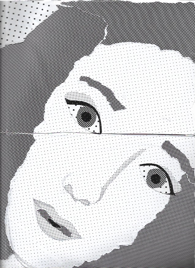
Finally on the largest side of the poster zine (A2 size) another collage approach is taken. Here different papers with different spot sizes were available, and these were to be ripped and layered to create another form of self representation. As the different spot sizes and frequency give the appearance of a different grey tone, these paper varieties allow for depth to be created with them. This challenge was particularly difficult as it was hard to think what areas would need to be light or dark.  Again when this was scanned in to be replicated digital, the seams that were caused when having to scan each corner in separately. This proved very difficult as it was hard to replicate the spot detail incorporating the same pattern. 


hyper-reality brief

Hyper reality- defined on google #

Hyper reality is the key theme for the next brief we will work around. Within in this, three key areas to consider were given.
  • millennials 
  • memes
  • hyper reality
As these are such wide ranging, thought provoking areas it is essential to ensure a sufficient amount of research is done beforehand. Because of this, research time allocated will be much more generous than other projects completed. Once a well rounded understanding of each of these phenomenologies is gained, then the focus can shift towards the production of a graphically designed representation.  

At this initial stage, my first direction of research is aligned to that of "millennials". This is due to this being a previously unknown term and needing further investigation. It was quite interesting when initially seeking information on this online, as the details and ages this range contains is that of my own age. Therefore it was intriguing to know how "typical" I actually was to this classification- how much I actually fit in to the stereotype it presented.

Playing around with an online calculator of "how millennial are you?", I scored quiet low. With a 67/100 I was slightly disappointed I wasn't much like the rest of my generation, weirdly. Maybe as this is the desired generation of being born/ growing up in the 90's. It has become a fashionable declaration to have experienced the 90's, so possibly I unknowingly want to be part of this 'club'.

While millennials find value in the era they've grown up in, with further reading it seems the previous generations don't see this generation similarly. The phrases used in other countries to describe millennials reflects this.

An interesting metaphorical name here, is that used in Poland. Being referred to as the "curling generation", is to indicate how the parents of the millennial children are constantly moving the obstacles and clearing the path for their child's growth and development in to adulthood. They do all the work to make the progression of the child/teen as easy as possible. 

As a progression of this research I want to look at the design aspects which have formed the lives the millennials have lived. Alongside the prospects and disappointments maybe the millennium influenced, it is undeniable that technology will provide the biggest significance in visual aesthetics and even language. 

hyperreality research


Hyperreality doesn't have an exact clear definition as the signs and symbols it generates from is completely subjective due to individual perceptions of these semiotics. Generally it is explained as when fiction and real life are infused and blended together with the boundaries between each not being easily defined.  This sociological theory is a postmodern approach, which is true to the cultural and economical state the western world (particularly) displays as a progression from modernity.

A way to illustrate the value semiotics have over our perception of reality, links to the sociological perspective of phenomenology. An item has connotations surrounding itself which hold how it is seen and interpreted by individuals. So an object such suit, on its own is meaningless, but when worn it has the representation of professionalism and business so therefore has its own meaning. The reality of the suit and the hyperreality of what is stands for become interwoven.  In hyperreality the copy becomes more valuable than the real thing, and it's symbolism is more important than the actual thing is.

Jean Baudrillard explains how humans have started to engage with simulations of reality, with the new experiences that can be bought, and the technology people can be submerged in in the age of mass media.
Firstly the experiences that have been created within this postmodern society should be demonstrated.   The large scale experience parks such as Disneyland, or casinos like those seen in Las Vegas are examples of these hyper realities. Inside either of these places, there is no real world as seen on the outside, but a constructed reality designed to escape temporarily from what is real on the outside. The experience can be so vivid and well rounded that it encompass all a person needs in reality. Such as disney themed food, or oxygen being pumped in to casinos.
Another example of experiences triggering a hyper reality is in the new VR technology. These virtual reality headsets transport an individual in to an alternative world and location by playing with their senses. The virtual games and realities that are depicted, fully emerge the individual to behaving out of character, as the hyper reality becomes an strong influence over reality.
A film representation of this is Nerve (2016). When a continually progressive 'dare' app gradually controls the users/consumers behaviour as the fiction slowly becomes reality.
A new Netflix film called IBoy (2017) may also be similar. In which iPhone components implant inside the brain of a teen and gradually make him succumb to the phones needs, not his own.


These examples draw upon the influence technology has significantly had. Arguably TV can be responsible for much of this, as a screen is key for information and entertainment in most households. (TV provides a hyperreality we can observe, such as Gogglebox.) By being engrossed in television on a daily basis, hyperreality can also take the form of reality by 'proxy'. This is particularly evident of those who are absorbed in to the drama of soaps and serial programming. In regularly watching the lives of others, some people begin to see the extreme situations and relationships as being real due to the interpersonal relationship between the viewer and the soap opera writers. E.g. the "Free Deirdre Barlow" campaign after she was imprisoned within the fictional Coronation Street.


Secondly hyper reality is formulated through advertisements. The objects that are presented to the viewer are shown to provide a service or provide an element of enrichment to the buyers life. The images promote the product as though it is highly desirable, and there for the symbolism takes over. The meaning the clothing or perfume accumulates is the reason it is purchased, and this is further heightened by the celebrity endorsements as a means of promotion. If an individual wants to be a glamorous actress, if a glamorous actress is advertising a perfume type, they feel compelled to buy it in hope that can be just like said celebrity.
Social media plays a key part in this too. People become detached from the real world by being exposed to a hyper reality for a long period of time, the boundaries between fiction and reality become blurred, when this happened it may become more important to take on the symbols than to achieve the reality. Some may believe that they can be celebrities just by acting as if they are. (e.g. youtube vloggers who assume people will be interested in their mundane life because it is presented in a way in which celebrity information is shown.) Similarly the Kardashians can be an example of this. The way the family act projects them in to th limelight without actually really being famous for any particular reason. Connected to this is the product ranges these 'so-called' celebrities launch, the Kylie Jenner lip ranges and Zoella toiletries gain in popularity through the constant exposure on all platforms of these products as something which should be highly desirable.


http://www.wisegeek.org/what-is-hyperreality.htm
https://i.ytimg.com/vi/5pXGmKmHgQ4/maxresdefault.jpg
http://images.gr-assets.com/books/1328033161l/7807446.jpg
http://news.bbc.co.uk/olmedia/70000/images/_71934_deirdre300.jpg
http://s2.r29static.com//bin/public/82b/0,0,2000,1050/x,80/1599357/image.jpg
http://i.dailymail.co.uk/i/pix/2015/07/07/09/2A4B488300000578-3151855-image-a-5_1436257045933.jpg


Monday, 16 January 2017

media types

Media Categories

  • ambient (outdoors)
  1. commonly regarded as outdoor. 
    1. billboards
    2. ads hells
    3. posters
    4. vehicle wraps
    5. bus/ Train wraps "T"sides, "rears"
    6. building wraps
    7. Guerrilla
  2. price;  2 weeks. 
  3. lighting
    1. not lit
    2. back lit
    3. fornt lit
  4. static and moving image available 
  5. 6 week deadline
  6. issues;
    1. proximity to roads can be good
    2. is it still clear and have clarity or will it get mucky
    3. does location affect colour choice
    4. local council permission for sometimes is needed.
  7. must be quick
  8. must be high impact
  • print 
    • (audience can dwell on this for a long time)
    • can be seen time and time again.
  1. magazine
    1. can need up to 5 weeks to produce
    2. FHM used to cost £17,00 per full print colour on a page
      1. FPC- full page colour
      2. FPM- full page mono
      3. DPS- double page spread
      4. cc- column centimetere 
  2. newspapers
    1. have a quicker turnover to reveal breaking news. 
    2. the shorter the time, the more expensive to achieve.
      1. circulation- number of people who buy it
      2. readership- the number of people who buy it (e.g. dentist waiting room, bought once, read multiple)
  3. journals/ newsletters
  4. books
    1. old technology?
    2. this is even digitalised.
  • broadcast
  1. TV (does not include abc, don't have adverts)
    1. itv
    2. sky
    3. BT
    4. Netflix
    5. Amazon 
  2. adverts
    1. all scripts must be put infant of British Advertising Agency, they accept or reject. This is just spoken word however
    2. advertising standards authority (part of OFCOM), they can force an ad off air, or off a billboard immediately. 
    3. very high cost
      1. depends on;
        1. time of day
        2. length of ad
        3. the program on after or before it
        4. number of viewers
        5. demand for ad space/ time. 
  • entertainment 
    • cinema
      1. ads are before the film
      2. the time limit is not so strictly restricted, e.g. better for an ad story.
      3. audience is captured, reality suspended
      4. entertainment imperative
      5. will these be remembered by the end of the film. 
      6. works out relatively cheap, compared to tv. 
      7. depends;
        1. film type
        2. rating
        3. expected impact, e.g. a blockbuster
    • performance
    • new media
      1. online aspects
        1. Netflix
        2. amazon
          1. often have trailer and ads in front of what is being shown
          2. problems with regulations but same broadcasting rules should apply although harder to police. 
      2. blue-ray/ DVD/ CD
  • Social media
    • to better to communication to the people that are most important to you
    1. liability for self publication
      1. concerns legal issues such as;
      • libel
      • deformation
      • bullying
      • misrepresentation
      • plagiarism
      • theft

business planning

Every business goes through business planning.

firstly;

  • purpose? - income?, profit?, charity?, kudos? (what do you want out of this and why?)
  • type?- freelance?, ltd?, semi-partnership?, partnership?
  • nature?- (what are you actually doing? this must be legal. Think what you can do, not just what you want to do) 
  • where?- (where geographically do you want this business to be? be realistic here. New York is not realistic (yet). If starting a business, then prove yourself first, stick to the UK)
if these basics aren't considered and stuck to, this can lead to drifting. No direction means you are unlikely to succeed, you need these fundamentals to succeed, and these should be firmly in place before starting the business. 

once these are understood and developed in to a plan you should try to consider the three distinct scenarios;
  • good
  • bad
  • ugly
For each of these you should address what you will do in each of these scenarios. It needs extra effort to maintain a business through each of these scenarios. Or if the business is really struggling, stop a challenging and difficult situation from being far worse then it needs to be and kill it off. 

considerations;
  • accommodation
  • cost of living where you intend
  • facilities you have
  • facilities you need
  • transportation
  • communication
these can be split in to two different financials. Personal expenses, business expenses. 
co-mingling only causes confusion, so these two separate groupings should always remain separate. 

  • how soon will you get work?
  • what type of work is it?
  • when will that work start paying you?
  • how much will you make in terms of profit?
  • how soon will you get another job/ repeat work?
  • how many jobs can you manage at once by yourself?


budgeting

budgeting- is the allocation of money/ time to undertake a particular last. e.g. travel/ staff budget. It may be over a specific task such as a project, or a time period or both. As this is an allocation it is only proposed.

If a budget (as a guide) is not accurate this leads to over and under spending.

Budget- proposed resource allocation
actual- actual resource used
variance- different between the two (may be positive or negative or neutral.)
cumulative variance- the variance as a cumulative spend across the project.

over time the budgets you propose will become more and more exact and accurate. They help you to understand where and how your costs vary and are different to expectation.

Its good practice when spending a budget to out aside a buffer, maybe around 10% just in case issues arise you weren't aware of.
As you spend more of the allocated budget, you should keep a record of the finances as they stand, with the remainder of the money listed you have left available.