Wednesday, 16 November 2016

typography posters


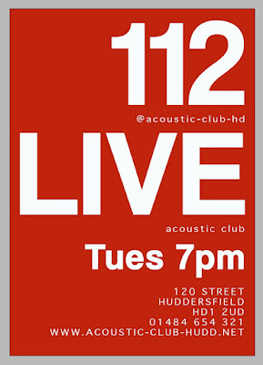
Brief- A3 Poster One — Acoustic Night

Session 2, 
Bar 122 Live, 120 New St, Huddersfield, HD1 2UD
Acoustic Club
Every Tuesday evening from 7.00pm — late
01484 654 321    www.acoustic-club-hudd.net
strum@acoustic-club-hudd.net
@acoustic-club-hd
You can only use typography
You can only use THREE type sizes. 

One large, one medium and one small.
Just use Red, Black and White. 

You can also use tints too.


 Brief-A3 Poster Two — Craft Beer Expo 2017
Session 2
6-19th June 2017 
Tickets Now On Sale, book online.
The Huddersfield Craft Beer Expo 2016
Magic Rock Tap, Willow Lane, 

Huddersfield, HD1 5EB

01484 649823    
www.huddscraftbeerexp.com
beer@huddscraftbeerexp.com  
@huddscraftbeerexp
You can only use typography
You can only use THREE type sizes. 

One large, one medium and one small.
Just use Red, Black and White. 

You can also use tints too.


Brief-A3 Poster Three — Interpret

Session 2
Your poster must include the following:
Designers name.
Full uppercase alphabet.
Full lowercase alphabet.
Numerals and glyphs.
Years active.
A short paragraph about why you have chosen your particular designer, what is it about them you find 
compelling or explain why you wanted to try and 
understand more about their approach.


Quickly research your designer.
Find out key information you need.
Call out the characteristics that make up the visual 
language of your chosen designer. Do they use a 
particular colour pallet? Any specific typefaces used? Do they structure their work in a particular way? Is it hand-drawn, physically made?
Example shown below.


Brief- A3 Poster Four — Wilson's Republic 6
Session 2
The overall theme for the evening and talks is:
"Resilience".
13th April 2017
6.00pm — late
Bates Mill, Milford Street, Huddersfield
HD1 3DX
A Design Network for Huddersfield
www.wilsonsrepublic.com
@wilsonsrepublic
#WR6
Christopher Nunn
Lord Whitney
James Sommerville
You need to include the WR logotype and pipe marque.
You need to use the WR colours, only use Red, 
Black and White. You could also use tints and half-
tone patterns of those colours.

Developments are shown below. With my final design showing at the foot of the page. The work previous slowly inspired how I wanted the final poster outcome to look.  With the theme being 'resilience' I wanted the '6' to stand out against the background, but decided I didn't with the background and main focus to be too contrasting. This was also the case due to the limited use of colour requested in the brief. The final outcome too has the impression of being pushed out of the background colour, I think this reflects a resilience as the character is further ahead than the rest and is stronger and bolder by being int he foreground, it is much more prominent. 


Tuesday, 15 November 2016

live brief 2


In the second week of working on our live briefs, we were advised to produce good boards in order to direct our research, and become fully immersed in the outcome we were each striving to achieve. In doing this it leads to more focused research and clear idea of how the project should develop in order to avoid going off on a tangent or for progress to seem random and unjustified. 

The first mood board I created was for the live brief by "UK Greetings". In the requirements for this they were asking for a range of graphic products that would formulate a range of stationary and gifting products. An example of wrapping paper, gift bags, notebook and four card varieties was given. Because of the example given I saw the importance of how in the market place it is essential for products to have coordinating items especially in regards to gift wrap and cards. Paper chase product ranges can be an example here as the same print and graphic is used and manipulated across a variety of items which are often purchased together due to the coordinating designs. A lot of school wear and stationary also use this design feature. 
For this reason my mood board focused on the colour palette I think will work effectively, and the styles and schemes that could form inspiration for the design of the graphic. In quick primary research in stationary shops I saw a common theme of each range of products being targeted to one area of the market. There seemed to be a lack of items matching in the same range but still being appropriate for different ages/ genders/ or occasions. For example the card that went alongside the gift wrap was of one design, so the wrapping paper would only seem suitable alongside this one other product. For this reason I want to start by designing a print/ pattern which will be solely for the wrap, but can have colours picked out from within it, that can be designed around to form a range of cards that will appeal to different ages and for a variety of occasions. 
 These colours were chosen as the fashion catwalks for 2017 seem to make use of the soft pastels, but also a more unusual, strong mustard colour. I think these colours are gentle but stylish enough to be manipulated for different schemes. As the children graphics above show, they can be used for children illustration, but then the lamp shades and bedding design show how his can be a a bit more sophisticated and appeal to a more mature audience. 

(all individual image sources can be found here)


The next live brief I considered was for "BEAR nibbles" and their yoyo bars made for children. In each of these healthy snack bars there can be collectable cards included- these are often fun fact cards about animals, history or nature. The aim for the design of these cards if to be lighthearted and bright, interesting information cards that children aged 4-9years would be wanting to collect and collate.  
So far the mention of how the children collect the cards has seemed to be in an album or file. However this seems quite dated to me, as this seems like the collecting and scrapbooking of top trumps or football cards, which I believe doesn't persist as strongly in someones childhood anymore. 
For this reason my aim is to work towards forming some sort of physical way in which card collection is essential in order to make something of fill-in the blanks of something. Im not yet sure how this would be possible but my idea include
  • a poster to stick an animal on that is retrieved from an information card
  • a piece of wall art that the cards are attached to
  • a cut out and fill the gaps design. With cards being perforated and the design having animal shaped gaps for the child to fit the animals where needed. 


 Above is my mood board for this brief. As I have less of a direction for this project yet, the mood board is less focused. However I have tried to focus on the content I could include regardless of what the overall output will be yet. The colours and scheme of a woodland adventure is presented here. I wish for the illustration to be child like as this is the age group I am designing for. The colours in relation to this will also be quite soft and more of a pastel tone, in particular I like the combination of the colours seen on the carton birds here. 


(all individual image sources can be found here)

Friday, 11 November 2016

week 5

Emigre Magazine (1984-2004) published by EmigreGraphics in San Francisco with an international style.

    • Rudy Vanderlands
    • Zuuzanna Licko
  • First digital type foundry
  • Sold or gave away the fonts used in the magazine
  • very popular stylistically
  • digital and portable


exploited the possibilities of apple software to produce a new innovative design language.
Very digital (deliberate) typefaces, bitmap 'un-smoothed' out type.

(experimental jetset had article published in Magazine)
http://sandilandslucy.blogspot.co.uk/2016/10/low-budget-typographic-posters.html
 (worked with DesignersRepublic, published their work)
http://sandilandslucy.blogspot.co.uk/2015/11/ian-anderson-lecture.html

Content

  • "Dear Emigre"- Letters to Emigre.
    • funny venting that is published in a magazine. 
    • Form of trolling?
    • some essay length submissions
    • back and forth discussion
    • writer and reader discussions
    • firey
    • disguised political debate of post modernism and modernism
    • fought out through type and composition, as metaphor for political debate. 
Format changes- attempt to move away 
    • CD and dvd format editions in a period before you would've seen this
    • open to changed
    • Tabloid
    • Smaller 'news' magazine
    • Emigre music publishing
    • "Catfish" 
Monotony of International Style
    • graphic interventions
    • the grid strips away unconventional things on the page. 


Barry Deck- Originally design template Gothic (postmodern graphic design style)
vernacular style- understood and used by ordinary people on an ordinary basis.
The future as imagined by those in the 1950's. Mass Produced.

Critics

Massimo Vignelli (neo-modernists)- 'A national calamity', 'An aberration of culture'

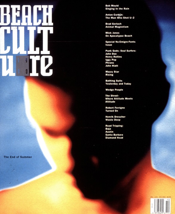
David Carson (postmodern)- Beach culture magazine published an issue with a cover one that boasted "no Emigre fonts", although the logo itself was set in Licko's Senator.
Ironically it was designers like Carson who popularised it. 


Allies

Stephen McCarthy- "the voice of a new generation of graphic designers: post-modern, deconstructed, experimental".

    • Break lines of text
    • use a mix of fonts
    • deconstructive layout.
    • broke affordances (broke rules) you could introduce awareness of what they are reading. 
    • crafting digital technologies
      • working with computer based technologies, but can also be mapped on to traditions such as arts and crafts movements (William Morris).(Eric Gill)- Gill sans 'humanist' font, which had a big impact on Futura and LondonUnder Ground signage. 
        • vernacular again, due to everyday use.
Vaughn Oliver- deep human qualities but highly surrealistic. Contemporary designer sensibility in animation (e.g. Tim Burton surrealism, poetic, Freudian references). Juxtaposition. Everyday objects with imposed human sensibility. 
    • typographic style was calligraphy. 
    • Starts with part of the body/ human cultural artefact. 


Katherine McCoy- Cranbook. Communicate ethos of the Cranbrook course. Legibility and communication shouldn't be confused. Deconstruction can convey that message if thats what you want to portray.  Collaboration of artists (Cal arts also). 
    • Jeffery Keedy (Modernism 8.0 Emigre)(old modernism vs new modernism)
    • Ed Fella
    • Lorraine Wild
    • Andrew Blauvelt.

Walker Art Centre- Rebrand for exhibition design
    • snap of serifs
    • stripe motif patterns recurring. 

Emigre 64 and 65, refused to be interviewed for Gary Hustwit's Helvetica film. 

Octavo- associated with music labels. More minimalistic.
    • small crafter work
    • reduction
    • use of white space
    • all handcrafted
    • depth of design despite not using multiple technologies. 
    • Swiss influence (e.g. Wolfgang Weingart)
    • filled with associations
    • e.g. Peter Saville. Minimalist modernist, worked for factory records. 
      • Win Crouwell


https://s-media-cache-ak0.pinimg.com/originals/21/3a/ab/213aab6b075f5a209025208ef13a205f.jpg
https://s-media-cache-ak0.pinimg.com/236x/83/5c/55/835c559cd1a476838c08f04dff73be2d.jpg
http://static.flickr.com/67/191189104_a71f037461_o.jpg
https://gamswennewsmag.files.wordpress.com/2012/04/pixies.jpg
https://s-media-cache-ak0.pinimg.com/736x/6f/e5/9d/6fe59d48bbacb3a4fa65ea6c8e4dd371.jpg
http://farm4.static.flickr.com/3580/5780946882_a9b30955b2_z.jpg

Wednesday, 9 November 2016

after effects animation rotoscoping

In this lesson we were experimenting with creating a "rotoscope" animation on Adobe after effects. In  creating this piece, a short piece of video is cut an masked frame by frame in order to create a fluid 1 second animation which can be used repeatedly to make up a short clip. e.g. 10 seconds (in this case.) 
In order for this to be possible the document was set up to have a frame rate of 25 a second, and this was inside of a clipped 1second range. The dimensions were set to HD as this could be a piece made for the screen (TV, advert etc).  Below shows the set up taking place.


The footage taken was then imported. It was a 6 second video of movement, which was filmed quickly and inexpensively just on a smart phone. We were made aware that the quality of the footage didnt have to be particularly high, as the original video would not be seen in the final render, but would just be used as a guide for each movement to mask from. The video acts as a template in order to outline each movement per frame within the second. (So in total 25 masks will be created per this one second). As this was a 6 second video, once imported I had to chose the bits of movement I wanted to include. There were a few guidelines to this to make it look most effective.

  • The figure to be contained within the frame at all times.
  • To be ending as close to the original starting movement as possible in order for a looping of the clip to not look too jumpy and not smooth. 
  • Be quite basic in movement
  • Have a clear outline of figure against the background colour (for ease of outline tracing)
  • Try not to include any fine details such as hair (as this proves very difficult to cut out)
Below shows the one second clip being placed in the timeline in the right location.


Below are the preference adjustments to enable different masks per frame to be held within the same mask on the timeline.


After this we started the rotoscoping effect creation. This was done by using a mask, and outlining the individual movements of the figure in the video (frame by frame).
Below you can see the figure cut out from the background as an example. 


It was suggested when dong this to use as little mask points as possible. While we wanted a fairly accurate online of the movement, it was explained that each of these points must remain in every frame, so the less to move the easier to manipulate and the quicker this would be.  For this reason when we started to place the mask, it was advised to do the first outline on the figure when it was at its most expanded in shape. This way no points would need to be added further on in the editing process. 
This was still however a very laborious process and very time consuming. Especially as the motion of punching I had chosen meant that editing the points across the whole body was needed on each frame. Until the video is slowed down its hard to realise how the body twists and the legs turn even when it just appears to be a punching movement from the arm. Therefore it took quite a while to get each frame outlined suitably.
Another problem encounter here was the background choice. As this footage was taken simplistically and naturally in the home, this meant that there wasn't a plain background to work against. When the video runs at full speed it is easy to distinguish the figure from the background. However when slowed and analysed frame by frame it becomes more difficult to make out the online of the body compared to pattern behind, especially when zoomed in for accuracy trying to distinguish the difference becomes more difficult. 


Above in the screenshot shows the completion of the masks on each frame within the 1second video clip. In the timeline you can see this as a small dot where the mask has been adjusted on the mask path tab. I learnt that during this overall editing process it is essential to save the composition after each mask path has been edited, as my software crashed several times and the editing felt even more tasking when having to be repeated. 

But once this was done the style and interest could be put in to the animation through colour and effects.  For this we were left to experiment and have free reign over what effects we wanted to trial. As I am not as comfortable with after effects as other adobe software I thought my work would look most effective if I utilised the skills I had learnt in other lessons. Because of this I made use of the effect of 'venetian blind' which we had experimented with in a previous lesson. This effect can be seen below in the screenshot; the figure on the left with a white venetian effect and the one on the left with a dark blue and vidid red stipe effect. To further contrast these figures from the solid background colour I copied the figure and used this misaligned as a backing colour for the venetian effect. I think the image towards the left of the screen looks most effective, as the white lines are really the main focus and give depth to the layers that are placed on top of one another. 


This is displayed to the left here in an alternative frame position. 
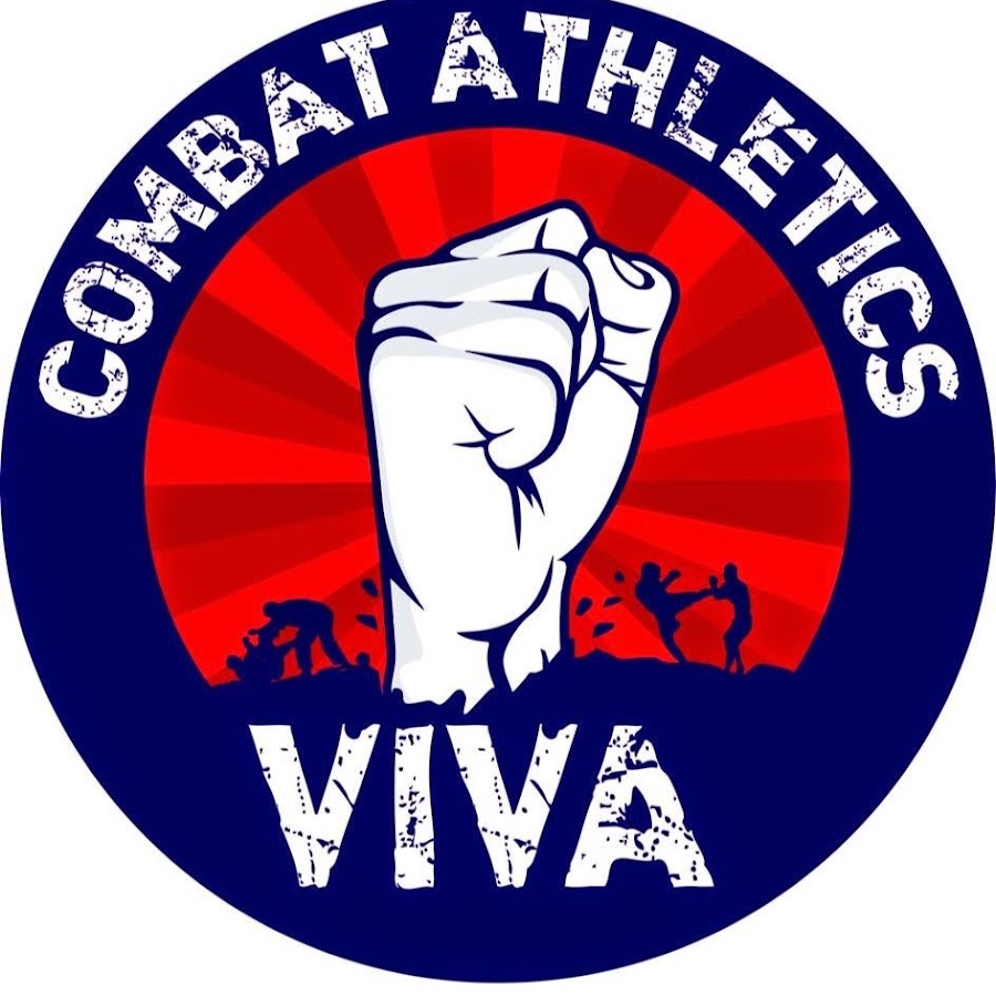
For the colour palette used here I took inspiration from a logo used from a combat athletics club. This can be seen in the bottom right of the screen shot above, as I used the eye dropper selection tool on this internet image to select the colours. They go together very effectively as the vivid red is quite 'punchy' and contrasted the deep blue of the background. 

However because this is an existing club logo I need to seek permission to further use this within my work. But my intention would be that this rotoscoping could act as promotional material for this local club. The short length of this animation would make it suitable for an internet moving image such as a GIF, and would also be effective as a moving ID for the club's online presence. Such as a motion profile picture on Facebook where a video can now be used as a reflection of your profile. 


Another idea here would be the capture individual sections of the film here and use these to form promotional posters. In the full outstretched punch motion the image would look striking alongside the logo and details of the club and the information needed to attend. In this example the white stripe would make effective use of white space, as the viewers eyes would automatically see this as a figure, despite just being made from stripes. 


Below is my rough version of the animation. This has been uploaded to vimeo with the link at the foot of the post. 


Tuesday, 8 November 2016

live brief

The briefs initialised in this lesson were live briefs set by industry. We were introduced to YCN (you can now) and RSA (Royal Society of Arts) who host and award those who participate in the briefs they incorporate. 
The briefs set by YCN included well know brand names such as;
  • cornetto
  • BEAR nibbles
  • Greenhalls Gin
  • Uk Greetings
  • Dave
  • Fedrigoni
  • Met Office
  • Orchard Pig
  • Quorn
  • THINK!
  • Roald Dahl Literary Estate
And the RSA briefs use more problems that need a designed solutions. These matters include
  • awareness of agent population
  • need to reuse office furniture
  • reverse or prevent poor health 
  • money management 
  • survival of birth for mothers and children 
  • encouraging learning environments
At the first introduction of these projects we were advised to keep an open mind surrounding all projects and to write down and discuss in small the groups the possible idea we were having. This meant that people could receive feedback from others straight away, and each of us could give guidance in to the direction we would think those projects would head towards. 


Above are quick sketches of ideas for a few of the project. 
  • Roald Dahl (requirements) and logo design that could be inspiration
  • Fedrigoni use of their papers in a christmas cracker, with confetti released in the variety they offer
  • Orchard Pig a DIY mass poster production of screen printed logo. Pink paper, black messy paint on top.
  • Opera House Ballet typical ballet shoe but emphasised colour maybe on striking black background. Although this may not fit for attracting new people "turned off" by the preconceptions of ballet.


In the small group i was in each of us had very different perceptions and previous knowledge about the outputs each project could have. This is due to people having various interests and different brand perceptions you may not consider when doing work solo. For this reason we were all happy to help each other out, as peoples preference of project was different so no one was "stealing" ideas.  A memorable discussion we had was regarding the THINK! campaign. A member of our grouping was an international student and was unaware of the striking impact these campaigns were known for having. Research in to the previously aired adverts and the billboard advertisements was completed and we each had different adverts we could remember straight away as personally affecting us due to the hard hitting portrayal.  It was interesting to see her reactions to the footage, as she had never seen such adverts being aired before. This illustrates how important group work is, as this research and discussion sparked an interest in here looking further in to this brand; and without this she may have skipped over the brief being unaware of what that would include. 

The briefs i was particularly drawn to were the UK Greeting, Roald Dahl Illustrations and the BEAR nibbles yoyo card creation. These were all from YCN, as after further research I wasn't drawn to any RSA briefs due to the vagueness of the design output and the seriousness of the content needed to be included on the graphic. As well many of these seemed to be more "product design" based, and this is not something I have the skills or resources in in completing. 


Above is the requirements for BEAR nibbles yoyo card design.

Below the ones for UK Greetings.


Each of these I will explore further through the use of mood boards, as these are the briefs which most appeal.

Wednesday, 2 November 2016

formative theory, assessment feedback

We were advised in the seminar to reflect back on theory we had as part of the formative assessment. This was noted down both from a personal perspective and from a whole group and the improvements and skills we need to learn as a whole. The larger bullet points are my own opinions, whereas the smaller ones are the areas the class generally behaved.

what thing was done well?

  • linking to real life examples (case study). E.g. pizza hut restaurant menu. Was helpful to support the psychological argument by the examples being true from real life perspective.
    • presentation design
    • topic/subject
    • aural description

what to improve on?

  • The depth of the study. It was all 'what' is done and a little on 'why'. But needs a thorough explanation of why, as the study could be linked to consumerism or the trend in eating out. 
    • should be more visually engaging with images and text
    • topic/ subject sometimes too broad
    • title to be a summary of topic, not the same as research question
    • research question should be as focused as possible. 

what was useful?

  • Using flashcards to concentrate information in to the most important points. Helped to keep the presentation on track and within the time associated. 

General points for Improvement

  • aural description
    • more practice and rehearsals
  • Language
    • correct english grammar and syntax errors
    • avoid the use of slang and jargon
  • Reference list and Bibliography 
    • always include at the end
    • listed separately
    • follow the APA 6th style
  • Submission
    • on time and in full
  • Attendance
    • will have an impact on the overall performance and grade received. 

Tuesday, 1 November 2016

formative studio

This post is a reflection of the feedback received at the formative assessment of my studio work. This was in regards to the project/ brief titled "cybernetic self".

The guidance tot he direction this project would lead to was mainly focused around three key terms;
sociomaterial
autopoiesis
network self.
It was essential to fully explain and explore each of these as the brief progressed. A deep understanding was needed in order for this knowledge to be portrayed in the visual work presented. As Nick went on expanding further; it was key to uncover personal meanings to each of these phrases and their definitions, as a literal "social media" (only) project would be surface level research and not fully reveal the duality of personality that could be present. Yes, social networks present the published version of yourself (the cybernetic you), but this goes without saying and would be a superficial study as everyone is guilty of behaving differently online. It was important to probe how and why people have multiple personalities including the one seen online.

For this reason my work centred around each persons different personality being reflected on a different layer. The stacking and unstacking of these interlinking layers could hide or reveal different personas depending on which one you want to show or cover.

To link this with my virtual self, I considered what makes me publish something online, and are their factors which make an image or status suitable or unsuitable. For me this was physical appearance, and how the majority of my "selfies" were of myself with heavier make up on and effort taken in hair and clothe styling. This led to another internet popularity.... a GIF. I thought it could be quite humorous to combine the 'beauty' accepted online, and the vulgarity of what we are layering and caking on our faces to reach the level of beauty promoted.  To achieve this I thought pop art cartoon features would provide the strong enough contrast to reflect the difference between our real skin and the 'made up version' plastered with additional features.  However I thought the piece could also be made with the 'fakery' being edited seamlessly with a digital portrait. I thought this reflected the editing and filtering of photos that everyone does in order to look 'better' online. Plus so many 'add make up' apps and upgrades exist, it is a commonality that self editing takes place before online publishing-  so for that reason I also want to edit my own portrait to contain the excessive make up these features are known for.

During the assessment it was clear to see how my tutor had an understanding at where my work had originated from in terms of cyber portraits and the subtle link to social media attitudes. It was addressed well, as he was keen on this being subtlety portrayed and not referring directly to social media related icons and phrases (such as logos and hashtags). This was something I was happy in hearing, as this had been an option I was considering, as the whole point of the added features was to be published on instagram for example. However instead I opted for a more classic output with a print finish. It forms a tactile, physical example of peoples personality levels, as well as having the style of an independent magazine insert. I think the tape bound finish I selected gives this high quality finish, and this was something Nick agreed with as well as acknowledging the value of doing another version in a different bind as an experimentation (saddle stitch). Another output I then considered was framing a single layer as a high finish poster, this too reflected the refined image the frame would contain. The so called 'beautiful' portrait needs to be presented in a beautiful way.

The constructive guidance given here was to expand the outputs possibly. Nick suggested with the poster production, time and effort needed to go in to the text that was placed alongside the digital portrait and also consideration was needed for the typeface selected and why. As the one I presented in the assessment was a small 'maybe' idea and I hadn't gone in to much depth at how and why I would frame it and what would work best when framed.
Another piece of guidance was in relation to sketchbook developments. As the weeks progressed, each seminar lesson I attended I came with new ideas and different brief perspectives; which meant that it took me a longer period of time to decide on a project direction than would be preferred. However Nick finished the assessment saying thats sometimes a consideration of every idea and a long winded initial idea process is needed, in order for the one you decide on to be refined and be inspired all ones thought previously.